
Das Feuer ist kuhl!
Tina Roth Eisenberg, who designs and blogs under the company name Swissmiss, is a Swiss designer gone NYC. She and her family live in Boerum Hill, and her blog is an interesting pastiche of very modern product design and graphic arts. Recently, she posted photos and a link to this Swiss manufacturer of the coolest…

Tina Roth Eisenberg, who designs and blogs under the company name Swissmiss, is a Swiss designer gone NYC. She and her family live in Boerum Hill, and her blog is an interesting pastiche of very modern product design and graphic arts. Recently, she posted photos and a link to this Swiss manufacturer of the coolest modern fireplaces I’ve ever seen. Check out her site, as well as the site for Rutz Feuerstellen. Now all I need is some serious Euros, and some Brooklyn loft space.
Photo: swiss-miss.com.

quote:
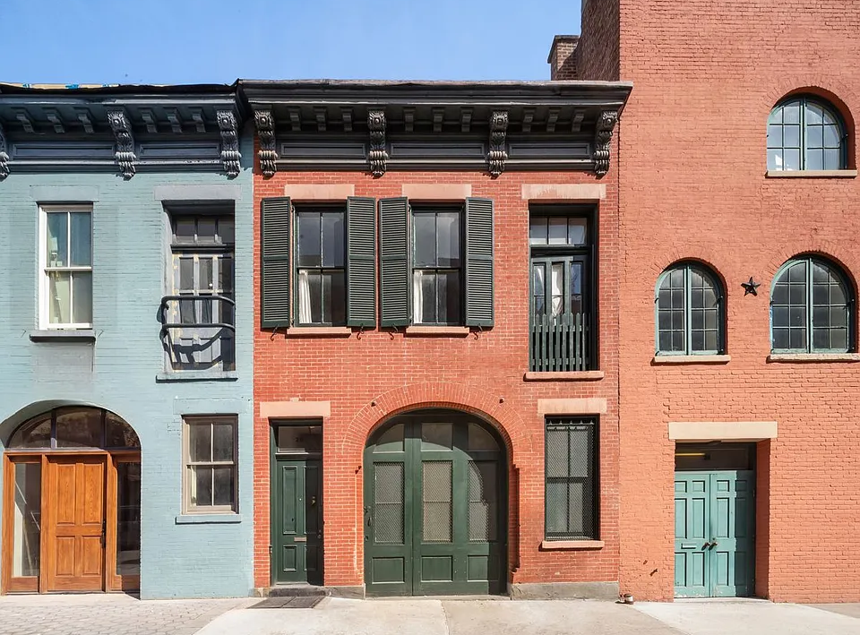
but turquoise is too over the top
lol but so are all his boyfriends!
*rob*
I thought about deep blues, greens and/or reds and I’ve had them before in other places. i just don’t want that really heavy look at this point. I want a blue and don’t want it to look like 18th C wedgewood
Hmmm, personally, the color is not saturated enough for me, but that would look good in your living room. Hold this thought, I’m doing a post on paint tomorrow.
That is pretty bright Dave. I thought you were talking about something like this:
http://tinyurl.com/yd4xl3x
Bermuda Turquoise
Dave, I vote no on the turquoise.
Prussian blue maybe, Deep green maybe, but turquoise is too over the top.
Gliden True Turqouise…
https://www.glidden.com/color/color-visualizer.do#path=intro&cid0&cid1=GLB07&cid2=GLB07&cid3&cid4&cid5&cid6&cid7&cid8
quote:
Caribbean Turquoise
🙁 that was the color of my old contact lenses. and my eye doctor insisted i wear clear contacts now which unfortunately make my eyes look like baby vomit green.
*rob*
Dave, you don’t have to go Caribbean Turquoise, get something a little more subdued.
Dave, the turq will look cool, but might prompt several more design changes…