Brownstoner's New Look
For those of you just tuning in, we put up a new site design over the weekend. The major change is that we removed the left-hand column and enlarged the size of the editorial column by about 25%. We’ve already gotten an email from Bob Marvin, who may have a year or two on our…
For those of you just tuning in, we put up a new site design over the weekend. The major change is that we removed the left-hand column and enlarged the size of the editorial column by about 25%. We’ve already gotten an email from Bob Marvin, who may have a year or two on our average reader, expressing his pleasure at the fact that he no longer needs a magnifying glass to read the text. We’ve also gotten an email or two from people who don’t like the new look. We’re interested to hear everyone’s feedback. Nothing’s set in stone so please let us know what you like and what you don’t, keeping in mind, of course, that it can take a few days to get used to a new design. (We’re not entirely sold yet on the Arial font – maybe we should go with the font we use on Brooklyn Record.) How many of you remember what the site looked like a year ago?
Update: Vote on which header you prefer by clicking here.


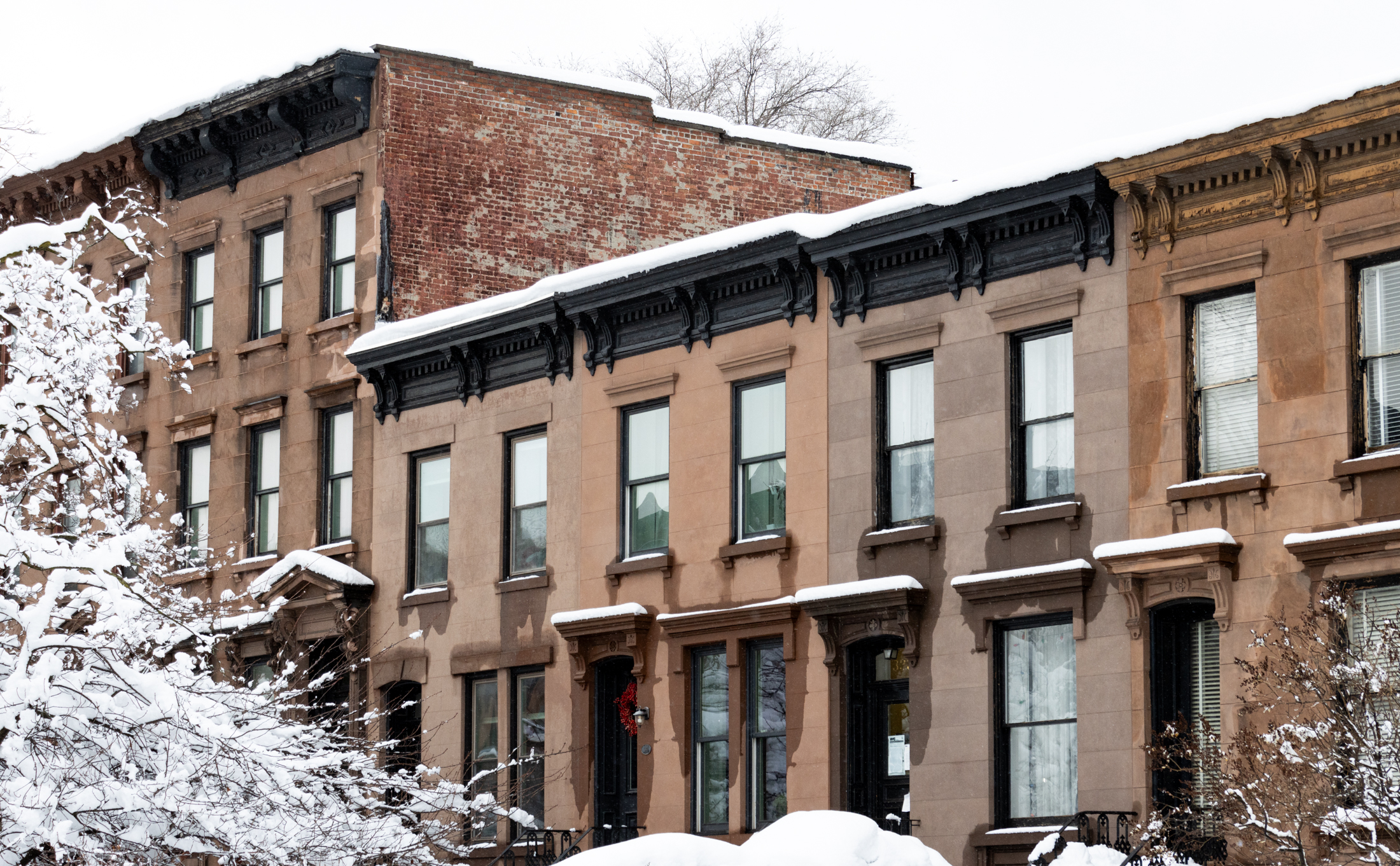
I agree with Argyle Road that the new photo is too generic. The renovation photo is symbolic of this site’s origins. I remember when you used to have a photo of yourself with one of your kids…How long ago was that? It seems like ages. Or am I dreaming?
what’s so bad about Arial? i like the whole look. it’s just much cleaner. and i don’t mind the asymmetrical nature. it makes it look that much more unique. i have a minor problem with the top pic– looks a lot like the pics on LGS Brooklyn — but it is still pretty. overall, change is good.
what’s so bad about Arial? i like the whole look. it’s just much cleaner. and i don’t mind the asymmetrical nature. it makes it look that much more unique. i have a problem with the top pic– looks a lot like the pics on LGS Brooklyn.
I’m a huge fan of this site but I’m not crazy about the redesign. The old photo of a Brownstone in the midst of a total renovation with legs walking over bricks, captured the whole thrust of the site which I always felt was for do it yourself homeowners (and potential owners) navagating through the joy and pain and ensueing obsessive behavior of creating restoring and/or building a home in Brooklyn. Very appealing. The new photo doesn’t evoke much and seems more stock. I felt confused by the round banner ad for Brooklynian…Is that a sister site of the Brownstoner media brand or is it a new form of advertising? Since its so prominantly featured on the title banner it feels like it might be a sister site, something I didn’t know about. If that’s an ad, I think its confusing. Also, the Brownstoner Font feels a little simple to me. Again it doesn’t make you feel like you are in the same place as when I used to log into Brownstoner. But this is just one man’s opinion. This site is still my obsession and maybe I just need to get used to it. Its only 1041am on Monday.
Also, the indenting on the left side is confusing – you should do something to make the comment and the poster look like a unit –
Serif fonts (like times new roman, palatino, garamond) are much easier to read in paragraphs. Sans serif fonts (like arial, helvetica, gil sans) were designed to be used as headline type not body type. Paragraph type should always be set in a serif font.
Don’t see what people have against Arial—very clean-looking and legible. My only complaint is the red headlines—agree that you should use another color.
I like everything except the font – much easier to read. Oh and maybe a bit more color. But choosing between this and the old – I choose this one.
What I would like to see is easier way to search archives for old OpenHouse and HOTD picks….. so when sale prices do come thru (from newspapers or propshark) can re-read all the ‘reviews’ and insights from brownstone contributors.