Brownstoner's New Look
For those of you just tuning in, we put up a new site design over the weekend. The major change is that we removed the left-hand column and enlarged the size of the editorial column by about 25%. We’ve already gotten an email from Bob Marvin, who may have a year or two on our…
For those of you just tuning in, we put up a new site design over the weekend. The major change is that we removed the left-hand column and enlarged the size of the editorial column by about 25%. We’ve already gotten an email from Bob Marvin, who may have a year or two on our average reader, expressing his pleasure at the fact that he no longer needs a magnifying glass to read the text. We’ve also gotten an email or two from people who don’t like the new look. We’re interested to hear everyone’s feedback. Nothing’s set in stone so please let us know what you like and what you don’t, keeping in mind, of course, that it can take a few days to get used to a new design. (We’re not entirely sold yet on the Arial font – maybe we should go with the font we use on Brooklyn Record.) How many of you remember what the site looked like a year ago?
Update: Vote on which header you prefer by clicking here.


I love it! Very refreshing; change the photo every now and then and surprise us….
Of course I have an opinion about this…looks likes ads are taking center stage now. Why can’t the real estate brokers column appear as one of the headers next to “Home” and “Forum”? An extra column makes the actual body of info seems squished to the left.
I miss the intimacy of the old design. With the smaller font and images I could open it at work without people around me being able to read it as they passed in the hallway and I could also scroll through the posts fairly quickly. This feels a bit like an “easy to read” picture book, and it feels like I am displying the content to the whole world around me at work.
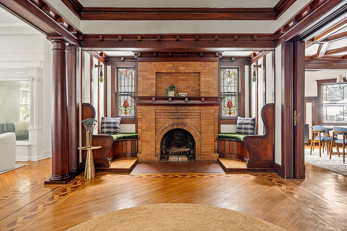
I hate the new format. Brownstoner.com now looks like every other blogsite. So boring and dull. The font is blah. Moreover, bring back the old photo or choose another one that captures a truly beautiful Brownstone Brooklyn streetscape (e.g., Montgomery, So. Portland, Midwood, Willow or Stuyvesant Ave.). The current photo says nothing and appears lifeless. Give visitors to the site the charm of the old photo or a provocative “Wow! This is Brooklyn?!?” photo. Despite the above criticism, I still love the content, Stoner! Keep it coming!
Not crazy about the font – looks too typical and blogish.
Can you reallocate the space dedicated to text vs ads? The ads seem to have 45% of the space on my screen in this new format.
I liked it better when text was centered, but I like the new font because it is easier to read. It was extremely small on my palm pilot.
Bring back the old photo and I’ll adjust to the rest!
It looks cheap. And please, move the reafing text to the right a touch.
I agree with Argyle Road that the new photo is too generic. The renovation photo is symbolic of this site’s origins. I remember when you used to have a photo of yourself with one of your kids…How long ago was that? It seems like ages. Or am I dreaming?