Brownstoner's New Look
For those of you just tuning in, we put up a new site design over the weekend. The major change is that we removed the left-hand column and enlarged the size of the editorial column by about 25%. We’ve already gotten an email from Bob Marvin, who may have a year or two on our…
For those of you just tuning in, we put up a new site design over the weekend. The major change is that we removed the left-hand column and enlarged the size of the editorial column by about 25%. We’ve already gotten an email from Bob Marvin, who may have a year or two on our average reader, expressing his pleasure at the fact that he no longer needs a magnifying glass to read the text. We’ve also gotten an email or two from people who don’t like the new look. We’re interested to hear everyone’s feedback. Nothing’s set in stone so please let us know what you like and what you don’t, keeping in mind, of course, that it can take a few days to get used to a new design. (We’re not entirely sold yet on the Arial font – maybe we should go with the font we use on Brooklyn Record.) How many of you remember what the site looked like a year ago?
Update: Vote on which header you prefer by clicking here.


I hope the absence of the “My Brownstone” entries is just a temporary glitch.
You still spin a good tale. Gives me plenty of bedtime stories to tell my kids…Once, there was a site with so many bitter and twisted people that they could not come together to do one once of good for their community, etc…..
i was just about to update my photos in “my brownstone” and iot’s not even there! 🙁 come back…please?
I hate how I can’t look at the picture & read the caption below. Everything is TOO Big. Please make it smaller.
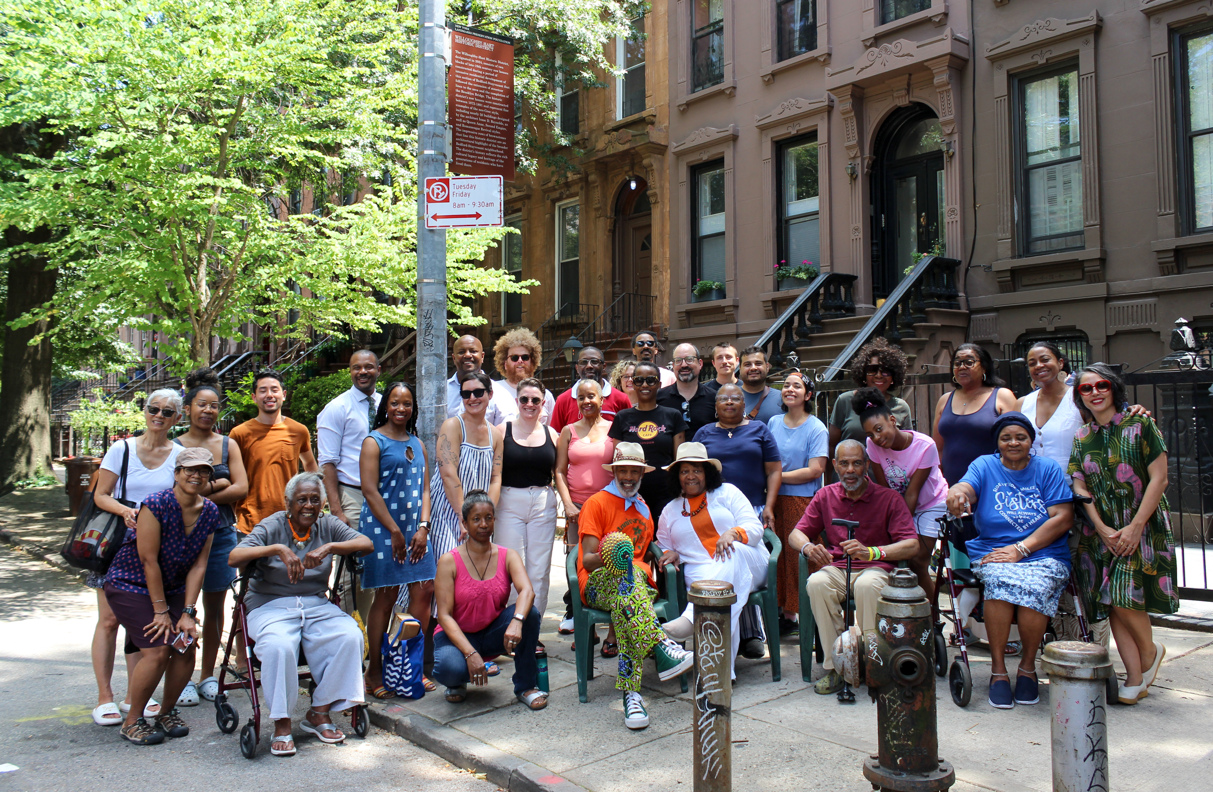
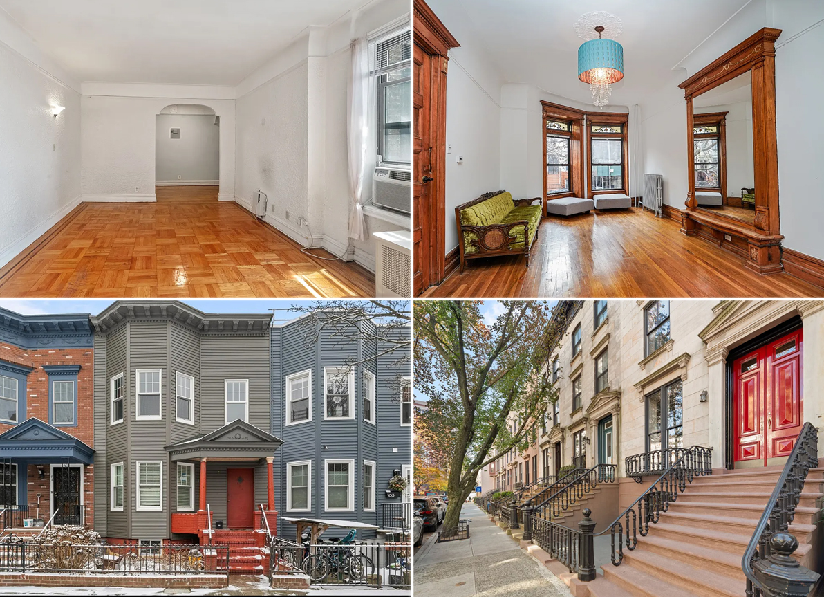
Please, please, please, Mr. B., change the picture at the top. It’s soooooooo blah and generic (not like you). Show us some of that fantastic architecture you’ve captured throughout the area. If the photos change periodically, that would also be a sweet touch.
What happened to MY BROWNSTONE section???
Please get rid of the red headers! IT’S LIKE THE SITE IS SHOUTING! The brown headers were way less disruptive while still commanding attention.
I do have to admit the old site felt more unique. This site looks like a typical blog site. If I had to change one thing is the picture at the top, you have posted much better pics.
I agree with the posters who are annoyed that the text isn’t centered- – it seems silly to me to have text on left + 2 columns of ads and links on right. Should be more balanced.