Brownstoner's New Look
For those of you just tuning in, we put up a new site design over the weekend. The major change is that we removed the left-hand column and enlarged the size of the editorial column by about 25%. We’ve already gotten an email from Bob Marvin, who may have a year or two on our…
For those of you just tuning in, we put up a new site design over the weekend. The major change is that we removed the left-hand column and enlarged the size of the editorial column by about 25%. We’ve already gotten an email from Bob Marvin, who may have a year or two on our average reader, expressing his pleasure at the fact that he no longer needs a magnifying glass to read the text. We’ve also gotten an email or two from people who don’t like the new look. We’re interested to hear everyone’s feedback. Nothing’s set in stone so please let us know what you like and what you don’t, keeping in mind, of course, that it can take a few days to get used to a new design. (We’re not entirely sold yet on the Arial font – maybe we should go with the font we use on Brooklyn Record.) How many of you remember what the site looked like a year ago?
Update: Vote on which header you prefer by clicking here.


If you want to read both active reno blogs, you need to click 4 times! This is up from 3 clicks on the previous layout and 2 clicks on the layout before that. What an unnecessary waste of time. Brownstoner – why are you burying one of the best features on the site?
the new design is fine I do prefer the old photo. just one thing – even if you don’t add a left column please move the test over a bit it looks like its running off the page its very annoying.
You need some space on the left…10 pixels at the very least. Also, the About button takes you into Brooklyn Record…???
I’d prefer to have links open up in new windows, as opposed to the way it is now where it opens in the same window you’re using.
No more space is being allocated to ads than before. There were always two columns of them. THe only diff is that the editorial column is wider and the left-hand column that used to include the blogroll and broker links has been removed and that content put below the ads.
I agree with ameraleed’s comments about it being large at work. If I was unfamiliar with the site I would also read it as “Brownstoner – Brooklyn’s Bulletin Board”, based on the layout at the top.
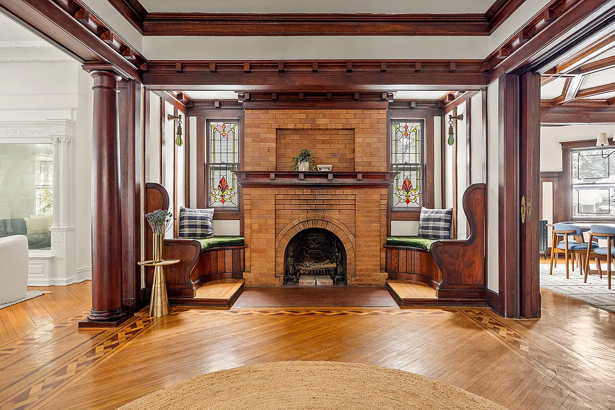
Although the new site is clean, it lacks some of the charm that initially attracted me to the site. The photo and menu links seem cold and generic. One row of ads would also extend down further when you scoll down – right now a lot of horizontal space is devoted to them at the top of the page.
two thumbs up..
I LOVED the old banner picture. Although the new pic is fitting, it doesn’t have the same attention grabbing quality… it looks generic. The old photo displayed emotion. Other than the picture, the new design is fine.
I love it! Very refreshing; change the photo every now and then and surprise us….