Ultra Modern Reno on South Portland Avenue
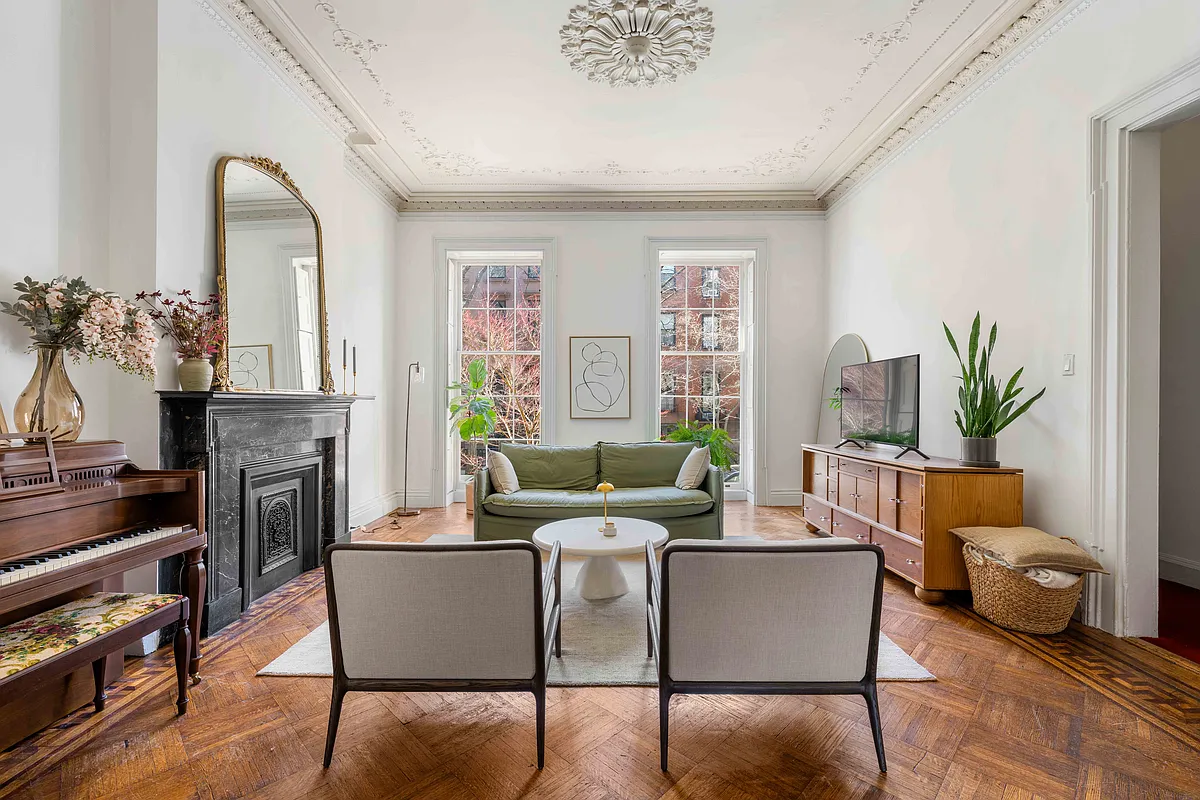
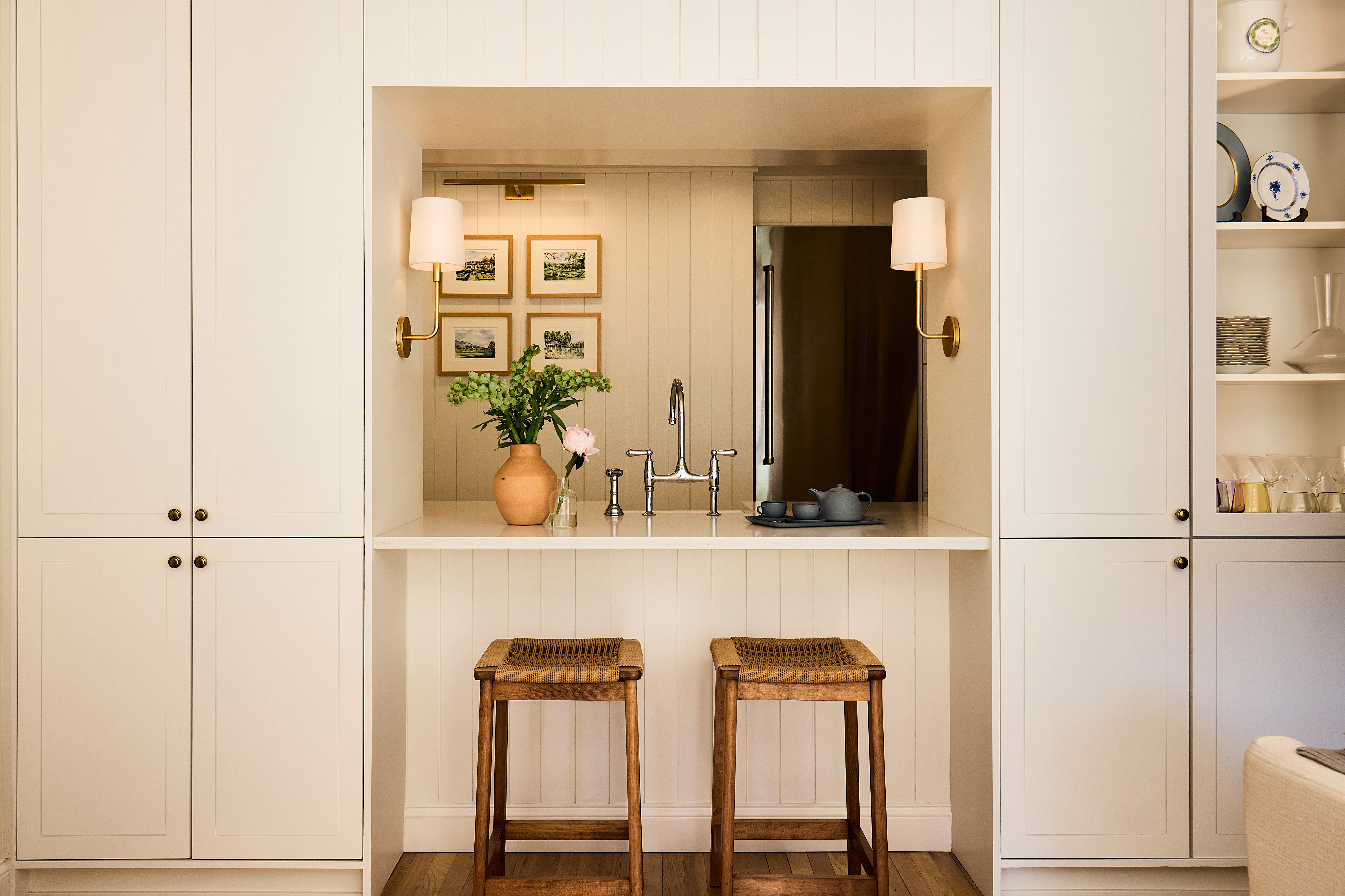
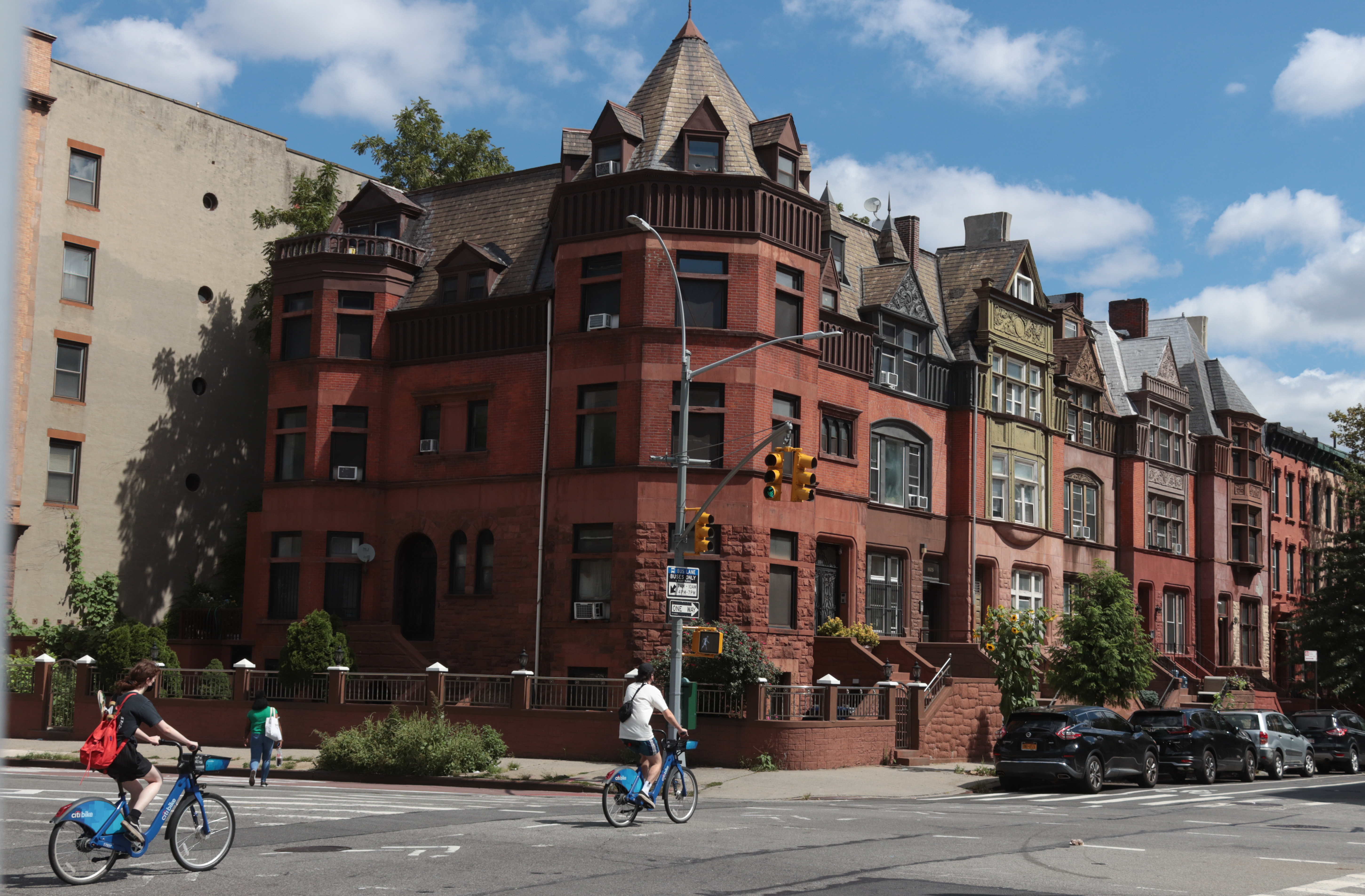
[nggallery id=”27585″ template=galleryview] Here are some very cool before and after shots of a renovation of a South Portland Avenue brownstone that took place in 2007. The architect was Field Lines Architecture, an Lower East Side-based duo with clearly modern leanings. We have to admit to mixed feelings about the whole thing: On the one…

[nggallery id=”27585″ template=galleryview]
Here are some very cool before and after shots of a renovation of a South Portland Avenue brownstone that took place in 2007. The architect was Field Lines Architecture, an Lower East Side-based duo with clearly modern leanings. We have to admit to mixed feelings about the whole thing: On the one hand, the finished product looks really amazing, what modern architecture should be; on the other, the intact interior of a brownstone on the definitive brownstone block in the city was lost in the process. At least there are no Fedders boxes! Update: The architects just sent in another view that shows how they did in fact maintain original details where they could. Great to see that our fears were misfounded! “We at Field Lines believe that the real magic occurs when palimpsest of the past are not erased but rather incorporate as unique opportunities for design,” they wrote. Check out the new image on the jump.


Agreed – the architect’s website is over designed.
It always puzzles me when I see glass floor, what if I am wearing a skirt, and it is summer, and my guests can look up and ….
Unless glass becomes opaque at the flip of the switch.
There are a lot of very personal design elements/choices in here, but I guess whoever is going to be able to buy/afford it in the future will have enough $$$ to change it to their own liking.
“Hardly a controversial or rancor-baiting sentiment.”
Yeah. It’s not like you singled the place out as a “Horror Show of the Week” or anything like that.
Can’t believe it, but I’m with Sam on this one.
I do love the outdoor shots of the accordion sliding doors/windows, and love the open and bright feel, but I can’t stand the rounded walls with a mix of exposed brick and Land of the Lost elements, the curvy metal stairs and railing – very Beetlejuice – and troubled by the idea of blasting out half of the parlor floor.
It just seems that if you want a bright, high ceiling-ed loft, and you have this sort of money, then buy a loft.
The architecture, layout and design are beautiful.
The interior design, furniture and accessories are 1 step above IKEA.
Seriously…
I think it’s gorgeous but since I love old and moldy, obviously this would not be my dream house. i think sam is right about how styles change and i would hope they didn’t rip out incredible details just for style. But after looking through the pictures on their sit it looks like they did on the room in the new photo. It was originally a yellow room and going back there was a beautiful entryway with columns. Is that still there but any chance? Did I miss it in the new photos?
And is anyone else totally annoyed by their poorly designed but architecturally precious website?
I don’t like the furnishings. That’s got to be the most uncomfortable sofa in the universe.
In this layout June Cleaver better keep her kitchen anal compulsively neat and tidy ‘cuz it will be out there for all to see, even when she is cooking and trying to drop the lobster into the pot or picking up the dropped turkey from the floor.
hahah… it’s poo mist, not poo haze.
*rob*
And stop referring to “clerestory” windows unless you’ve built a catherdral. (These folks are not guilty of that one at least).