
Retro Thinking Gone Wild at 288 7th Street
This place at 288 7th Street is one of the odder building designs we’ve seen in a long time. Clearly the owner (or architect) had some good intentions to try to convert the former two-story commercial building into some sort of period-appropriate residential structure. The result, however, is just plain weird, with massing and proportions…

 This place at 288 7th Street is one of the odder building designs we’ve seen in a long time. Clearly the owner (or architect) had some good intentions to try to convert the former two-story commercial building into some sort of period-appropriate residential structure. The result, however, is just plain weird, with massing and proportions that don’t really work in our opinion and an overall look that’s more Disney than Old New York. And even if the facade were more successful, the tall rear addition would have been a spoiler anyway. This is an instance where the developer would have benefited from having some input from the folks at LPC! According to a sign out front, Brown Harris Stevens is now marketing the converted building as duplex condos, although we couldn’t find any online listings. GMAP P*Shark DOB
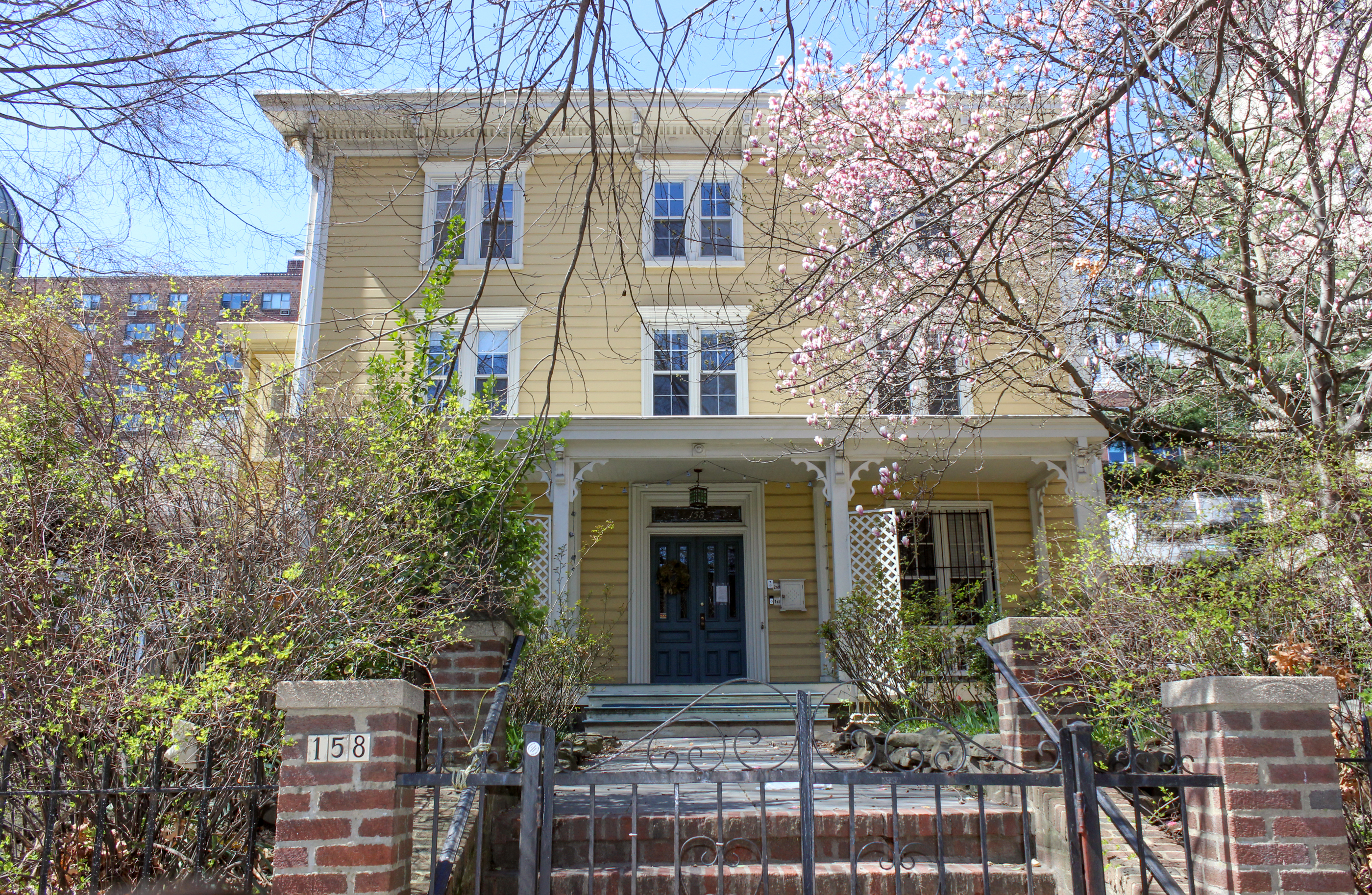
We obviously signed off on Emily’s critique–and even added that Disney comment…As she said, it’s not a bad try but the scale feels off to us and, as LITH says above, the FAR-maximizing additions both at the top and the rear are the real killers. (It’s not nearly as bad, but it reminded us a bit of this bastardized mansard addition on State Street: http://bk.ly/ozy.) For the record, we like the brick and the windows though and it looks like there was no corner-cutting on construction quality. We also suspect that the inherent problems with the design were developer-driven; we bet the architect would have liked to have just stuck to three floors on the front!
1. Did you see what it USED to look like?
2. If this were in Williamsburg, it would be up for a design award.
I think comments are skewed towards neighborhoods.
I rather like it as well. The addition in the back just looks its another building. Seems like a good use of space.
Also, it looks like there are 2 roof decks. Pretty awesome. I’d grow me some tomatoes up there! (Can someone lend… cough… give me a few hundred thousand?)
its all going ok until you get to the rooftop which is incongruous fedders-square. Coulda matched better to the mansard or whatever its called.
And it’s a great use of space. The developer could have just made a flat front wall, but instead decided to make an interesting facade for the building.
I actually agree with Emily’s assessment. Decent intentions and materials but the design falls victim to trying to squeeze every last drop of FAR out of the site, I think.
I walked by it yesterday and it looks good.
The nasty commentary about every single thing built post 1950 is getting old.
Yeah, the comments are what’s weird…Disney? How? Where?
It’s a very appealing structure, updating the brick row house tradition in perfectly positive ways. And the ‘tall addition’ lends it an air of mystery. If you don’t like this house you are set in 19th century aspic.