
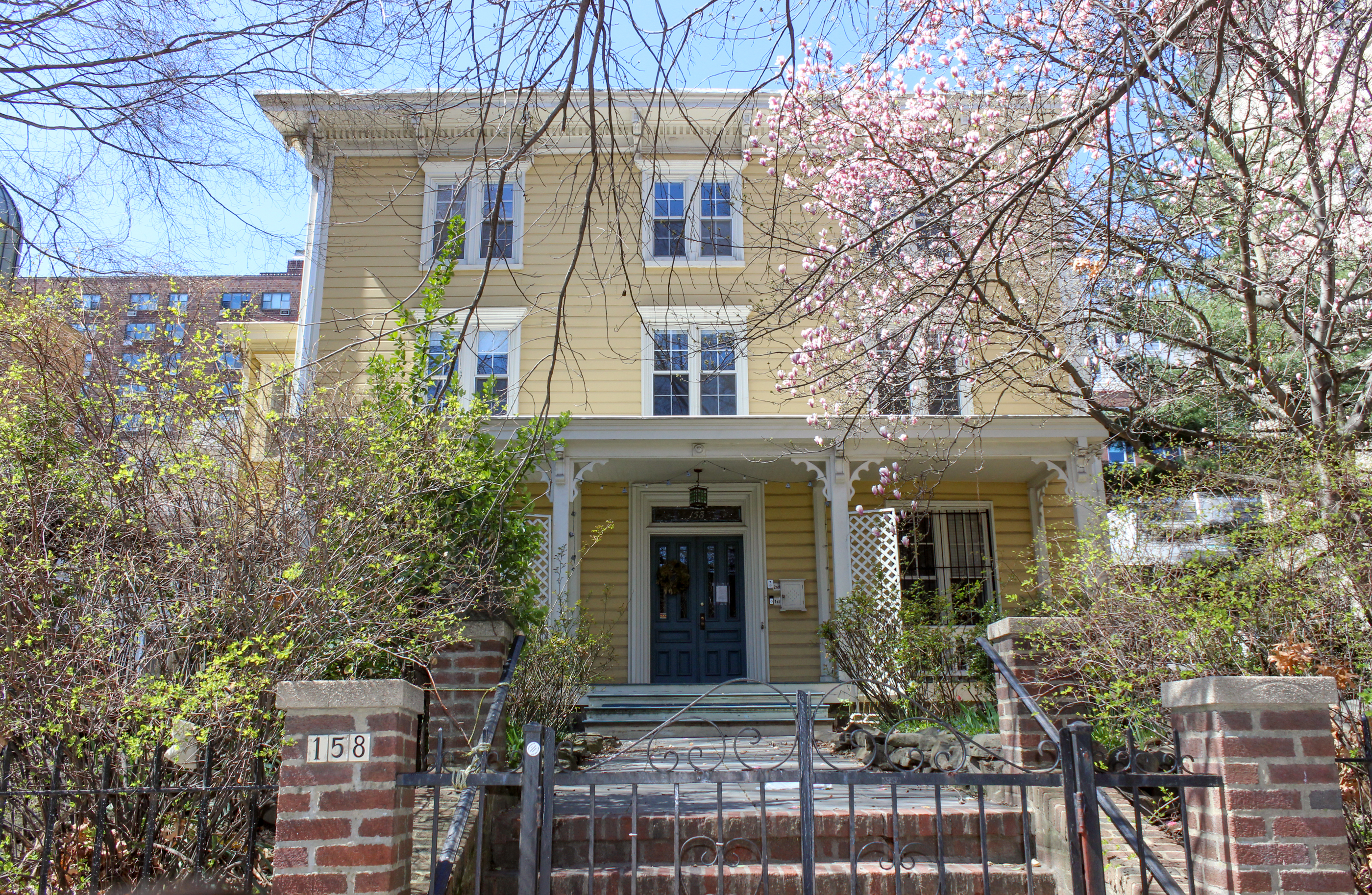
Retro Thinking Gone Wild at 288 7th Street
This place at 288 7th Street is one of the odder building designs we’ve seen in a long time. Clearly the owner (or architect) had some good intentions to try to convert the former two-story commercial building into some sort of period-appropriate residential structure. The result, however, is just plain weird, with massing and proportions…

 This place at 288 7th Street is one of the odder building designs we’ve seen in a long time. Clearly the owner (or architect) had some good intentions to try to convert the former two-story commercial building into some sort of period-appropriate residential structure. The result, however, is just plain weird, with massing and proportions that don’t really work in our opinion and an overall look that’s more Disney than Old New York. And even if the facade were more successful, the tall rear addition would have been a spoiler anyway. This is an instance where the developer would have benefited from having some input from the folks at LPC! According to a sign out front, Brown Harris Stevens is now marketing the converted building as duplex condos, although we couldn’t find any online listings. GMAP P*Shark DOB
I can’t figure out where the floor is between the first and second stories. If it is above the ground floor lintel, where one would expect, those windows would be at ear height. The inside and outside don’t mesh. That is a clear indication of bad design whether modern or traditional. Also, there is no pedestrian entry to the building, I realize it is probably through the rear set back area somewhere in the shadows, but…..the more I look the more flaws I find so I will stop.
Maximizing FAR is pretty much always going to be at odds with an attempt to create a piece of period architecture.
But what Minard says is true. brooklyn has very high quality historic architecture and that raises the bar for any project like this.
i like it!
We’re not tsk-tsking his attempt to maximize FAR (“It’s just business” as they would say on the Sopranos), but we are saying that his attempt to maximize FAR is at odds with the attempt to create a piece of period architecture.
Here are my opinions:
Good: general idea, materials, mansard roof addition with nice window placement, use of original building, and cornice.
Not so good: Squeezing every inch of FAR in the back, as per lowintheheights.
Might improve it: instead of back addition all across the width of lot, would have bumped out a bay, or a couple of bays on the side for extra room. Would also have carried the mansard all the way to the top, and wrapped the metal and the cornice around on the sides, so it doesn’t look so “Disney”, and is an integral part of the design, not decoration. I’d also put some kind of iron fencing or cornice on the rooftop to cap it off.
Brownie — I won’t disagree that a *different* architectural choice would could have been either equally or more successful…. but you do know that the reactions to you suggestion of a glassy topper would have received similar “This is a horrible [insert whatever here]!!” comments.
Also, I think the modern museum restoration technique (i.e., not attempting to “blend in”) is far more successful if it were a FULL structure. Like those townhouses with the burnished metal or teak facades stuck in between two 19th century row houses.
“DH, honestly you’ve been looking at crap too long in Williamsburg if you can’t tell the difference between quality brickwork and crap. ”
You’re right – it’s in Park Slope so it’s obviously high quality.
I’m sure the developer is happy he tried to meet the frownstoners half-way on this project. After seeing that this bought him nothing, he’s probably looking at this thread and saying to himself: “Damn, I should have just ripped down the old building and put something up like the structure next door”.
I’m sure he almost fell out of his chair when he saw Mr. B. task-tsk his attempt to maximize his FAR. Oh those damn developers, trying to make a profit and all.
Agreed, bxgrl. Not to mention that the buildings on the other side of the street would be looking right into your glass box here.
To pull off a glass addition to this would have taken a superior design and implementation of that design. A mediocre glass addition to the original structure would have REALLY looked like crap, in my opinion.