
Out-of-Scale Addition at 524 State Street
How ridiculous-looking is this? We don’t make it down this last block of State Street very often (we tend to take 3rd Avenue to Lafayette when heading back to Clinton Hill from Smith Street or the Heights) so this addition to 524 State Street had eluded our watchful eye until now. While this is technically…

How ridiculous-looking is this? We don’t make it down this last block of State Street very often (we tend to take 3rd Avenue to Lafayette when heading back to Clinton Hill from Smith Street or the Heights) so this addition to 524 State Street had eluded our watchful eye until now. While this is technically only a one-story addition, it looks like two-stories since the original top floor had small flat-roof dormers to start with. The current owners blew those up to full-size windows and then slapped these two massive arched windows that are completely out of whack with the scale of the house—or any of the houses on the block. The design is by Andrew Tesoro Architects. What were they thinking? GMAP P*Shark DOB

Yeah, people have been putting additions on top of buildings here, and in Paris, for ages–and some of them look great. This one is hideous. An embarrassment to the architect and the owners. An eyesore to the neighbors. It’s like a tacky, tasteless McMansion was plucked from the Jersey suburbs and dropped from the sky onto this innocent building.
Oh, the aesthetic evil that men do… call it Carbuncle: The Sequel. These people should get together with the poor schmucks who inevitably will buy in the Carroll Gardens Atrocity (which, admittedly, is much worse), maybe have swingers parties in their above-ground pools.
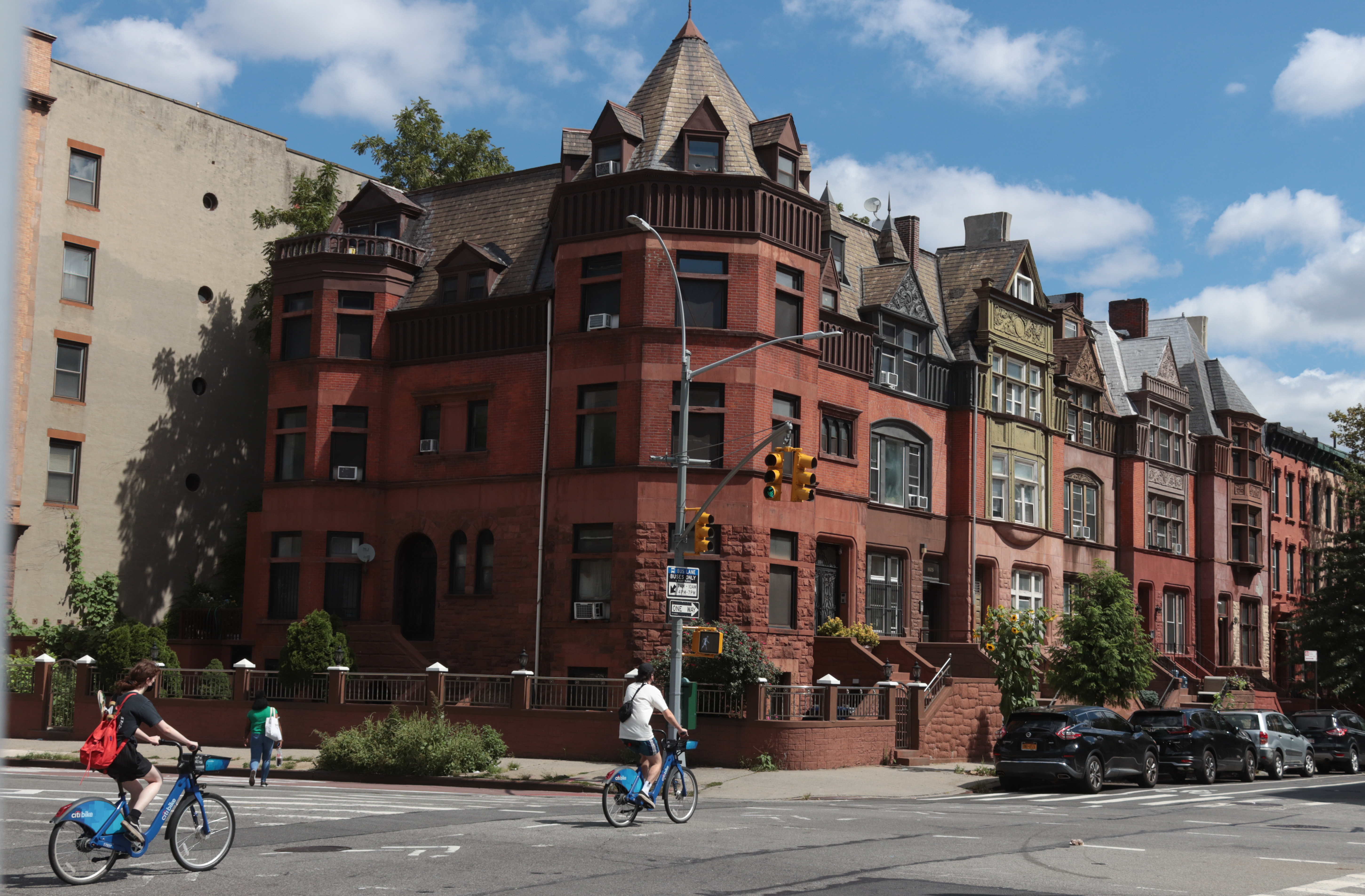
Thank god for landmark protection—glad I have it. Fortunately for me and my neighbors, and thanks to clueless losers like the above, the great looking houses on our blocks in Clinton Hill will only become more scarce and valuable. People who resist landmark protection are fools. You can have your cookie-cutter studio on 6th Avenue; me, I’ll take Bedford and Commerce.
Pray to GOD they will not loan money to Asshats to go shit like this. The sad thing you think the dumbass factor in heating/cooling cost? Did this dumbass factor in higher property taxes? No beacuse Asshats live for the now…
The What
Someday we will run out of money..
I love the garrett look but why they couldn’t face it with brick or even make it a darker exterior color? And the cornice looks out of whack now, rather than the visual top sightline it was meant to be. I’m bet the interior space is wuite beautiful, especially with the arched windows (12:10- I see the face too) but I will never understand how an architect would sign off on a design that works so poorly on the outside- visually speaking.
Looks like its their own da*n house and they can do with it what they want. Geez. Mind your own business – especially since its apparently not your neighbor since you never go down that street like you said. Youre worse than some old busybody.
Guest at 12:08: Paris has had building regulations that limit height since 1783. Paris currently has plenty of laws limiting development and the shape and size of buildings in the “inner core.”
Popping on an extra storey or two to the top of a row house is more common than you think. I can think of a several buildings here in Crown Heights where that was done within a generation of the house being built. The key to looking good usually involves moving the cornice up to the new roofline, so the addition looks like it belongs. That said, this one doesn’t bother me as much as some others, and does look like a quality job.
I think if the architect would have faced the addition in a similarly aged and colored brick, that at least reads from the street as period, it would blend in better with the house itself, as well as its neighbors. The design makes the house look like it has a mansard roof, which is a period shape. I think that is what works, it’s not just a glass and steel square cabana, like so many new additions. I would have capped it with a similar cornice, or even the original one modified, so the entire house is a unified whole.
-Montrose Morris
“It was obviously originally constructed for a relatively lower income family”
A terrible, terrible development, to be sure.
I have a hard time with this one. I don’t think it’s an inherently ugly design, it just stands out–and not a in good way– compared to the rest of the houses on the block/the neighborhood. In the owner’s defense, though, I’d have a hard time saying no to huge windows if you can them approved by DOB… I bet the interior of the addition is an amazing space.
Are those stairs going up to a roofdeck in the middle of the arched windows? Pretty sweet.
What an unattractive addition.
Amazing that the walls and foundations of the little old house can support this.
The design is so bad and so ad hoc that I bet it is completely illegal.