
Architect's Journal: Park Slope Brownstone
[nggallery id=”41777″ template=galleryview] Today James Cleary of James Cleary Architecture walks us through a recent renovation. If you’d like to write about one of your projects, please send us an email at brownstoner@brownstoner.com. The new owners of a three story central Park Slope brownstone hired us to transform the building into an open, light-filled home…
[nggallery id=”41777″ template=galleryview]
Today James Cleary of James Cleary Architecture walks us through a recent renovation. If you’d like to write about one of your projects, please send us an email at brownstoner@brownstoner.com.
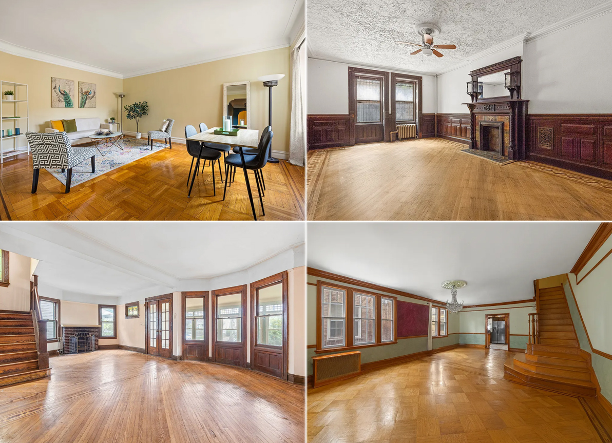
The new owners of a three story central Park Slope brownstone hired us to transform the building into an open, light-filled home for their family of four on a budget that was reasonable but not to be exceeded. The building had been used for years as an illegal two-family, with interiors that had not been touched since a decades-old down-and-dirty renovation that stripped much of the original detail from two of the building’s floors and left the interiors feeling cramped. It was clear from day one that all new plumbing, electrical, and mechanical systems, including central air conditioning, would be required. After the initial design studies were completed, the owners and I agreed that the existing layout did not work with the owner’s program, so the interior partitions – including the interior bearing wall that ran the length of the building on each floor – were all demolished.
In the new layout, the parlor floor contains all the home’s social spaces, and has been completely opened up so that the kitchen, living, and dining areas share one grand space. The parlor floor was the only area with intact original details, and the renovation’s design creates a sense of play between those details and newer, contemporary elements. In the center of the floor, the dining room walls and ceiling are wrapped in a wallpapered ‘liner,’ which gives the area a unique feel, and at the same time carefully conceals the HVAC system, drain lines coming down from the third floor bathroom, and the building’s risers. To maximize storage space, the full height and width of one wall of the kitchen conceals a series of pantry cabinets whose face has been painted with blackboard paint, allowing the children to draw on the wall while dinner’s being prepared, or spouses to jot a note about what time they’ll be back from the gym.
The garden floor…
…contains a home office and the master bedroom suite with the master bedroom overlooking the rear garden through a new large window. On the top floor are the children’s bedrooms – each with its own walk-in closet and private reading nook – which flank a full bathroom and open play area. The rear yard has also been redone, including a new stair from the kitchen to the yard, new fencing, and both paved and planted areas.
From start to finish, construction took 6 months, and was completed for approximately $200 a foot. The owners are now settled into their new home, and are thrilled with the results of the renovations.

cmu –
re: load bearing walls v. joists that span the building
You might find this forum discussion from 2005 insightful.
http://www.brownstoner.com/forum/archives/2005/09/removing_loadbe.php
Q for architects: why is the typical longitudinal wall is load bearing and needs to be replaced as above with serious beams, since it often does not extend into the back parlor? (and in my house no wall on the upper 2 floors bedrooms). In other words, if the joists safely span in the bedrooms, why do they need a wall in the middle section?
Inspiring! What a difference a thoughtful, contemporary renovation can make. I especially like the bathroom and kitchen, with the little wine nooks. The “wrap” area is a interesting solution — not sure I love it, but I applaud the creativity.
Brilliant!
The liner on the parlor floor is a very nice touch, but I was actually really taken with the entry area. I very much like the white low cabinetry extending out. The series of skylights up top are nice too – nice to see natural light coming in.
Perhaps it’s a 3/4″ or thicker plexi? Not so easy to break.
PS: is that foolhardy or what to use a glass banister in a children’s play area, even if it looks great?!
Agreed – I REALLLY love what they did!
am not a fan of that wallpaper choice in the kitchen
but everything else is amazing!
Absolutely a beautiful, functional, elegant design! Should be required viewing for all those who claim dark varnished trim is the way to go.
The wallpaper may take, as snappy says, learning to live with, but I could do it, methinks. At least it’s a strong and vibrant statement, rather than the usual wishy-washy homage to the past.
Wow. That liner is crazy – makes it looks like a dollhouse. You’re hired.