
Architect's Journal: Park Slope Brownstone
[nggallery id=”41777″ template=galleryview] Today James Cleary of James Cleary Architecture walks us through a recent renovation. If you’d like to write about one of your projects, please send us an email at brownstoner@brownstoner.com. The new owners of a three story central Park Slope brownstone hired us to transform the building into an open, light-filled home…
[nggallery id=”41777″ template=galleryview]
Today James Cleary of James Cleary Architecture walks us through a recent renovation. If you’d like to write about one of your projects, please send us an email at brownstoner@brownstoner.com.
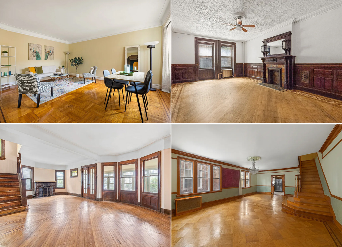
The new owners of a three story central Park Slope brownstone hired us to transform the building into an open, light-filled home for their family of four on a budget that was reasonable but not to be exceeded. The building had been used for years as an illegal two-family, with interiors that had not been touched since a decades-old down-and-dirty renovation that stripped much of the original detail from two of the building’s floors and left the interiors feeling cramped. It was clear from day one that all new plumbing, electrical, and mechanical systems, including central air conditioning, would be required. After the initial design studies were completed, the owners and I agreed that the existing layout did not work with the owner’s program, so the interior partitions – including the interior bearing wall that ran the length of the building on each floor – were all demolished.
In the new layout, the parlor floor contains all the home’s social spaces, and has been completely opened up so that the kitchen, living, and dining areas share one grand space. The parlor floor was the only area with intact original details, and the renovation’s design creates a sense of play between those details and newer, contemporary elements. In the center of the floor, the dining room walls and ceiling are wrapped in a wallpapered ‘liner,’ which gives the area a unique feel, and at the same time carefully conceals the HVAC system, drain lines coming down from the third floor bathroom, and the building’s risers. To maximize storage space, the full height and width of one wall of the kitchen conceals a series of pantry cabinets whose face has been painted with blackboard paint, allowing the children to draw on the wall while dinner’s being prepared, or spouses to jot a note about what time they’ll be back from the gym.
The garden floor…
…contains a home office and the master bedroom suite with the master bedroom overlooking the rear garden through a new large window. On the top floor are the children’s bedrooms – each with its own walk-in closet and private reading nook – which flank a full bathroom and open play area. The rear yard has also been redone, including a new stair from the kitchen to the yard, new fencing, and both paved and planted areas.
From start to finish, construction took 6 months, and was completed for approximately $200 a foot. The owners are now settled into their new home, and are thrilled with the results of the renovations.

Love the concept – open up the floor plan. Anyone who lives in or has lived in a row house or floor through of a townhouse knows it is a challenge to bring natural light into the center of the structure.
However, I am not getting the love for the execution of this design. The functional aspect of the liner is it “conceals the HVAC system, drain lines coming down from the third floor bathroom, and the building’s risers”. OK, fine, not a terrible idea…but then why leave the ugly steel i-beam exposed? Also, I DON’T like that the liner is concealing original details that would greatly enhance the overall look (check out photo #4 and #7 to see what I mean).
I can’t stand the wallpaper choice, but that personal design choice is an easy fix.
Overall, great idea…but I disagree strongly with those who think the execution if brilliant.
the wrap makes me feel a little claustrophobic, but otherwise it’s really nice. interesting to see the storage on the parlor floor, including the red coat closet – i considered trying something similar when we did our renovation, but couldn’t figure out how to do it and maintain a unified look. our house is too narrow for the low cabs that run the length, but they’re neat here, and allow the coat closet not to ruin the openness of the space.
I like this, but also like traditional, old school dark finishes in period buildings. Seems to me there is more than enough “stripped” housing stock in Brooklyn, that those who want to go down this road (and I do like it) should be able to find properties where the destruction of period detail is not an issue…. Yes, I realize there are other quality of life issues when purchasing a home, but it’s nice to think that those who want a contemporary home can get a bargain on a “fixer upper” devoid of details, and those who want the untouched woodwork, glass, etc…, can still lovingly preserve them (albeit at a premium). Sigh. Utopia.
widget guess 1.9 mio.
Nice clean re-design, though I think the liner is over-kill.
sally, could either be a design statement (I like it), or, would reduce the size (and cost and difficulty of install) of the actual beam.
thanks, bh for link. still not sure why my back parlor never had and apparently does not need a bearing wall. otoh, my house is 17′.
CMU- This is because the headers and joist connections at stair openings in old buildings were usually not strong enough to be supported without a bearing wall. In the back the joists run continuous from brick-to-brick.
Wow! I’m not feeling the styrofoam tunnel over the kitchen but I like the openness. Those top floor hardwoods are killer diller.
***Bid half off peak comps***
Also-why does the steel beam need the post that is intersecting with the countertop? I thought the whole point of a steel beam is so that you don`t need one. Can somebody explain?