
Architect's Journal: Park Slope Brownstone
[nggallery id=”41777″ template=galleryview] Today James Cleary of James Cleary Architecture walks us through a recent renovation. If you’d like to write about one of your projects, please send us an email at brownstoner@brownstoner.com. The new owners of a three story central Park Slope brownstone hired us to transform the building into an open, light-filled home…
[nggallery id=”41777″ template=galleryview]
Today James Cleary of James Cleary Architecture walks us through a recent renovation. If you’d like to write about one of your projects, please send us an email at brownstoner@brownstoner.com.
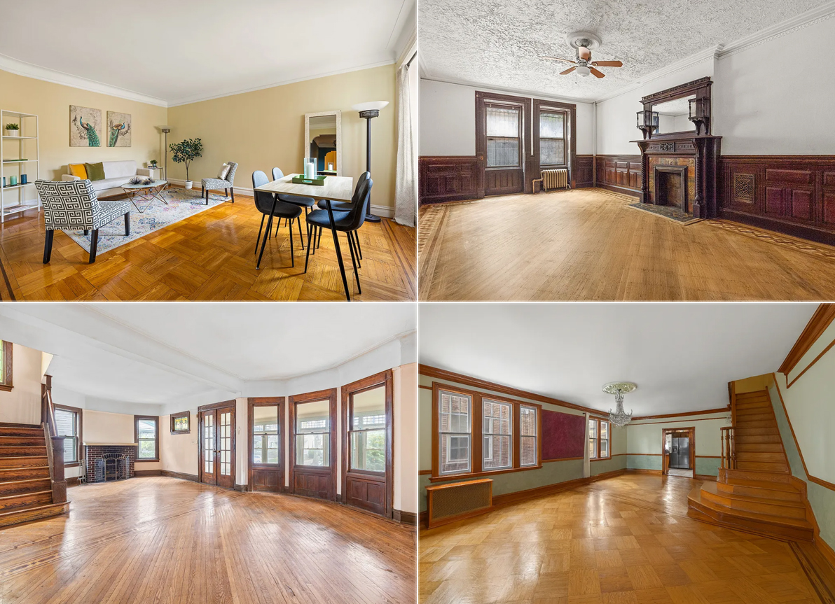
The new owners of a three story central Park Slope brownstone hired us to transform the building into an open, light-filled home for their family of four on a budget that was reasonable but not to be exceeded. The building had been used for years as an illegal two-family, with interiors that had not been touched since a decades-old down-and-dirty renovation that stripped much of the original detail from two of the building’s floors and left the interiors feeling cramped. It was clear from day one that all new plumbing, electrical, and mechanical systems, including central air conditioning, would be required. After the initial design studies were completed, the owners and I agreed that the existing layout did not work with the owner’s program, so the interior partitions – including the interior bearing wall that ran the length of the building on each floor – were all demolished.
In the new layout, the parlor floor contains all the home’s social spaces, and has been completely opened up so that the kitchen, living, and dining areas share one grand space. The parlor floor was the only area with intact original details, and the renovation’s design creates a sense of play between those details and newer, contemporary elements. In the center of the floor, the dining room walls and ceiling are wrapped in a wallpapered ‘liner,’ which gives the area a unique feel, and at the same time carefully conceals the HVAC system, drain lines coming down from the third floor bathroom, and the building’s risers. To maximize storage space, the full height and width of one wall of the kitchen conceals a series of pantry cabinets whose face has been painted with blackboard paint, allowing the children to draw on the wall while dinner’s being prepared, or spouses to jot a note about what time they’ll be back from the gym.
The garden floor…
…contains a home office and the master bedroom suite with the master bedroom overlooking the rear garden through a new large window. On the top floor are the children’s bedrooms – each with its own walk-in closet and private reading nook – which flank a full bathroom and open play area. The rear yard has also been redone, including a new stair from the kitchen to the yard, new fencing, and both paved and planted areas.
From start to finish, construction took 6 months, and was completed for approximately $200 a foot. The owners are now settled into their new home, and are thrilled with the results of the renovations.
I meant to say, “I would worry about LOSING the heat barrier of an enclosed parlor.”
Many things to love here. Like the entry way. Like the kitchen. Like the landing of the kids’ floor. But I’m struggling with the wrap. It’s the way it throws off the sightlines on the parlor floor that troubles me. The view from the kitchen seems OK but from the parlor, I’m really not sure. But I’d love to see it in the flesh to try to appreciate it in person.
And let’s hear it for the price! $200 per sq ft seems like a bargain for this major a renovation which such innovative design solutions.
Question: The entry way is so attractive but I would worry about the heat barrier of an enclosed parlor. With the high ceilings, we have a hard time keeping that floor warm in the depths of winter. Isn’t it even harder when the hall and staircase are open too?
Btw, sally, when we removed the wall in our rear parlor to create an open kitchen/dining-room, the steel beam was seated in the rear wall of the house at one end and supported by a lally post going all the way down into the cellar floor at the other end.
Mopar,
I agree that the design will not stand a test of time. Although it may seem fun to play with traditional and modern elements, I think 10 or so years from now anyone interested in this will say “total gut job”. I’m glad the owners like it now, they should enjoy it. Although the more artistic set may feel smug that the design generated these negative comments; often art that is cutting edge offends because it is too far from what is comfortable. Maybe they’ll be right in the end.
I admire the work, the ingenuity, and execution, although I have to say the wallpaper wrap is oppressive. Couldn’t something else have been used, i.e. light panels to create a sense of space? In its current form it just looks too intrusive.
Enjoy that liner gesture; a fun way to make the kitchen it’s own room while maintaining the openness of the floor (though it isn’t my taste, I’m always happy to see architects getting interesting things built). That low floating cabinet/counter as you come in (between the entry door and the parlor) is also a very nicely design touch.
I think the comments on the wallpaper being wimpy or calico are odd; the pattern actually looks like it’s pretty big and contemporary-looking.
If the owners love it, that’s all that matters, but it’s not to my personal taste. I believe it will look quite dated in about ten years. While I understand the decision to move the kitchen up to the parlor floor, the original brownstone layouts, walls, pocket doors, and such function admirably well to control heat, light, and privacy — and they are flexible.
Whether in an apartment or house, an entry way is a desirable buffer between the house and the outside world. I also find the metal beam and envelope discordant here. They remind me a bit of post-modern redesigns circa late 1980s.
On the plus side, the kitchen cabinets are elegant, and I like the trendy wallpaper.
The front parlor is perfectly executed.
The back parlor’s problem is probably the wallpaper,
it makes it look unfinished or not anchored enough,somehow. Would look better with a bold primary color like red, to emphasize the box inside of a box solution.
Excellent look overall.
Just my own opinion, like everyone elses here.
I love everything but that hideous wallpaper wrapper thingy. Seems ill conceived and poorly executed. The rest is quite nice though.
I love wallpaper in general but don’t like the wimpy pale “calico” tiny floral of this one. I’d have chosen a bold print or if they wanted a pale solid look, a wallpaper that wasn’t a print but more about a texture.
Actually Architerrorist, by the 1910’s the most fashionable people were painting the woodwork in these houses white and by the 20’s nearly everybody did it. By that time people were so ready to toss the heavy dark Victorian look, they were totally over it. I’ve seen period photos and illustrations of this and read about it.