
Building of the Day: 250 Joralemon Street
My camera setting were wonky, but it is atmospheric. The BOTD is a no-frills look at interesting structures of all types and from all neighborhoods. There will be old, new, important, forgotten, public, private, good and bad. Whatever strikes our fancy. We hope you enjoy. Address: 250 Joralemon Street, between Court and Boerum Name: Brooklyn…

My camera setting were wonky, but it is atmospheric.
The BOTD is a no-frills look at interesting structures of all types and from all neighborhoods. There will be old, new, important, forgotten, public, private, good and bad. Whatever strikes our fancy. We hope you enjoy.
Address: 250 Joralemon Street, between Court and Boerum
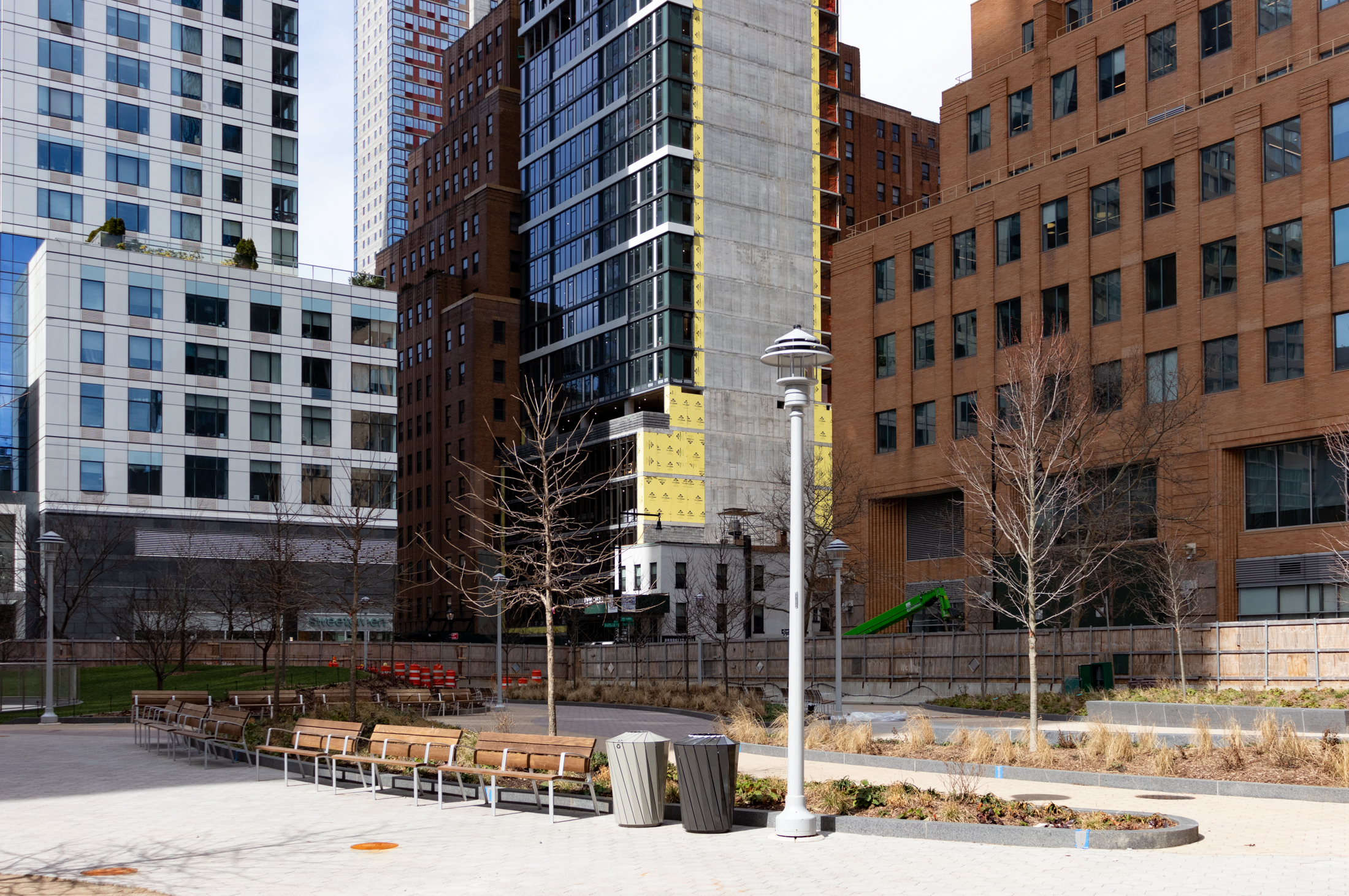
Name: Brooklyn Law School
Neighborhood: Downtown Brooklyn
Year Built: 1994
Architectural Style: Post-Modern
Architects: Robert A. M. Stern & Associates
Landmarked: No
Why chosen: The eminent architectural historian and writer Francis Morrone calls this building the best building built in Brooklyn since World War II. He liked it so much, he put a picture of the Law School on the cover of his book, An Architectural Guidebook to Brooklyn. Hey, who am I to argue? It really is a fine building, and the more I look at it, the more I like it. Stern had to squeeze his building in an odd shaped lot between the Neo-Classic Municipal Building and the rather uninspiring Modernist 1968 Law School building, which was set way back from the street with a gated plaza. Now this is where you separate the great architects from the hacks. Instead of ignoring the vastly disparate styles of both buildings and throwing up an institutional glass and steel ego finger building, Stern designed his building to be set back midway on the lot, allowing the viewer to catch a peek of the Municipal Building, a nice two sided view of his building, and the 1968 building in front. He used light colored stone to transition between the white marble of the Law School and the grey limestone of the Muni Building. The facades are full of windows of various sizes and configurations, and balconies with colonnaded enclosures, all functional elements for the school, as well as visually interesting, a transition of light as well as mass, and a nod of tribute to the buildings around it. The 1968 Law School building is modernism without context. Stern’s 1994 Law School building, built by a post-modernist master, calls attention to itself, not by dazzling us with steel and glass, but by the majesty of its graceful, yet strong, presence on the street. Mr. Morrone, you’re preaching to the choir.

Photo: Property Shark


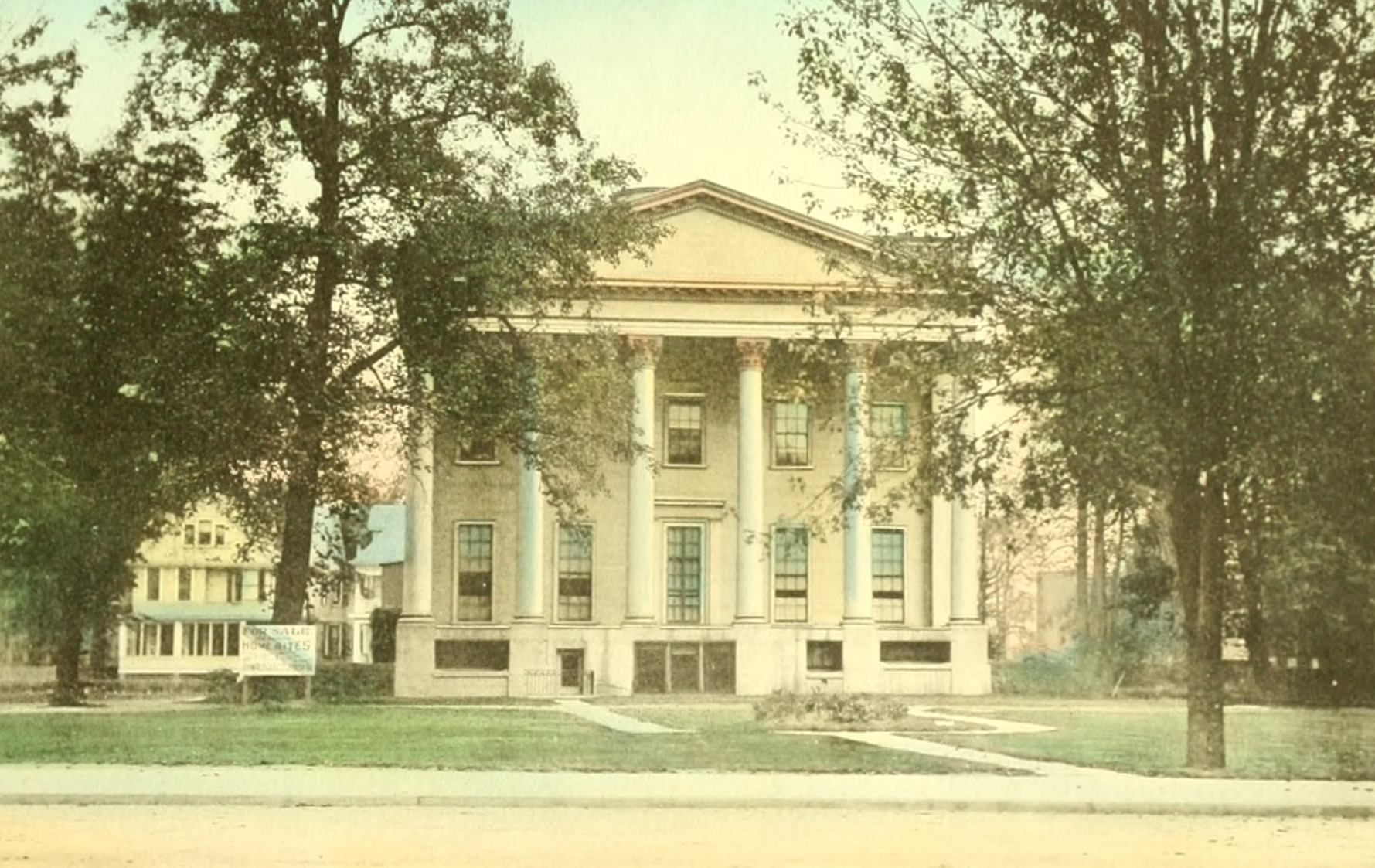
Doesn’t anyone remember what was torn down to build this? One of the great domed buildings of NYC and Brooklyn, a court house, was wantonly destroyed before Landmarking, to put this up. It’s a nice building, an early post-modern design, but what we lost — it’s heartbreaking.
What WBer said (@ 11:35pm & 10:00am).
I nominate the Newtown Creek Sewage Plant as the best post-WWII building(s) in Brooklyn.
WBer, now that’s criticism. Well done for not stooping to the knee-jerk, half-baked frownstoner way.
I happen to disagree with almost all of it (except the part about the mix of punched windows & spandrels, which I agree is a bit cluttered/confused), but at least it’s a well-articulated point of view…
It’s a pretty third-rate building, but I can’t even think of another post-ww2 building in Brooklyn. So it could well be the best.
I’m not a fan of post-modernism architecture or Bob Stern’s architecture to begin with (I love his books, though – he is an excellent historian). And this is certainly not going to make me change my mind. Why this is an appropriate addition to the Law School is absolutely beyond me – it obscures half the building behind Lego set of quasi-classicist pastiches, it destroys the urban space in front of the Law School, the design has no relation to the modern building and only the most facile relation to the Municipal Building.
Stern (who by the way was the director the preservation program at Columbia when he designed this “contextual addition” – go figure) has a much better handle on the classical idiom now that he has abandoned most of his po-Mo predilections, but this building is just a mess. The base is a clumsy classicist nod to the Municipal Building. The shaft uses recessed spandrels to create monumental openings (with industrial sash?) that defy any sort of classical arrangement (hierarchy) to the facade. The mix of punched openings and the recessed spandrel openings is cluttered. The porch atop the base and the barrel vaulted roof are horrible. At best, this is Mannerism missing the mark. The pedimented opening at the ground floor looks like it being squeezed the pilasters in antis, giving the whole entrance an unordered (in the Classical sense) feel.
I don’t know if I would have lamented the demolition of the Law School, but surely that would be a better solution than this mash-up.
How’s that for meaningful criticism?
Caveat: Just trying to move a conversation forward, not necessarily trying to impeach any one individual for their views (there’s no accounting for taste, and everyone is entitled to their opinion), but if you’re going to hate on the design at least offer some meaningful criticism — and consistency, for that matter — don’t just trot out some tired knee-jerk cliches.
What is it, Snark, is the building “bland” or a “Frankenbuilding of mismatched parts”?? Cause those two sound completely inconsistent to me (a mismatched Frankenbuilding may be many things, but it certainly doesn’t sound _bland_).
And yes, HDL, the general criticism of postmodernism is that it’s “full of nostalgia for a glorious (not) past that ceases to exist.” On that note, I feel we’re on the same page that design should seek to be of its time. Thus postmodernism as a style is weak because it refers to the past as opposed to advancing the ball. But just because I hold postmodernism in generally low esteem doesn’t mean I’m willing to write it off completely, and IMO this is one of the few cases where the style actually works.
Then we get to the notion of “clumsy proportions”. I happen to completely disagree — the building seems very elegently proportioned — but I guess proportion is in the eye of the beholder (and, perhaps, in the eye of the sophisticated beholder like Morrone, but I digress…). That other hated word, “context”, also plays in here. Just look at the Municipal Bldg nextdoor, and notice how the levels/massing etc. are similar. The proportions of Stern’s addition, whatever you think of them, are at least responding to their surroundings.
I guess I’ll repeat the question I asked fsrg (which was well answered … I happen to disagree that a modernist growth would’ve been better, as IMO we’d then have an ill-proportioned L-shaped modern building hugging a plaza as opposed to essentially a third building that smoothes the transition btw. BLS and the Municipal Bldg … but at least fsrg said specifically what he/she’d do differently): for those who hate this bldg so much, what, exactly, would you do differently?
> “bland and ungainly”?? I’ll lob the “really?” back at you, Snark.
Lob away. The proportions on this mess are all off. It’s a Frankenbuilding of mismatched parts, with a weak jab at classicism that has all the sublimity of a suburban Dallas shopping mall.
> Clumsily proportioned and depressingly full of nostalgia…
Exactly.
Touche fsrq. Monstrosity indeed. Clumsily proportioned and depressingly full of nostalgia for a glorious (not) past that ceases to exist.
On the other hand the modern addition to Brooklyn Poly’s building on Jay street is really very elegant for example.
BTW, Brooklyn Friends School occupies the original and quite handsome Brooklyn Law School on Pearl Street.