
House of the Day: 144 Lincoln Place
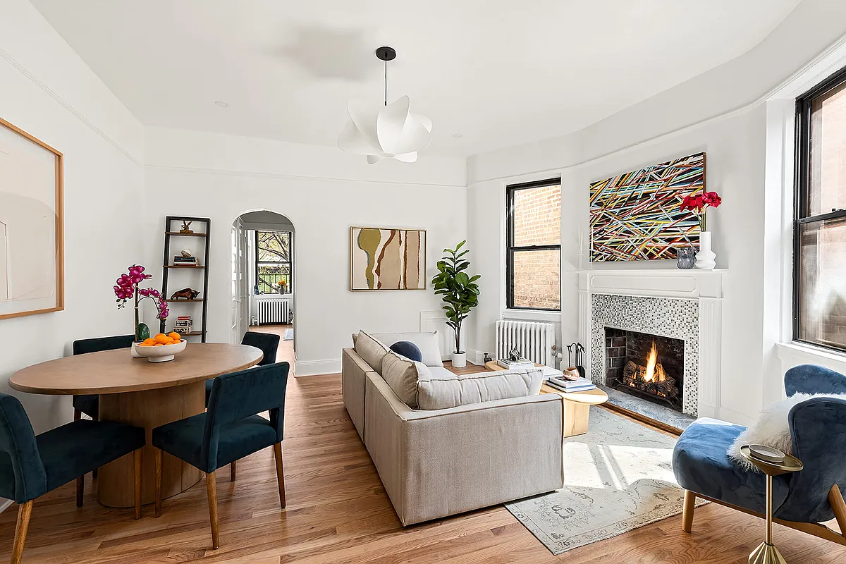
There are certainly some attractive elements to the brownstone at 144 Lincoln Place, but the renovation feels a bit schizophrenic to us. Most of the original details have been removed but the resulting aesthetic is not austerely modern (which is how we prefer our modern), nor is it traditional. The exposed beams are beautiful, but…

There are certainly some attractive elements to the brownstone at 144 Lincoln Place, but the renovation feels a bit schizophrenic to us. Most of the original details have been removed but the resulting aesthetic is not austerely modern (which is how we prefer our modern), nor is it traditional. The exposed beams are beautiful, but we never can get used to the look of new wood floors in these old houses. Likewise, the kitchen is very attractive but the concrete fireplace juxtaposed with the exposed brick wall doesn’t work for us. If this were an immaculately restored brownstone at this location, the $3.1 million asking price might be achievable, but we suspect that the decision direction may have narrowed the pool of potential buyers enough to make it a challenge under these circumstances.
144 Lincoln Place [Brooklyn Properties] GMAP P*Shark


It’s a Blownstone.
bowl of dicks – post some pics of your house please.
I’m willing to bet that most of the critics have traditional boring row houses. There are some user specific design choices that will not appeal to everyone, but overall – great effen job! I think all you people with traditonal bs are upset that it is not as desirable as it once was. I also think that 99% have no idea how much work was involved with this reno.
Things I love (in this house):
garden, deck, back floor to ceiling window/doors, stairs, skylights, bathtub, fireplace, piano
Things I hate:
Bathroom sink on glass shelf, stove hood, stools.
Things I don’t mind:
Open beams on ceiling.
Glad to see the tide of comments has turned. I think it’s a brilliant rendering of a modern aesthetic in what would otherwise be a darkly traditional home — WITHOUT being stark or austere. In fact, it manages to respect the building’s provenance (wood, structure, brick) in a way you rarely see in modern renovations of old buildings.
No one is ever going to completely agree with another person’s design choices — and there are certainly some with which I would quibble here, mostly the furnishings (but that’s irrelevant since they don’t come with the house) — and the different shades of wood, but overall, I give these folks props for their effort and vision.
WL,
That’s my beef with the exposed joists. You go through all that trouble to do a nice clean modern reno and bring all that light in, only to suck half the light back out of the wood with all those dark joists and shadows in the ceiling. I agree, it’s a modern reno and I wouldn’t judge it by preservationist standards, but I just don’t like those dark, busy joists in any setting.
some of this place is hard to judge from pics, but some of their ideas are just great.
one – they’ve done their best to bring light in. the back glass wall of the kitchen is great. really good. also the skylights and the see thru walkway landing. brownstones are dark and depressing and filled with heavy doors and woodwork and ugly grey marble. i realize that people out there actually like that stuff, but it’s oppressive to me.
two – fireplace is fantastic. wonderfully un-obtrusive and can be viewed from both dining and living room.
three – opening up living floor to avoid 3 cut up rooms and to avoid kitchen being on ground floor. from the built in seating to the back glass wall, probably the best parlor floor layout i’ve ever seen. would copy this in a minute if i ever ended up in one of these victorian funeral homes.
no clue on the price point, but sure there will be interested serious buyers.
Brownie,
Admit it! The exposed brick and recessed lighting in the kitchen has tarnished your whole judgement. This place is furking awesome! Natural light through the freakin floors in the stariwell – what! It’s got the best of both worlds, modern and antique (stair, stoop, exterior, etc).
Great location, near the 2 3 B Q. Triplex over rental – that’s how you do it, right DIBS! I hate Brooklyn Properties listings. No convenience of listed info – everything is a fucking essay. Kinda narrow though, no? (Floor plan dims please! Slick, guys, real slick.)
20/3 (typical window) x 0.707 (assuming 45 deg angle though probably 30) x 2 + 20/3 = 16′ width? 17′?
***Bid half off peak comps***
I too am surprised by the degree to which this place is being taken to the woodshed — Though I must say Minard’s “architectural version of a Labradoodle” was laugh out loud funny.
I have seen several of these homes on Lincoln Place, and they are very narrow. Removing the interior wall between living room and entry hall/stairs seems to me a masterful decision. The doors in the back are lovely and let in a ton of light.
I love the bathrooms and the skylights. The backyard would host a dozen or so Brownstoner gatherings a year, were it mine 🙂
My main beefs with the place are the recirculating hood over the range — huh? — the cement surround for the fireplace, and that straight-out-of-Design-on-a-Dime bench with cushions in the living room.
I think it’s great- maybe would have made the floors darker. Love the garden…