
The Insider: Narrow Gowanus Townhouse Reimagined With New Rear Extension, Stair
A new rear extension, relocated stair and three floors of outdoor space transform a tiny brick row house for a family of four.
Photo by Russ Ross
When a local couple bought a three-story brick row house for their family of four, it didn’t have much going for it. Besides being in a state of serious disrepair, it was tiny — just shy 15 feet wide and only 36 feet deep.
“We looked at going up, going back, going up and back,” recalled architect Christine Harper of Park Slope-based Harper Design + Build, which carried out a gut renovation that transformed the building inside and out. “Ultimately, we decided going back was essential. If you want to fit three functions on one floor, you need a certain amount of depth.”
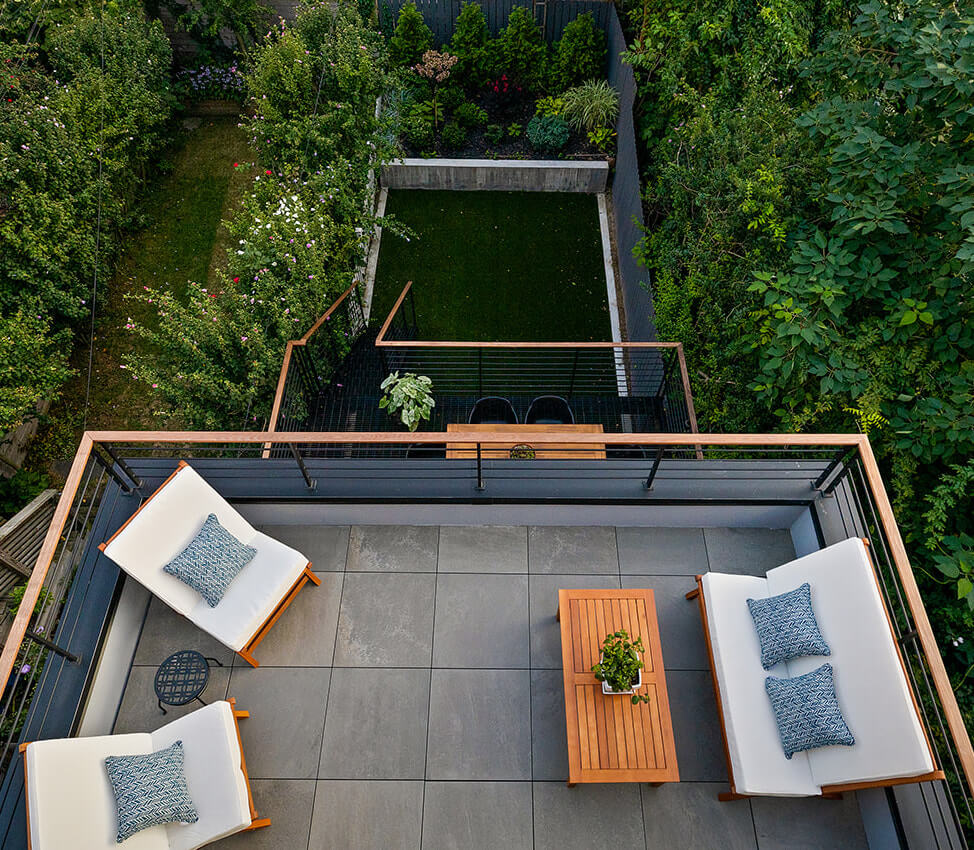
A new three-story rear extension, clad in cement-like panels, adds about 16 feet of depth on each of the two lower floors and half that on the floor above, with the happy effect of giving each level its own outdoor space — a sunken patio on the garden level, a deck off the living room and a terrace off the primary bedroom on top.

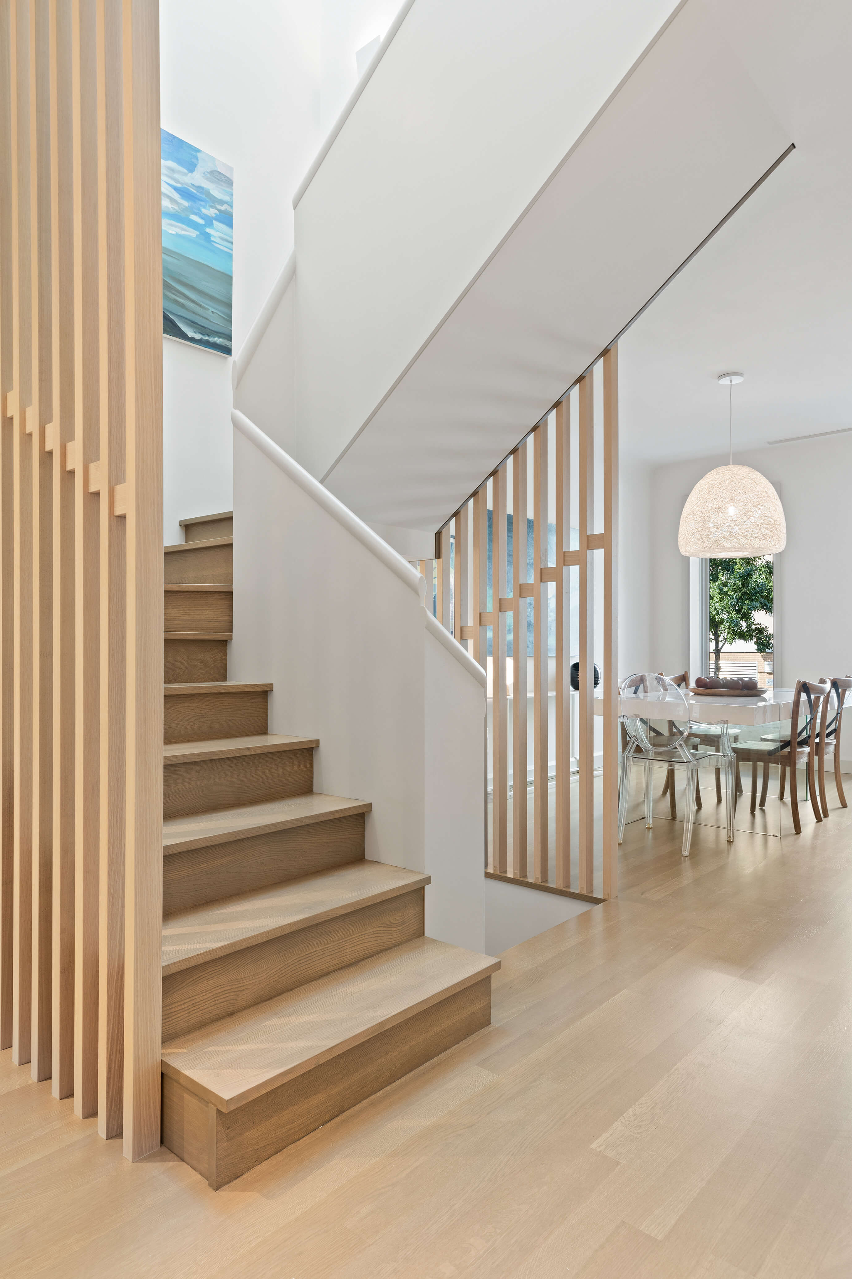
The original interior stair, in its typical position alongside a party wall, made the interior rooms very narrow. Shifting the stairwell to the center of the house addressed the “dead space” issue in that area and allowed the architects “to break up the house front to back and gave us width everywhere,” Harper said.
A dining table at the front of the parlor level, where a small entry vestibule ate up a few feet of width, makes good use of space too tight for a living room, which sits at the rear, behind a central kitchen, and spans the full width of the house.
A neutral palette of white oak, grays, taupes and whites prevails. “We were aiming for consistency” in both materials and color, Harper said. “We didn’t want every room to be a showcase for another idea.”
Dark decking, rails and window frames outside stand in contrast to the bright interior.
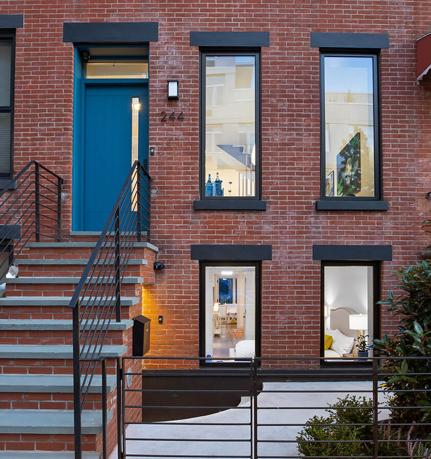
The front facade was refreshed with all-new windows, stoop, ironwork, landscaping and a welcoming blue door. The windows are casements that open with a crank.
The steps going down to the garden-level entrance are curved “to be more inviting,” Harper said.
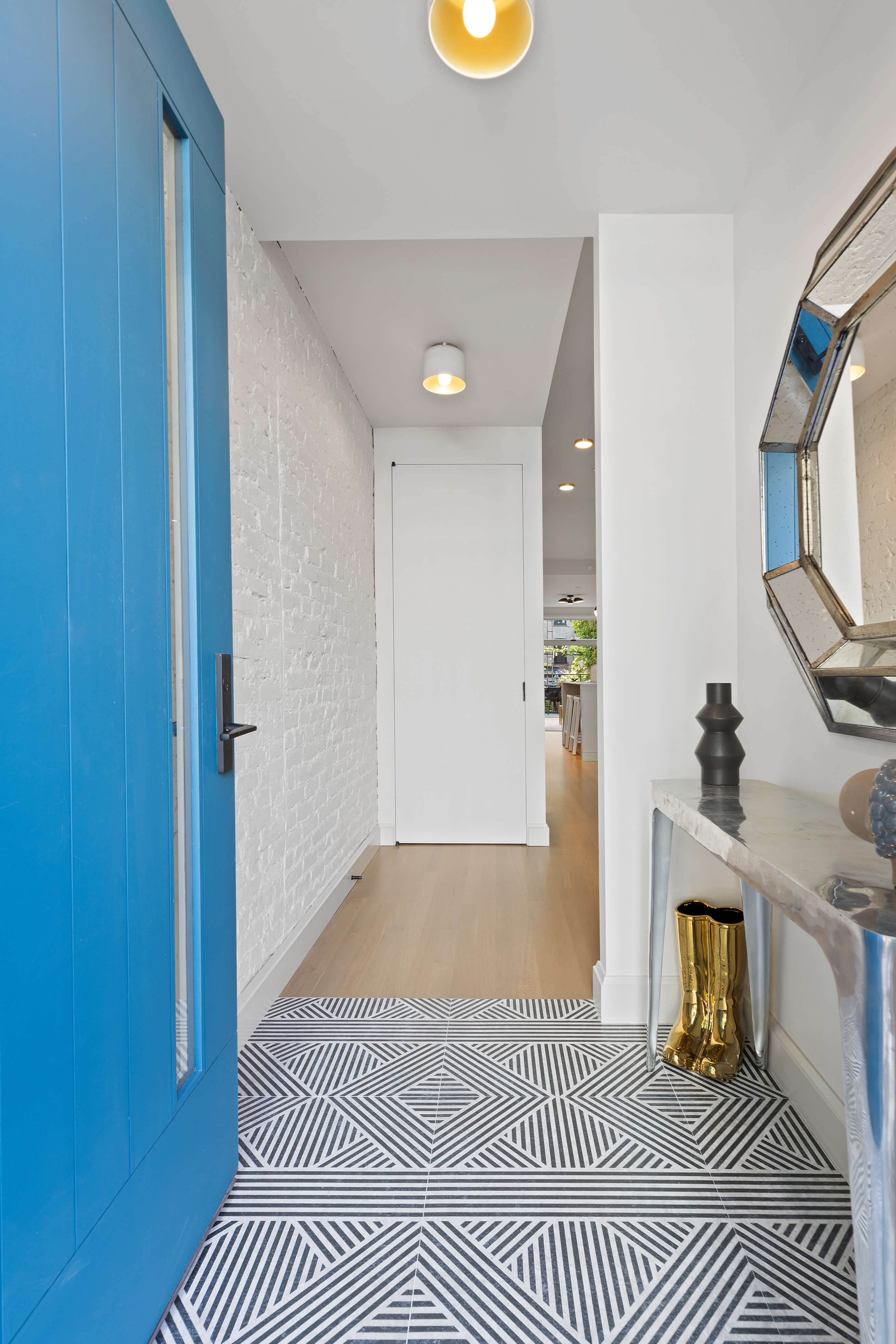
With new windows and insulation brought up to modern standards, two sets of doors at the entry vestibule “weren’t really needed,” the architect said.
The front parlor, which loses a few feet to the small entry vestibule, is dedicated to a dining table. “The front room is always compromised by the entry vestibule and the flow of people coming and going,” Harper said.
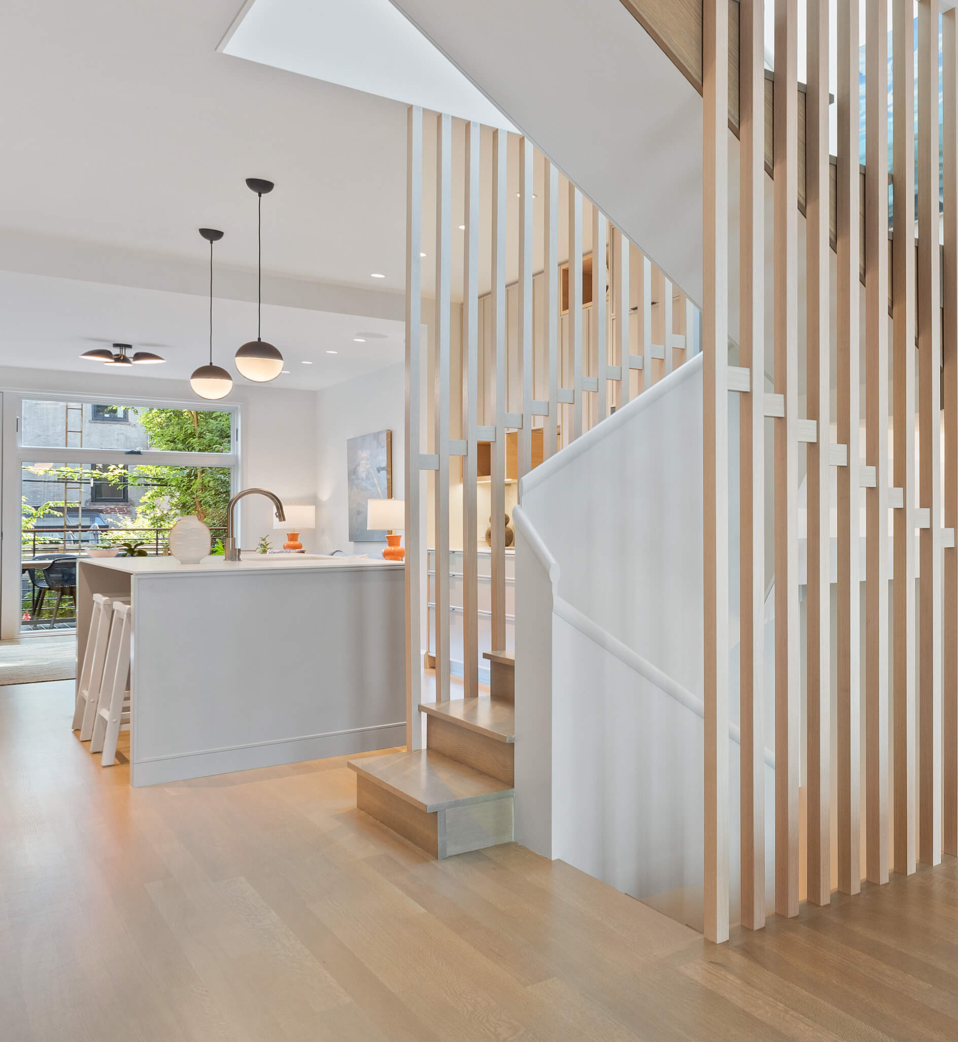
Inside, a new switchback staircase at the center of the house connects main living space on the parlor floor with the primary suite upstairs and the children’s bedrooms downstairs.
“We wanted the stair to be a screening element, especially on the parlor, between front and back,” Harper said. “If people are going up and down stairs, the full-height wood screen gives a sense of intimacy in the dining room, and at the same time lets light through,” funneled down from a new skylight.
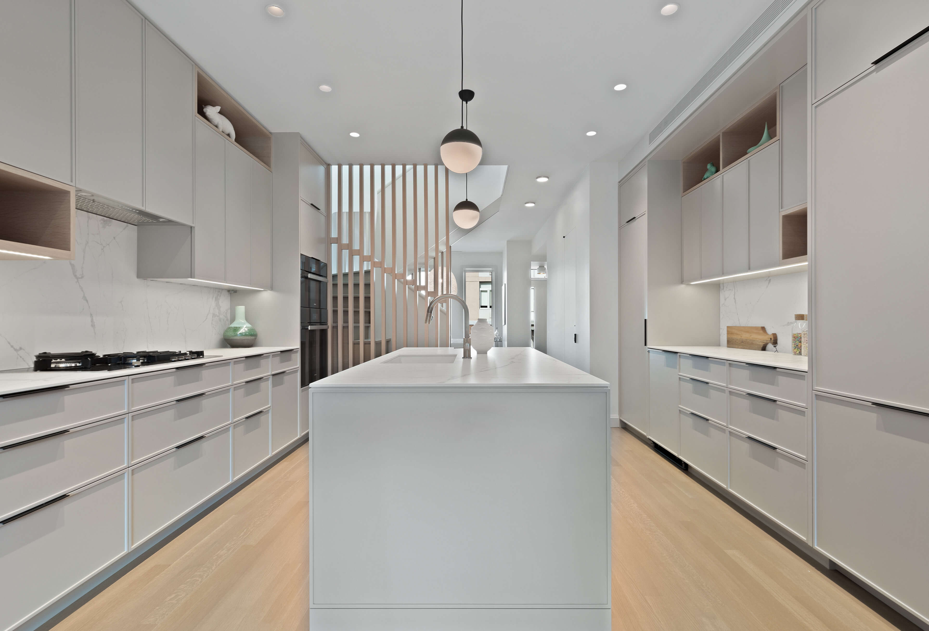
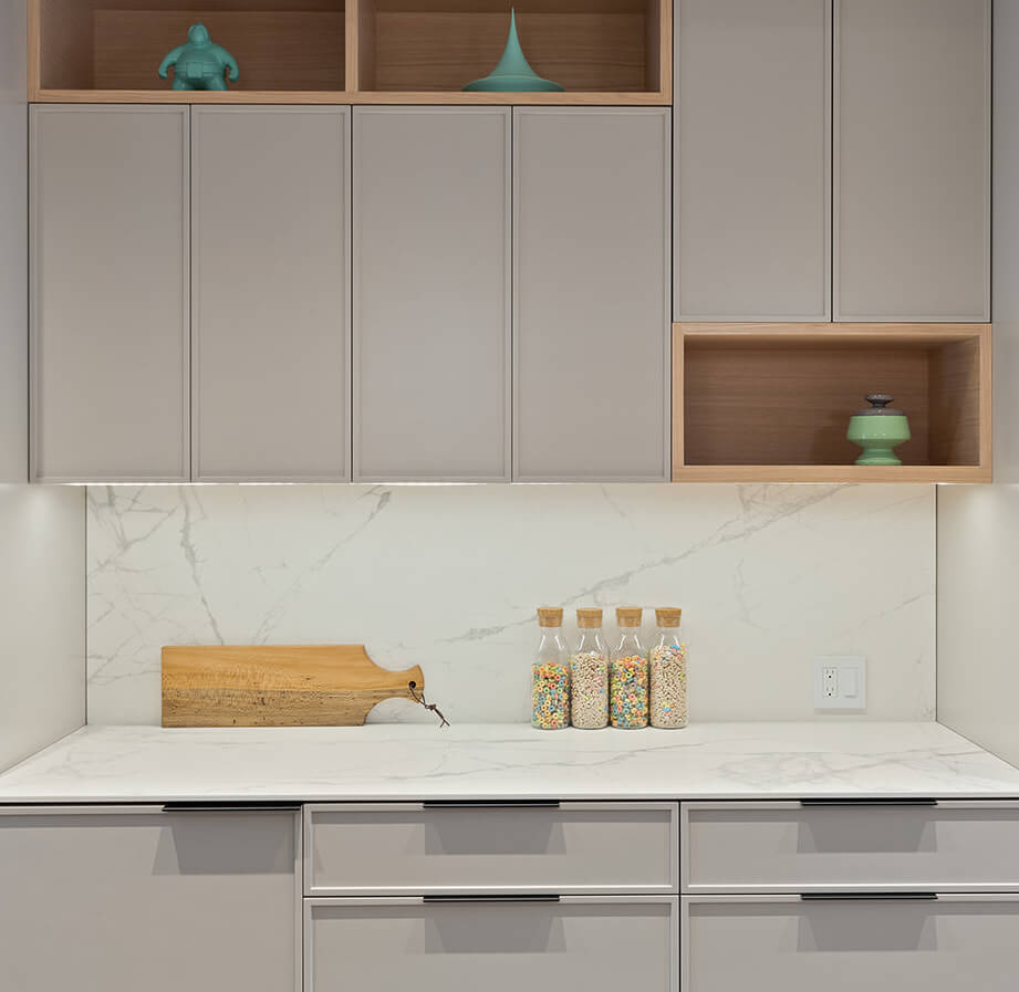
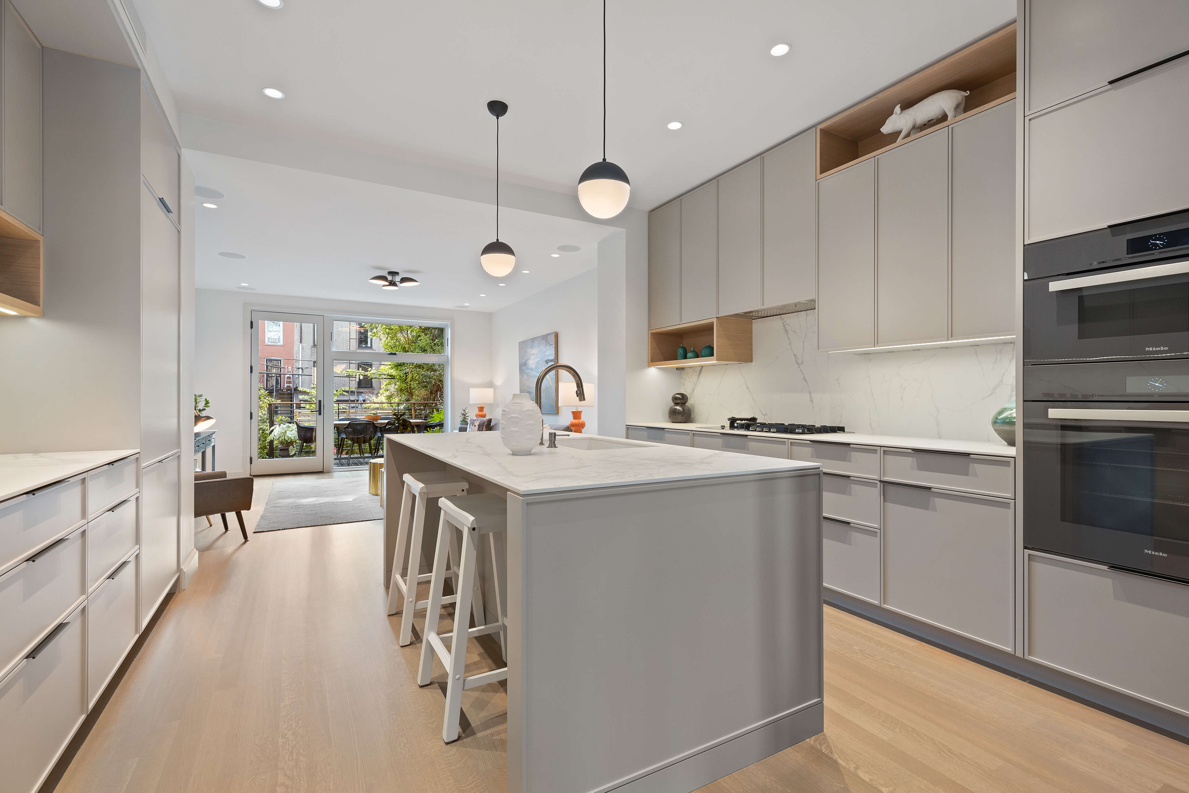
Shop-lacquered custom cabinetry in the large central kitchen has white oak accents and Caesarstone countertops.
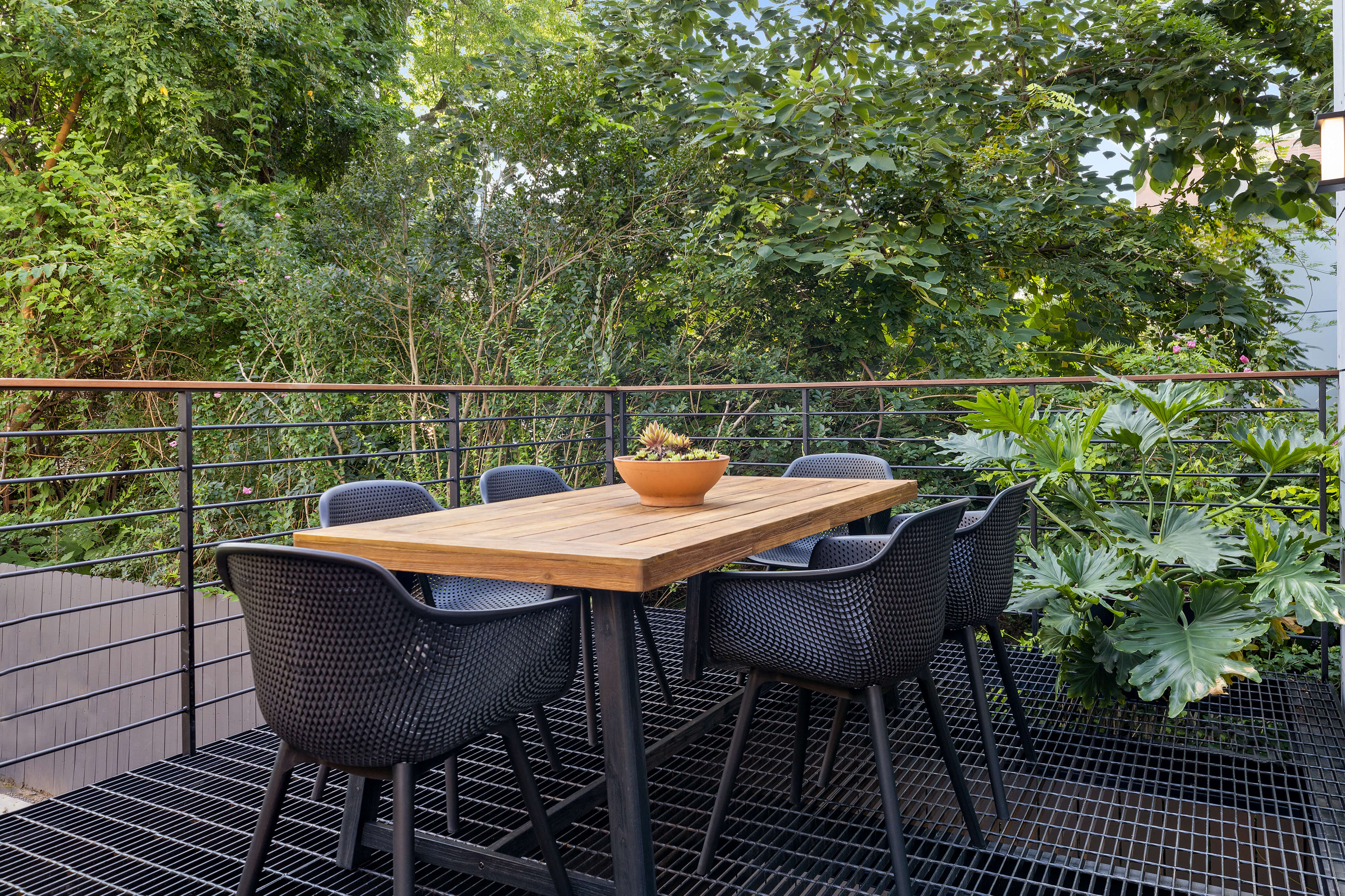
Floor grating on the new deck off the parlor floor living room (top photo) admits light to the area underneath.

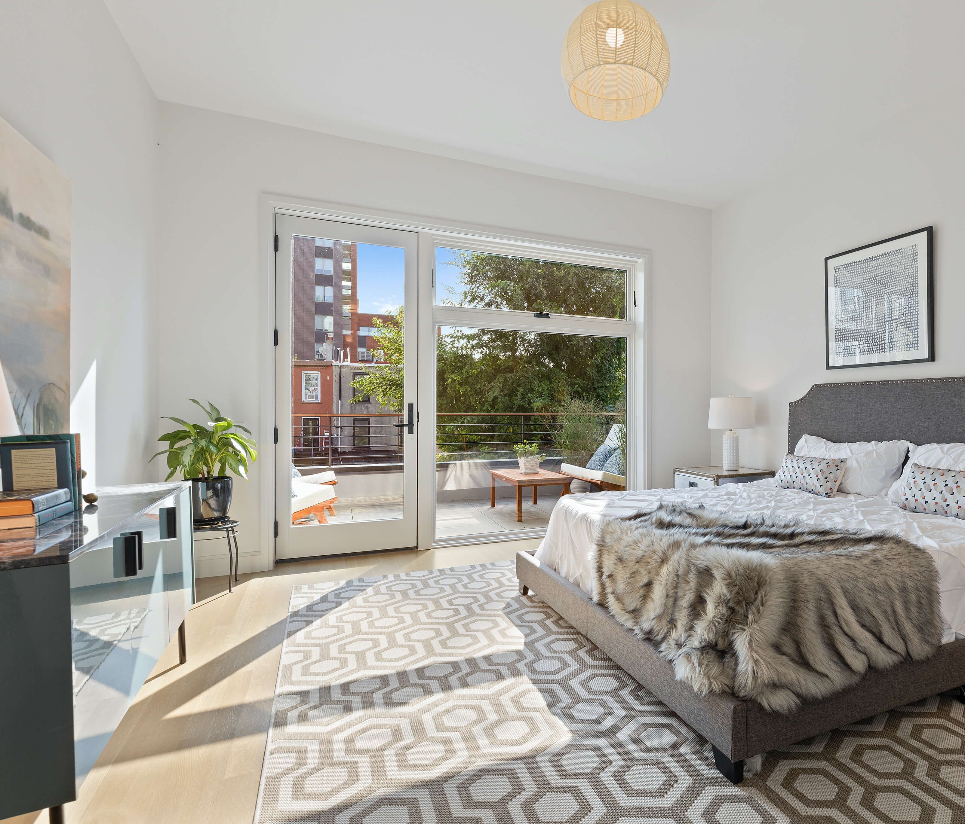
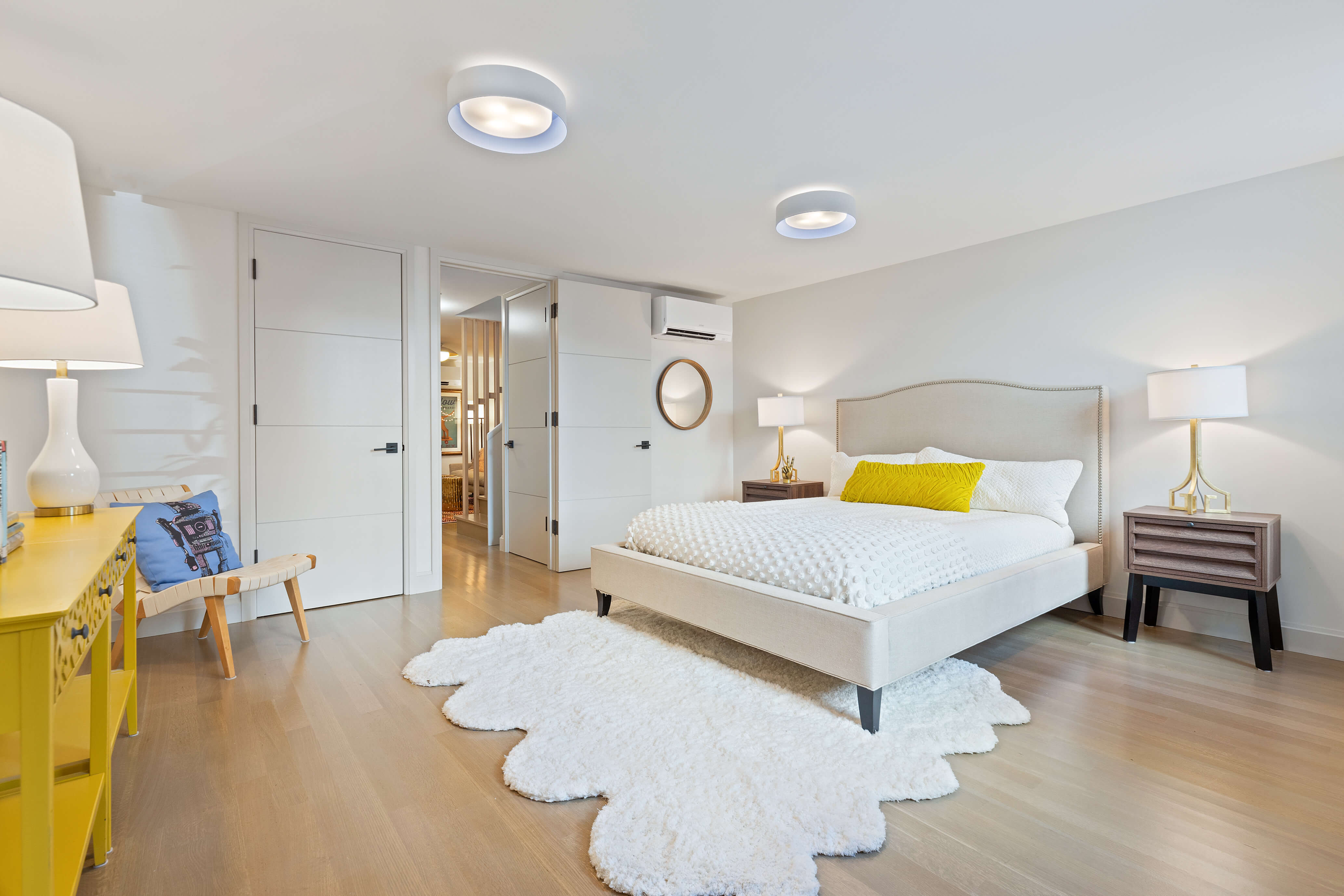
The top-floor primary bedroom enjoys a terrace atop the deeper extension below.
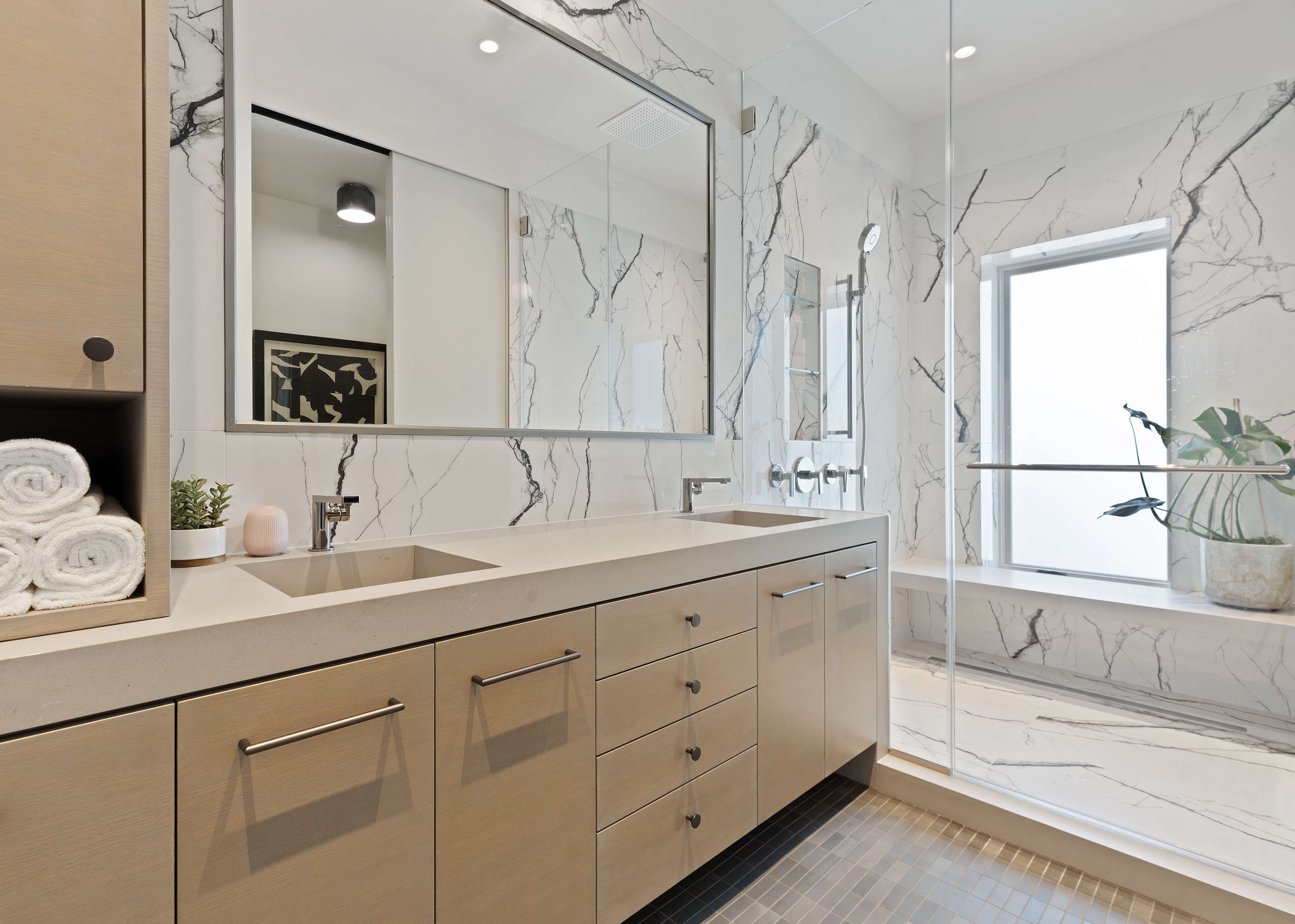
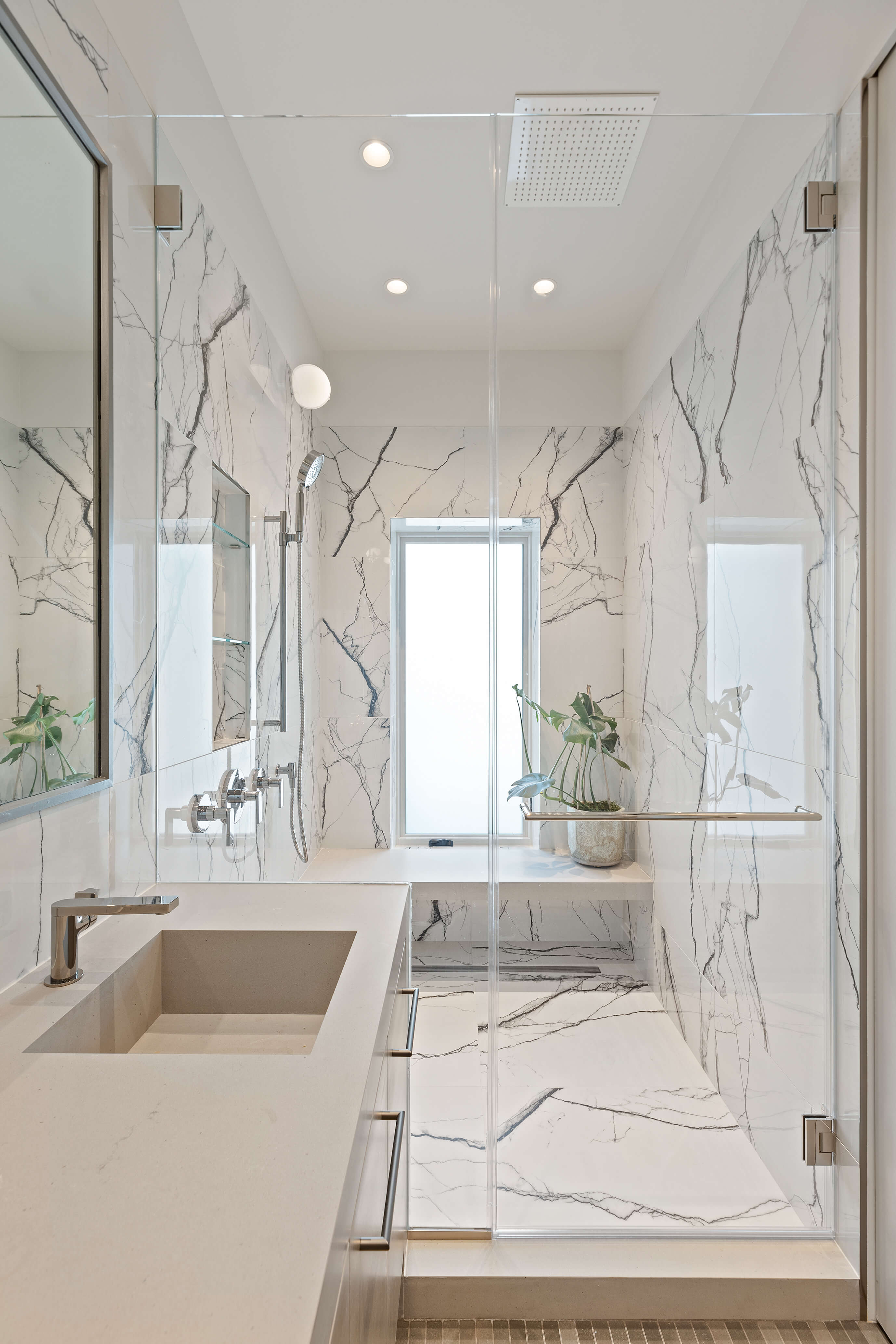
The pale neutral palette extends to the primary bathroom, where large-format porcelain tiles resembling marble clad the walls and luxurious shower.

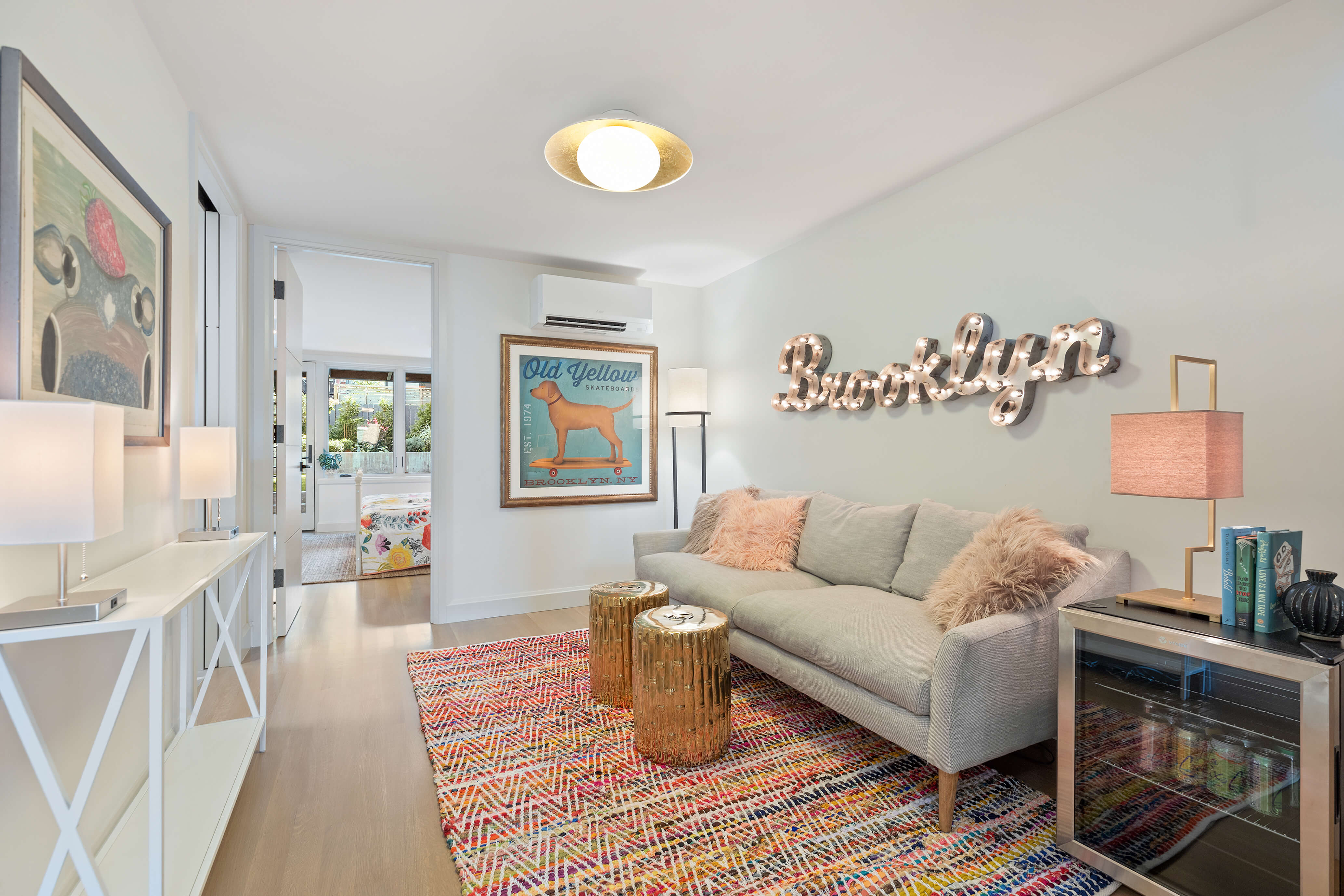
The garden floor is a two-bedroom suite for the homeowners’ teenagers.

The garden level has two zones: a seating area next to the house before a few steps up to the backyard.
[Photos by Russ Ross]
The Insider is Brownstoner’s weekly in-depth look at a noteworthy interior design/renovation project, by design journalist Cara Greenberg. Find it here every Thursday morning.
Related Stories
- The Insider Archive: Brownstoner’s In-Depth Look at Notable Renovation and Design Projects
- The Insider: Gut Renovation of Landmarked Clinton Hill Townhouse Adds Extension, Keeps Mantels
- The Insider: Central Stair, Bold Black Paint Distinguish Renovated Clinton Hill Townhouse
Got a project to propose for The Insider? Please contact Cara at caramia447 [at] gmail [dot] com
Email tips@brownstoner.com with further comments, questions or tips. Follow Brownstoner on Twitter and Instagram, and like us on Facebook.


What's Your Take? Leave a Comment