
Interiors: Modernizing a Row House in the Slope
[nggallery id=”26489″ template=galleryview] The folks from Coburn Architecture, based in Dumbo, have taken on the task of updating, and adding to, a row house in Park Slope. If you have interior projects large or small, amateur or professional you’d like to share, please contact us. This mid 19th century row house on a quiet street…
[nggallery id=”26489″ template=galleryview]
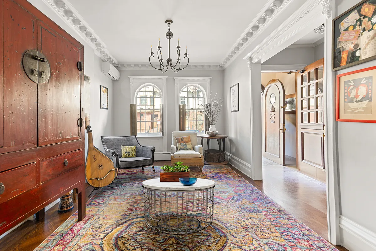
The folks from Coburn Architecture, based in Dumbo, have taken on the task of updating, and adding to, a row house in Park Slope. If you have interior projects large or small, amateur or professional you’d like to share, please contact us.
This mid 19th century row house on a quiet street in Park Slope was in relatively poor condition when purchased by the client. The house next door had burned down many years before, leaving the lot vacant and overgrown, and the new owners wanted to build a structure in its place that would connect to the existing house.
The client’s ambitious program for the new structure required a new master suite with a spacious bath and dressing room, a dining room, a garage with a driveway (a luxury for city dwellers), and some outdoor living space. To avoid having to move to temporary quarters, the client elected to complete the project in two architectural phases, followed by an interior design phase.
UPDATE: Brendan Coburn just dropped us a note to clear up a couple of things: 1) The house is only a combined 3,400 square feet, as the addition is just two stories high; 2) The construction and renovation took place in four phases over eight years.

can’t comment much on the architecture, but it seems to get a lot of light and i like the back facade on the new building.
however, there is something very schizophrenic and off-putting about the decor of some of these rooms. i don’t think it’s tacky so much as…not hitting it’s mark? it’s like they used all of the leftover easter-egg dye on the walls, then sent 3 people off shopping – one with an issue of “country living,” one with “dwell,” and one with a collection of edgar allan poe stories – and then put it all together. it could be interesting but…somehow it isn’t.
TACKY????? TACKY??????
While I don’t like the pink walls and some of the furniture is too traditional for my taste, but overall the house is beautiful!!!!!
There is nothing tacky about it. It’s beautifully designed and tastefully furnished. It’s a very understated traditional style.
THL – please post something tacky for contrast.
cmu…because a parked car looks better??? They built a beautiful facade out of nothing. I don’t understand people’s loathing of other people’s driveways. Well I do actually.
A lot of the furniture though is nouveau riche tacky. The kitchen looks nice. I suspect there was an interior designer for the furniture who was different from the architects.
Jeez…Xanax anyone?
Better a well done driveway than a burned out lot.
Agreed with shillstoner, tacky. And I might say that anyone who screws up the streetscape in PS with a driveway should be shot.
Gorgeous!
Wow, the building looks great but the decor sure is tacky.
Really pretty. Makes me realize how infrequently I see traditional renovations anymore and how much I like them. I mean, a house without a nelson saucer pendant? Is that even legal anymore?
It is beautiful. If you go to the architects site and read the captions along with the additional pics, it is pretty clear that this was a renovation/restoration of the exising building with a very well-done addition where the burned out empty lot was.
I suspect they had to replace much of the period details which they did. The facade of the adjoining addition looks great. Wish more new construction looked that way.