
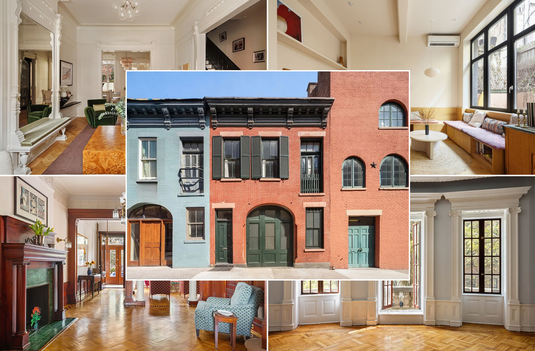
Designers Load Up on Classic and Neutral Paint Colors Inside Brownstones and Townhouses
When it comes to painting the walls of a brownstone or townhouse, classic and neutral colors work best, designers say.

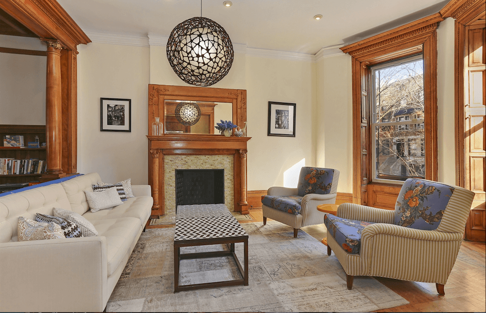
Photo via Tamara Eaton
Choosing paint colors and finishes can be one of the hardest parts of a renovation. The seemingly endless options and divergent opinions can leave your head spinning. When it comes to painting the walls of a brownstone or townhouse, classic and neutral colors work best, designers say.
“With paint colors in general, as a designer I tend to use a lot of soft whites in townhouses,” said interior designer Tamara Eaton. “For trim, I almost always use Chantilly Lace from Benjamin Moore as it’s a very crispy white. Then, I use that crispy white to play with a little color on the wall.”

Eaton also prefers to paint the walls in a creamy white or off-white, mostly avoiding bold colors and grays.
“For a townhouse or brownstone, I like just a touch of a creamy color or an off white,” she said. “I’m not a huge fan of the very trendy grey walls in a townhouse, unless it’s a gorgeous soft, warm grey. With warm wood floors and traditional detailing, I think grey often feels too cold and institutional.”
Interior designer Lauren Stern suggests warm, earthy colors for a townhouse such as Chantilly Lace, Benjamin Moore’s Linen White, or Farrow & Ball’s Hay or Elephant’s Breath.
“I like to keep the paint colors, interior finishes and architectural elements consistent with the historic period of the building,” Stern said. “The modern details can be brought in with movable items like furnishings and accessories. Rich, warm colors will mimic the effect of oil paint and the plaster used traditionally in brownstones.”
A matte finish on walls absorbs light, a satin finish on walls makes a space feel luminous, and high gloss works best for moldings, millwork and doors, she said.
“When selecting a paint color, we always test in a few spots throughout the room,” she said. “Colors will look different at different times of day. Floor color and interior and exterior lighting affect the way we view color. The same paint can look very different in different spaces.”
Once you’ve selected a color, interior designer Jen Albano suggests using lighter and darker variations to connect one room to another and create continuity throughout the house. Or stick with one color for walls, trim and ceilings.
“With old homes — especially these vertical Brooklyn houses that have retained their fanciful trims — I frequently like to create a cleaner, more modern palette by using one color from floor to ceiling, and only vary the sheen,” Albano said. “This is especially nice in hallways and for shelving, emphasizing high ceilings.”
In a current townhouse project, Albano is painting some of the long, dark hallways top to bottom in different sheen levels of Benjamin Moore’s Gray Owl.
“For darker, narrow halls I tend to avoid white on its own unless it’s happening everywhere in the house,” she said.
Occasionally, Eaton steers away from a muted palette in a townhouse and opts for a dark, dramatic color on the walls and trim.
“In terms of color on walls, I’m fairly restrained on this and typically stick to either a dark charcoal or a dark navy blue such as Deep Space or Hale Navy from Benjamin Moore,” she said. “I’ve had one chance to paint a powder room pink, which was fabulous, but I think classic and reserved colors work well throughout townhouses.”
Related Stories
- How to Know When an Old Wood Floor Is Worth Restoring or Should Be Replaced
- 11 Pro Tips for Creative Ways to Fit a Powder Room on the Parlor Floor of a Row House
- What the Pros Know About How to Arrange Furniture in a Brownstone
Email tips@brownstoner.com with further comments, questions or tips. Follow Brownstoner on Twitter and Instagram, and like us on Facebook.
Businesses Mentioned Above
[blankslate_pages id=”d55666ed8c61c2, d5b2d4383330c1, d571f93d485fec, d5b43bf985ed6a” type=”card” show_photo=”true” utm_content=””][/blankslate_pages]
What's Your Take? Leave a Comment