
Renderings, Details Revealed for Prospect Hotel
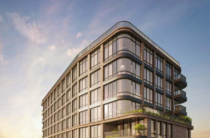
Last night Community Board 7 met for a preliminary discussion concerning the hotel extension proposed at the Prospect Grand Hall. The eleven-story addition would include four stories of above-grade parking – along with another one underground – with the hotel on top. As building owner Michael Halkias told the crowd: “The cake I bring to…

Last night Community Board 7 met for a preliminary discussion concerning the hotel extension proposed at the Prospect Grand Hall. The eleven-story addition would include four stories of above-grade parking – along with another one underground – with the hotel on top. As building owner Michael Halkias told the crowd: “The cake I bring to you: my parking garage. And the cherry on top, the hotel.” Parking did seem to be on everyone’s mind at the meeting. Business owners and a rep from the Brooklyn Chamber of Commerce brought up the limited amount of spaces in the neighborhood and the relief the 400 extra spots would provide. But as one CB7 member asked, “How much more traffic will the hotel create?” Because the developers are in very early stages, they were not able to speak definitively on the time frame, environmental impact, or a shadow study. But while the crowd seemed concerned, it wasn’t hostile. (No one brought up the scare tactics used in a recent flier for support.) The hotel got the biggest seal of approval from Irene LoRe, owner of Aunt Suzie’s and Executive Director of the 5th Avenue BID. “Only in the last five years have we seen tourists in Brooklyn,” she said. “There are hotels going up all over Brooklyn… why not support a hotel coming from an institution already in the neighborhood?” Check out a few more pictures of renderings after the jump. IMBY also attended and has pictures of the two homes that would be demolished to make way for the garage.


I’d rather have the Brooklyn Brewery next door to me.
low end renderings/drawings = low end clientele
Those sketches are truly awful. No self-respecting architecture firm would release those to the public. But while they kind of show you nothing, they definitely show that the owner has engaged a subpar firm and is doing this on the cheap right from the beginning. Bad news bears.
yeah so many renderings are done in this style lately, it really looks SO bad. i wonder if the reason is because the final products almost never looking like the original models anymore? or maybe architects just have such bad aesthetics these days (lol, ever notice how architects dress these days?)
*rob*
These drawings cannot be serious. The quality is so poor that it’s hard to see what is the design. In this day high quality presentation are pretty easy so often it’s hard to get past the icing on the cake. But if this is the best first effort than it does not bode well because once approvals are gained than projects usually turn to the cheap and mundane. The Atlantic Yards basketball stadium ans The World Trade Center are examples of bait and switch. Enough of the presentation.
This ‘design’ doesn’t seem to respect or respond to the existing function hall building. Nor does it contrast in an interesting way. It looks like a parking lot that has added a sixties fenestration as window dressing. It reminds me for the Court Street movie theater and the parking lot on Court and Atlantic that was thankfully demolished.
Seems like a monstrous addition of tackiness to the street. Maybe it doesn’t matter.
Nice rendering (sarcasm). Seems like a lot of thought was put into this – (again sarcasm).
By horrid standards of Brooklyn hotels, this one looks pretty good.
ugly, as usual. also you do not place trees above eye level. ever. no one wants to walk around feeling like a gnome or a smurf. also watercolor pencil drawings make your plans look puerile and jejune, as stated by the first poster.
*rob*