
Map: Subway and Development, More Than Crime, Affect Home Prices in Brooklyn
Think you know what has the biggest impact on property prices? You might have to think again. Subway service (or lack of it) is one of the most powerful factors driving the most dramatic decreases in property prices in Brooklyn neighborhoods over the past decade. New developments go hand in hand with the biggest price jumps. A new…
Think you know what has the biggest impact on property prices? You might have to think again.
Subway service (or lack of it) is one of the most powerful factors driving the most dramatic decreases in property prices in Brooklyn neighborhoods over the past decade. New developments go hand in hand with the biggest price jumps.
A new data map from PropertyShark appears to show the power of transit lines, new development and Hurricane Sandy to affect home values. Crime, surprisingly, appears to be less important, at least in the decade studied.
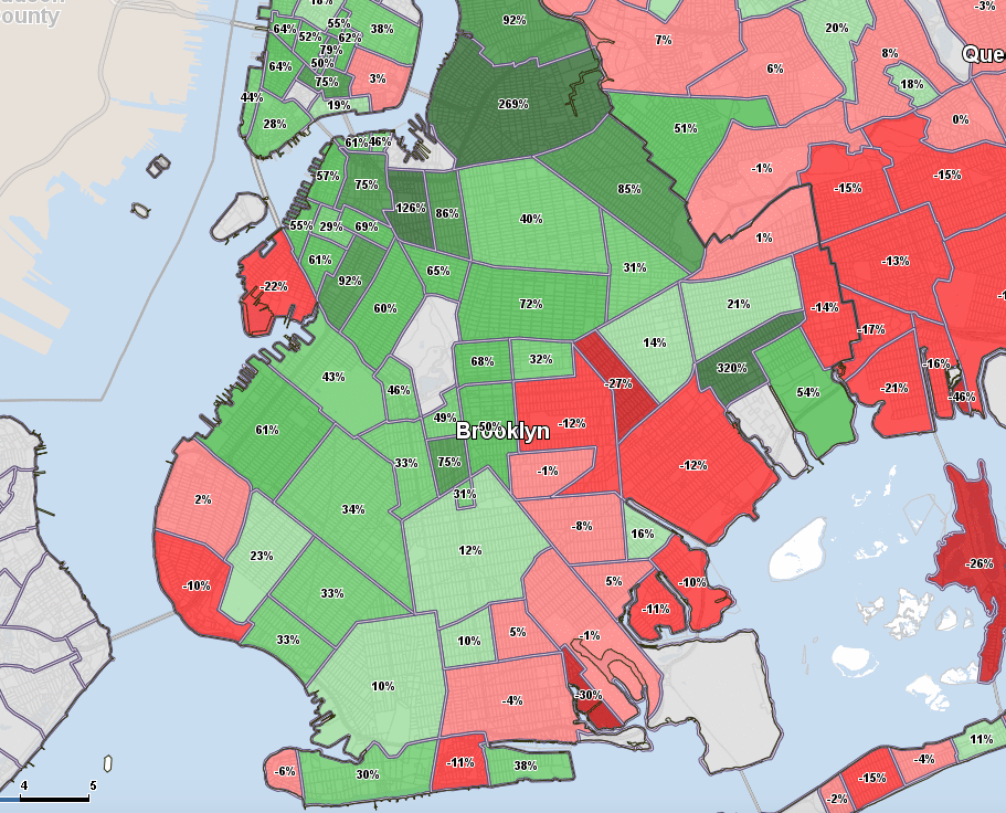
The interactive tool illustrates the change in median price per square foot of homes — the most reliable metric to measure — from 2004 to 2014. Green areas on the map show increases, and red areas show decreases.
Almost all of Brooklyn increased in price during this period, and New York City’s biggest price jumps were in Brooklyn. It’s worth noting the period measured starts during a boom and ends during a boom. It includes the years during and after the crash, roughly 2008 to 2012, when prices fell or flatlined in many parts of the borough.
What’s Up
The areas with some of the biggest increases were Bushwick (up 85 percent), Crown Heights (up 72 percent), Ditmas Park and Downtown (up 75 percent), Fort Greene (up 126 percent), Clinton Hill (up 86 percent), Greenpoint (up 92 percent), Gowanus (also up 92 percent) and, finally, Williamsburg, where prices rose a whopping 269 percent during the 10 year period.
But, surprisingly, the area that increased in price most dramatically was not, in fact, Williamsburg. It is, puzzlingly, New Lots, often considered part of East New York. Prices there rose an incredible 320 percent in the period.
No, it is not where Mayor de Blasio is planning a rezoning, either. It is a small area south of Linden Boulevard near Gateway Center.
Much of the area is warehouses. As well, there are housing projects and small wood-frame one- and two-family homes like the ones that are common in Bushwick.
The very popular Gateway Center may, in fact, account for the price increases. The large, suburban-style development has a Target, BJs Wholesale Club, Nordstrom Rack, ShopRite, BestBuy, Old Navy, Babies R Us, Home Depot, Marshalls, Applebee’s and many other shops.
It draws shoppers in search of bargains from all over Brooklyn. There is ample parking and bus service.
It offers employment in the area and convenience to those who live nearby. It may have raised the profile of this once-obscure area as visiting shoppers pass by and see houses for sale. Developed by Related Companies, the mall’s Phase II opened last year, and more shops are planned for Phase III.
Some of the areas that have shot up most dramatically are also ones where there has been a lot of new residential development (typically after a rezoning), such as in Williamsburg, Gowanus, Downtown and Dumbo. In Gowanus, for example, where prices are up 92 percent for the decade, low-rise car repair shops and retail have been replaced by high-rise luxury rentals and condos following the rezoning of the 4th Avenue corridor in 2003.
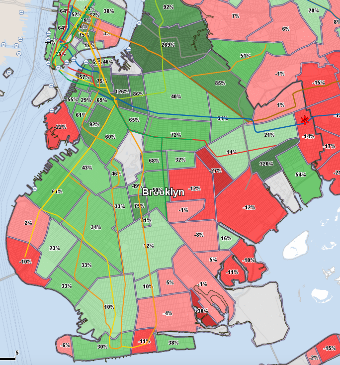
The subway overlay shows a conspicuous lack of service in red and pink areas where prices have decreased
But Some Prices Also Fell in Brooklyn
Kicking yourself for missing out on buying property in Brooklyn back in, oh, say 2004, when it was “cheap”? (Well, cheaper than it is now?) It’s not too late, according to the map. Incredibly, Red Hook, for example, is down 22 percent since 2004.
Gerritsen Beach is down even more at 30 percent. An area known as Remsen Village (east of East Flatbush and west of Brownsville) is down 27 percent.
Other decreases were more moderate: Brighton Beach (down 11 percent), Mill Basin (also down 11 percent), Bergen Beach (down 10 percent), Fort Hamilton (also down 10 percent), East Flatbush (down 12 percent), Marine Park (also down 12 percent), City Line (down 14 percent).
A study of the map reveals the three areas with the most extreme decreases (in dark red) have no subway service. (The map has an overlay for subway lines). Many areas in red and pink are at the end of the line and/or were hit hard by Hurricane Sandy.
While Hurricane Sandy also affected Dumbo, Williamsburg and Greenpoint, they rebounded relatively quickly, whereas the damage was more widespread and the economic effects lingered longer in Red Hook, Gerritsen Beach and Brighton Beach.
Price increases and decreases, and even median price per square foot don’t always appear to correlate with crime. Some of the highest crime areas according to Police Department figures include parts of East New York, Brownsville, Bed Stuy and Bushwick, for example. Some of these areas are relatively affordable though others are not — but all saw healthy increases in price per square foot (Bed Stuy is up 40 percent for the period, for example).
Brownstoner reached out to PropertyShark for a little more information about the data. This map is a one-time-only project, a spokeswoman told us. It includes closed residential home sales of all types: condos, co-ops and single-family homes for all of New York City, excepting Staten Island. It is based on ACRIS.
To see all the details and overlays, click on the map on PropertyShark.
[Photo: Barbara Eldredge]
Related Stories
Brighton Beach Asking Prices Up 23 Percent, Three Years After Hurricane Sandy
Brooklyn Rents Stabilize While Sales Prices Soar
Six Brooklyn Destination Grocery Stores: Which Has the Best Prices?


hmm… with new development in red hook selling at over $1000/sq. ft. (160 imlay and the new townhouses on king & sullivan), I’m not sure that red hook is -22% since 2004….