
Interiors: Sleek and Minimal on Sterling
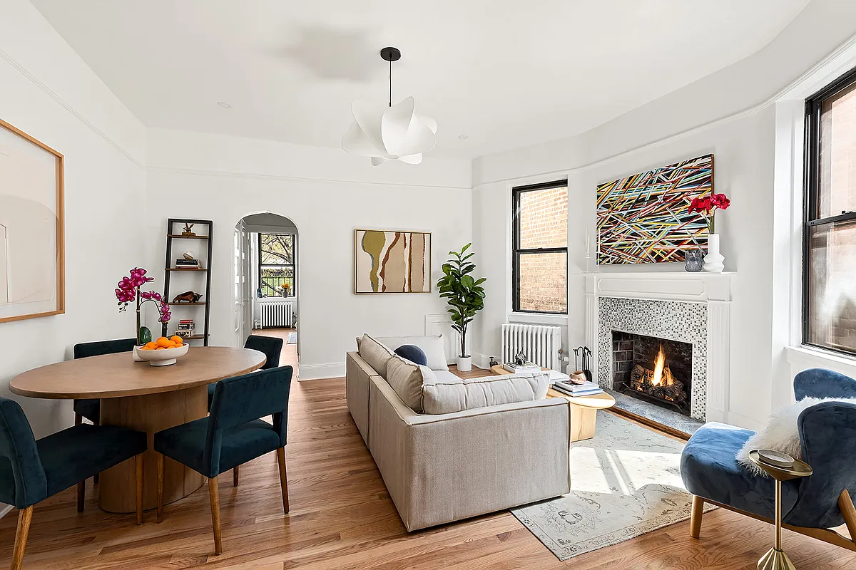
[nggallery id=”24673″ template=galleryview] Welcome to our new interiors feature. The week, the transformation of a featureless 800-square-foot two-bedroom on Sterling Place into a sleek, minimalist and comfortable place for two architects and their burgeoning family. Got a project you’d like us to publish? Send us some photos and a note. Leone Design Studio describes the…
[nggallery id=”24673″ template=galleryview]
Welcome to our new interiors feature. The week, the transformation of a featureless 800-square-foot two-bedroom on Sterling Place into a sleek, minimalist and comfortable place for two architects and their burgeoning family. Got a project you’d like us to publish? Send us some photos and a note.
Leone Design Studio describes the layout of their apartment as a “box with a tail,” re-conceived as a loft-like living area: kitchen, living/dining area and office nook wrapping a flexible space defined by open bookshelves that maximize sunlight. The flex space is used as a sleeping room, playroom and den, with Japanese futons stored in a specially designed nook. The palette is simple and bright: white acrylic for the bathroom door and white lacquer for the cabinetry. Oak floors were stained a dark walnut, to set off the white. The ceiling over the entry hall was dropped make main living space ceilings feel higher.
More from Leone: “The bookshelves were made by a carpenter we met while watching a Yankees game at Bar Minnow (now closed), in Park Slope. The kitchen cabinets are IKEA, but we used a local kitchen shop to build the countertop and other metalwork. Our biggest obstacle was trying to accommodate everything we thought would accompany a child into our lives, such as toy storage and playspace, a comfortable place for family members to stay when visiting, and a place to work from home on occasion. Our son Gabriel was born in July, and the apartment is functioning perfectly. Our dressing room was turned into the perfect size nursery, close enough to our bedroom so we can hear him when he cries. The flex-space functions as a playroom by day, a TV room at night, and a guest room when his grandparents visit. And we have a sleek living space free of kiddie-clutter to enjoy when he is asleep.


Nice! Where did you get the acrylic bathroom doors and what made you choose them?
This is absolutely great. A little too minimalist for my tastes, but I can admire good design, both in materials and space. Also shows that you don’t have to spend a ton of money to look good…I like the IKEA cabinets (great value for money) with more high-end counters and that work table, though that could have more storage.
And it’s so bright! No dark wood “details,” hooray.
I have the same dining chairs and love their looks but they are not too relaxing and a good way to curtail long dinner-time arguments.
They may get a little tired of rolling up the futons every morning though. Is there really no separate bedroom?
I like American style. This sort of neo-Bauhaus decor is cute too but a stray toy, or doggie dish, or kitty scratch pole, would ruin the whole look. That makes it less than practical for real life, although it makes for a great staged photo.
What’s that on the wall? round placemats? Dunno.
this is beautiful, and i am jealous. a fine testament to the skills and efforts of the designers. is it even possible for a non-rich person to afford this quality of design? every time i see something this clever, it’s either self-designed by architect owners (or architect best friends or something), or a multi-million dollar project. the problem seems to be that paid designers and architects are often less willing to work with the kind of compromises on materials (like ikea cabinets) or layout or to work to find innovative solutions or designs that this space and budget might require. i understand the reasons why not, but it’s frustrating for us talentless plebes!
Place needs a shot of love: More artwork, more “stuff,” more evidence that someone actually lives here. This is coming from a minimalist…
yea it does not look like an American home cause it actually has some taste and looks like it was designed by an professional instead of by some nitwit contractor. Uncluttered? Um maybe, but only cause it was staged for the photos.
Very nice. I like what they’ve done. I think the mass bookcase allows for some clutter. The open low shelves will lend themselves nicely to toy storage in bins.
Is there also a floor plan to share? I’m curious to see what space they’ve left for bedrooms.
Pretty amazing use of space I would have to say. Well laid out and thoughtfully designed. Perhaps a little spare for my sensibility decor-wise but still a really nicely done apt.
who makes the lighting fixture above the dining table?
thanks