
Finding the Loft in a Brownstone
If the icon of old Brooklyn is the Brownstone, with all its ornate detail and small spaces, and the icon of new Brooklyn is the open floor plan of loft-like spaces in glassy towers, perhaps the house featured in the NY Times this weekend represents a happy medium, a meeting of the two. The current…

If the icon of old Brooklyn is the Brownstone, with all its ornate detail and small spaces, and the icon of new Brooklyn is the open floor plan of loft-like spaces in glassy towers, perhaps the house featured in the NY Times this weekend represents a happy medium, a meeting of the two. The current owner of the house on Park Place moved there in the 1970s (her mother bought it for $39,000), and eventually decided on a high-modern makeover for the place. The moldings had already been removed, much of that detail scraped off by an earlier owner. “They agreed that the garden floor would become the rental apartment and they hired an architect, Ron DiDonno, to reconfigure the space.” That garden floor ended up being so open that they’ve rented it out for television commercials. “To get the home they wanted, everything had to go. ‘It was a brick-to-brick renovation,’ Ms. Marland said. ‘Nothing is left but the staircase and the downstairs kitchen.’ To that they added a B&B Italia sofa and Donghia dining table, bought at sample sales, though not all the modern flourishes are high-end. We still have $8 paper shades from Pintchik’s on the windows.”
An Old Brownstone’s Loft Aesthetic [NY Times]
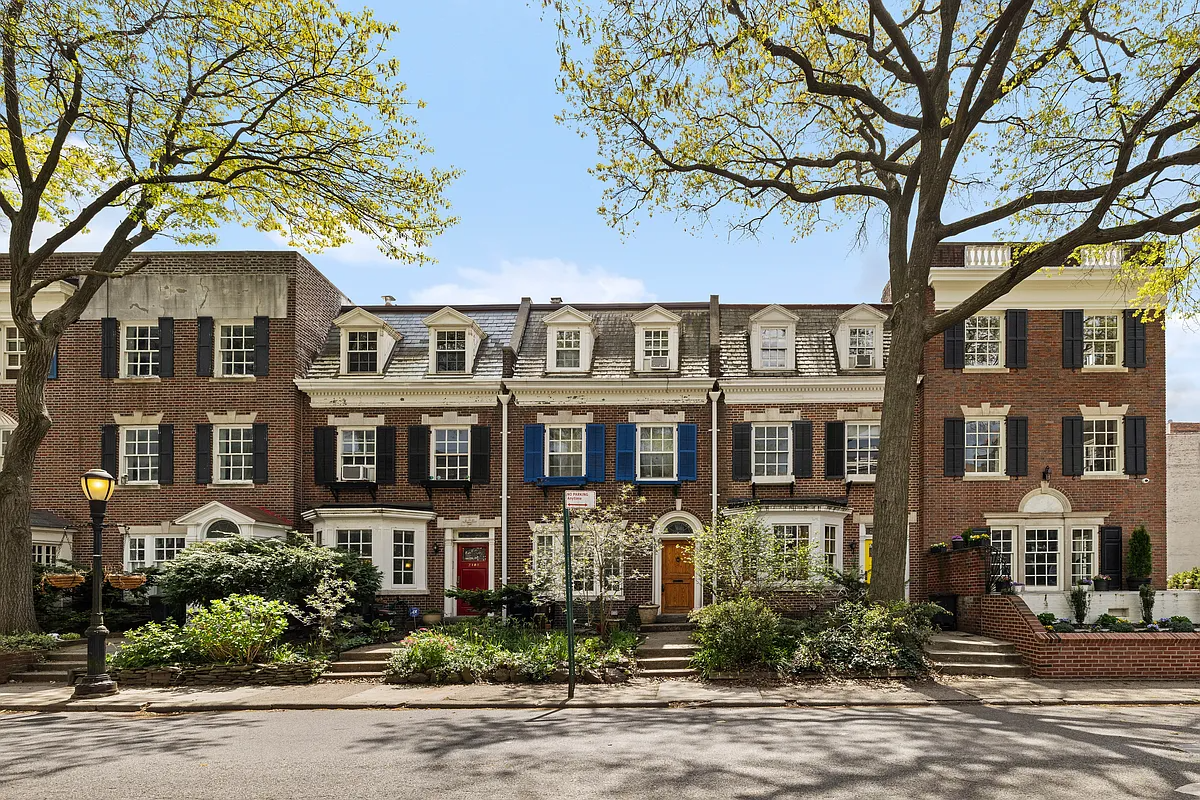
Photo from Property Shark.


Open, airy, modern and delicious.
I don’t understand all of these reactionary attitudes that a brownstone should not have a modern interior. It’s not as if these naysayers are sitting around wearing period costumes to complete the authentic look.
I continue to be amazed at the amount of press Park Slope gets in the NYT! Not complaining as I live there but it seems like there is a Park Slope article every week. NYT also just did a Metro article on the closing of the Berkeley Carroll daycare center. Maybe I’m just on the lookout for these articles? It still seems like Slope gets lots of attention.
The house is nice. The major problem with these townhouse to loft-like conversions is the “shoebox” problem. When you make the parlor floor one long room, the middle always feels narrow and dark. The skylight makes the openness of the upper floors work much better. And it looks like the third floor kids’ bedrooms open onto the “atrium” created by the big open skylight area … very nice!
I like it. Given what they had to start with, it was a great idea for a couple with this design aesthetic. Sometimes I wish it were my aesthetic, as I wonder if it would somehow calm down or zen out my life a bit.
The only thing I don’t particularly like are the stairs. I like stairs to be old school. Love them in fact. I think stairs can be absolutely beautiful. These feel too much like industrial or office building stairs.
Given a stripped-of-details rowhouse, I’d love to try the same thing. I’ll quibble with their interior decoration choices but not the overall concept, structure and materials choices of the renovation. Well done indeed.
Right at the end of the article, the couple admits that all their friends say it looks like a museum. and i’m sure they way over paid for that kitchen but it looks like Ikea. especially the tall cabinets. really bad.
i think this is great. i really don’t get the mindset that assumes that unless you have all sorts of weird, old, expensive, mismatched, “french country,” “antique,” “balinese” or whatever furniture and tchotchkes all over the place that your design is soulless or lacking in personality. some people prefer to have their souls and personality remain, well, in their persons, rather than on their walls. particularly when it’s not just one person/personality/soul occupying the space.
I think this is really apalling.
The interiors are just weird.
I like the back yard but wonder why it was spared. Why didn’t they concrete it over and make it part of their souless design statement?
Thank goodness they couldn’t touch the front facade.
Generally I’m a fan of the modern aesthetic, but this goes a bit too far minimalist for me. I like the kitchen but the living room has a 50′ expanse of blank white wall with a big white sofa parked next to it. Yawn. Get some personality beyond white paint and a credit card.
I love this place, it’s basically my dream home. I think it looks great.