
The Insider: New Arches and Color Give Crown Heights Parlor Floor Dramatic Style Upgrade
The owners yearned for color, showcasing their piano and art, and a dining table with space for guests.

Photo by Raquel Langworthy
A family of four had been living for several years, not entirely happily, on three floors of their turn-of-the-century townhouse. “The facade was beautifully restored, but the developer had stripped the interior down to bare bones,” said designer Arianna Rosenberg. “There wasn’t a molding in sight.” As for furnishings, “Everything was gray and white.”
The busy homeowners had not made interior design a priority. Yet they yearned for color, a central role for their piano and art collection, and a dining table with lots of space for guests. That was the wish list they presented to Rosenberg and Yasaman Hoorazar, partners in Studio Y&A, a boutique architecture and design firm with projects in Manhattan and the Hamptons. “When you have young kids, you feel you have to live through chaos,” said Hoorazar. “You don’t. Family homes can be beautiful.”
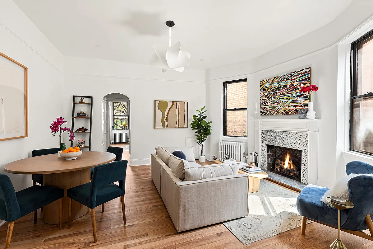
Studio Y&A transformed the parlor floor from one vast box-like space to a more gracious, traditional townhouse layout. Two wide arched openings define a deep blue front room lined with bookshelves, separating it from an airy, elegant dining room and light-filled kitchen at the rear. “We built the walls, created the curved openings, and added crown moldings, baseboard, and chair rail,” Hoorazar said. The duo introduced rounded shapes to make things feel softer and more organic.
“The wife loved color, but had been kind of paralyzed,” Rosenberg recalled. “We realized she gravitated toward blue, and looked at six or seven” before settling on the super-saturated Newburyport Blue from Benjamin Moore that distinguishes the front room. It was conceived as a moody “jewel box” in contrast to the ethereal paleness of the dining room and kitchen: “We wanted a progression from dark to light, front to back.”
The rug in the front room was “the one colorful item” the homeowners had, Hoorazar recalled. Studio Y&A used its swirl of blues and browns to suggest a palette for the rest of the furnishings, sourced mainly from accessible outlets like Crate & Barrel, Restoration Hardware, and West Elm. “We’re very mindful of people’s budgets,” Hoorazar said. “We spent money in places where it needed to be spent, but didn’t go crazy.”


A wide arched opening flanked by peachy sconces from Blu Dot separates the front room from the hallway. A rust-colored sofa from Crate & Barrel’s Athena Calderone line, a pair of vintage leather armchairs with chrome arms, and a round coffee table from Wayfair furnish the space.
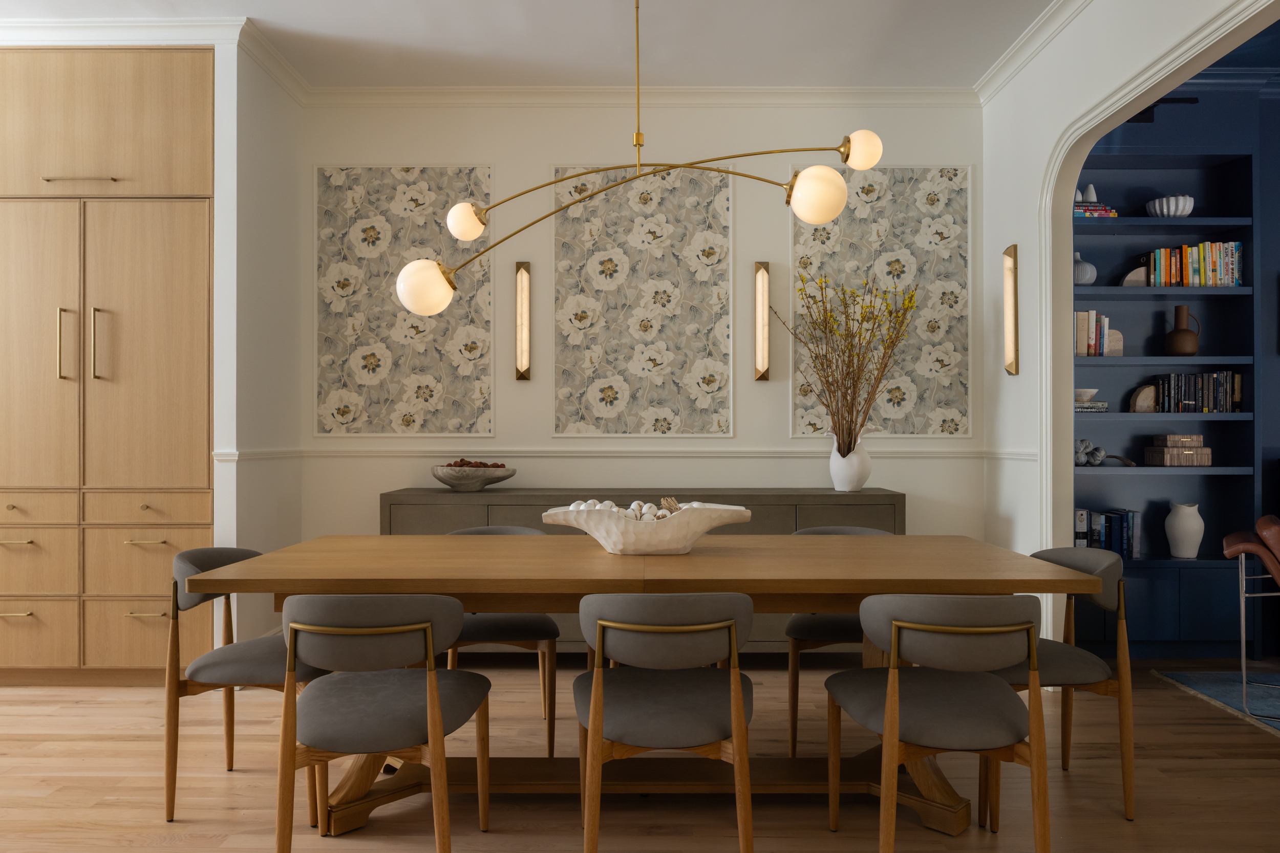
The family’s cherished piano is centered between open bookshelves. A Natalia bubble chandelier from Visual Comfort lightens the look.


“We wanted the dining room to be French-inspired,” Rosenberg said. “We created wall moldings and set wallpaper within it” — the Florent Positano pattern from Harlequin. “Walking from the super-saturated library into the dining area is almost like walking into a secret garden; it’s so calming.”
The vertical sconces from West Elm and the impressive Prescott brass and glass chandelier from Visual Comfort were “less expensive options,” she said. The table, chairs, and sideboard were sourced from Restoration Hardware.


Clean-lined, floor-to-ceiling custom cabinetry of rift sawn white oak, with countertops, island, and backsplash of Taj Mahal quartzite, all designed by Studio Y&A, contain a wealth of storage. “Every inch has a purpose,” Rosenberg said.
Underneath a hidden bar, with doors that fully retract into the cabinet frame, are dedicated snack drawers for the couple’s two boys. The purple-upholstered bench, with built-in storage beneath, is used for reading during the day, or for friends to sit and chat while visiting. It becomes extra seating during holidays when the homeowners set up a secondary “kid’s table.”
Pendant lights from Visual Comfort illuminate the center island.

The powder room’s vanity was sourced from Home Depot, with indigo hummingbird Amazilia wallpaper from Harlequin supplying another hit of strong color.
[Photos by Raquel Langworthy]
Got a project to propose for The Insider? Contact Cara at caramia447 [at] gmail [dot] com
The Insider is Brownstoner’s weekly in-depth look at a notable interior design/renovation project, by design journalist Cara Greenberg. Find it here every Thursday morning.
Related Stories
- The Insider: Soup-to-Nuts Reno, Vibrant Interiors Polish Historic Heights Gem
- The Insider: Boerum Hill Parlor Floor Impresses With Chic Decor From Online Sources
- The Insider: Design Clarity, All-White Palette Characterize Fort Greene Reno
Email tips@brownstoner.com with further comments, questions or tips. Follow Brownstoner on X and Instagram, and like us on Facebook.


What's Your Take? Leave a Comment