
Brownstone Boys: The Difficult Decision of Choosing the Right White Paint
We didn’t plan on writing an article on paint, especially since our place will be mostly painted white.

Overwhelmed by the massive number of shades of white available
Editor’s note: Welcome to the 43rd installment of Brownstone Boys Reno, a reader renovation diary. We’re excited to publish their tale of buying and renovating a brownstone in Bed Stuy. See the first one here. They also blog at www.thebrownstoneboys.com.
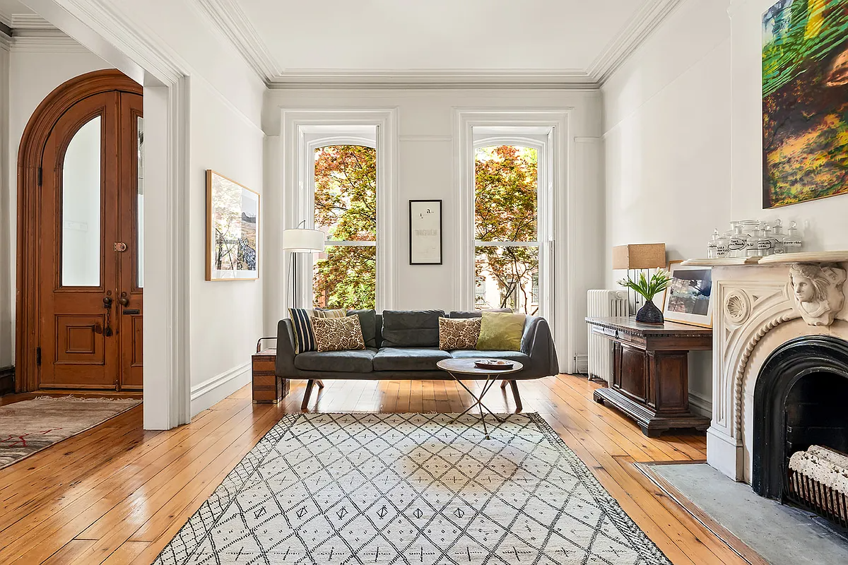
We didn’t plan on writing an article on paint, especially since our place will be mostly painted white, but given the amount of time we have spent trying to pick white paint and get the sheen levels right, we felt we need to. We’re planning on letting the architecture and original features of our house speak for themselves with a nice clean white paint on the walls and ceilings. It will make the richness of the original wood pop and keep it classic looking (although we’re going to sneak in a pop of color in a few places). Choosing a white paint is easier said than done because there are a lot of options, ranging from cool to warm, creamy to bright, and everything in between.
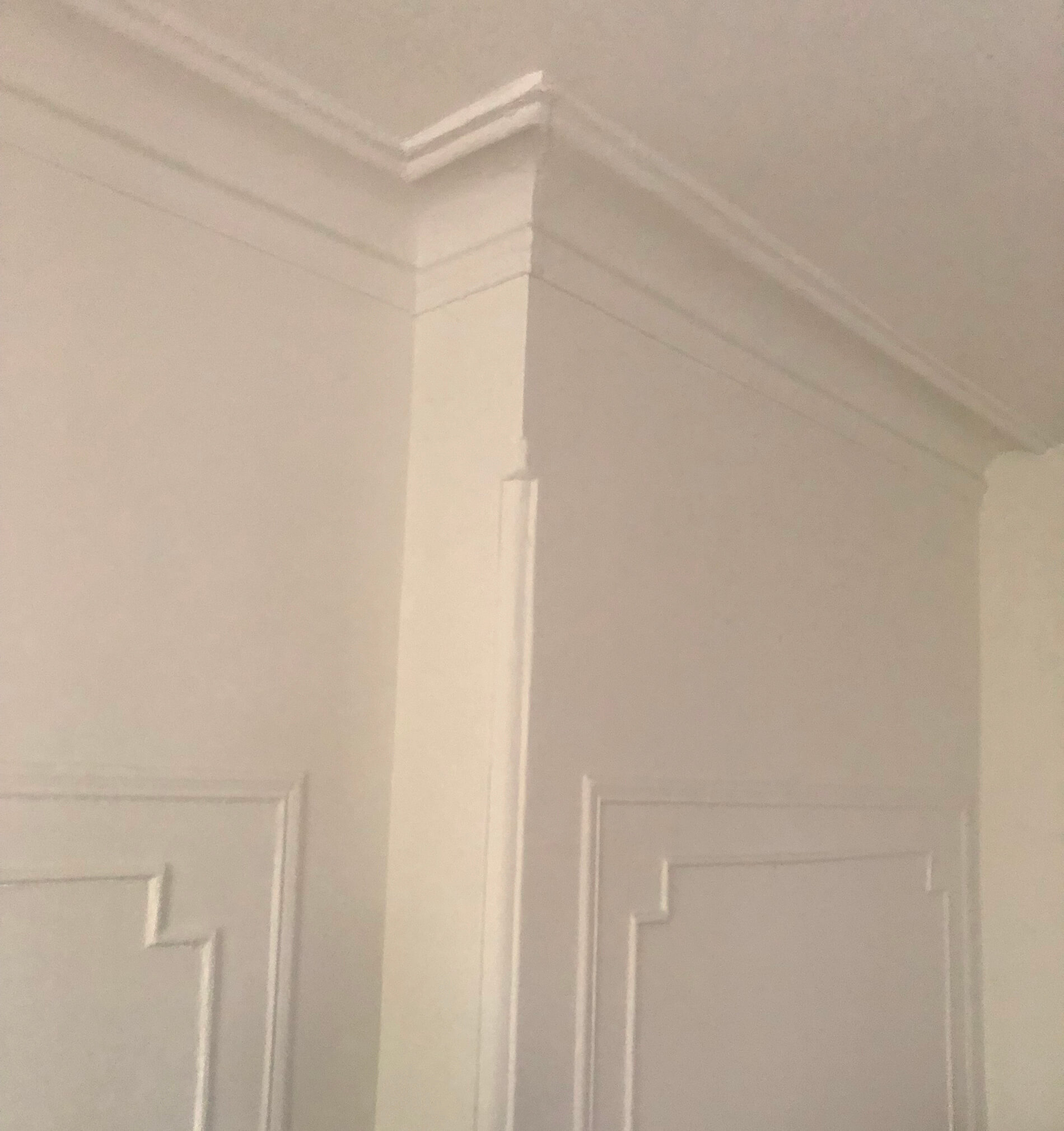
We have a lot of wall space with high ceilings that will be painted the same color since the walls cove into the plaster moldings, so we wanted to get it right. There is already a lot of warmth in in our place with all of the natural wood so we want to complement it but not make things too warm or creamy. We also prefer the warmer glow of incandescent bulbs in our lighting and that will warm up the place no matter how bright the paint is.
If it isn’t daunting enough to pick paint colors from thousands of options, you also need to decide on a sheen. Gloss, semi-gloss, satin, matte or flat are the typical options. Each one is better suited to some areas more than others. We’ll give you the rundown but first let’s talk about color.
We decided to go with Sherwin-Williams paint. We like that they have local stores with professionals who can discuss options. They also have a literal book of different whites to choose from so we knew we would find one that would work well for us.
Walls and Ceilings
Snowbound is too warm and Alabaster too creamy. Greek Villa was a finalist for us, and probably what we would have gone with if we didn’t have the warm wood and lots of incandescent lighting. Despite its name, Pure White is the perfect balance of warm and cool for us. It has a grey undertone that works well for our space. We recommend getting a few different colors in pints and trying them on your walls (or on a primed piece of sheetrock inside your place that you can move around if you don’t want to mess with the walls). Your lighting conditions and other factors might make it look completely different than the swatch you see in a store.
Woodwork and Trim
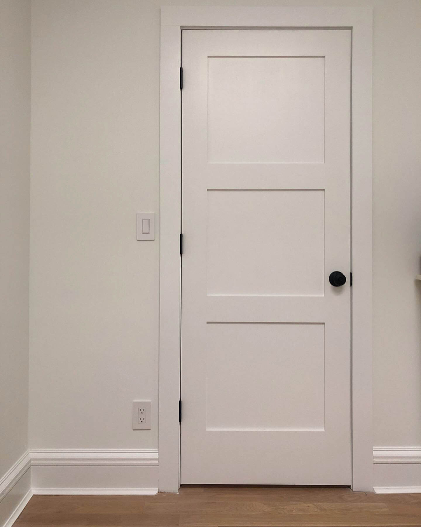
As you know, a lot of our original woodwork will not be painted. It was painstakingly stripped of many layers of paint and it is looking beautiful in its natural state, but we are being careful not to have too much wood. Our baseboards, doors, door casings, and our wainscoting coat nook will be painted out in a clean white. We are pairing the Pure White walls and ceilings with Extra White on the painted woodwork in semi-gloss. It’s a bright white, but not the brightest they offer.
Sheen
The sheen you pick for your paint is almost as important as color. It can really change the feel of the space by creating contrast. We’re fans of flat paint on most walls. It bounces almost no light and we just like the look of it. It also goes really well with a semi-gloss contrasting paint on the woodwork. Some may warn you against flat paint on walls because traditionally more reflective sheens were easier to clean. Scuffs would wipe off and it would usually last longer. Flat paints these days are made to clean up pretty much just as easily, but if you have kids or expect a lot of wear and tear it might be something to think about. Another reason to go up to a matte or satin sheen level is if you do want to bounce a bit more light around the room. We decided to go up a sheen level in our master bedroom. It’s in the back of the house and there are a lot of trees out the window so it doesn’t get as much direct sun. So it brightens up the room a bit and makes it look a little bigger.
Adding a Pop of Color
So far the third floor is mostly painted and it looks great. The Sherwin-Williams flat Pure White on the walls and ceilings is the perfect tone. And the semi-gloss Extra White on the wood is a great contrast. Now it’s time to add a couple of pops of color!
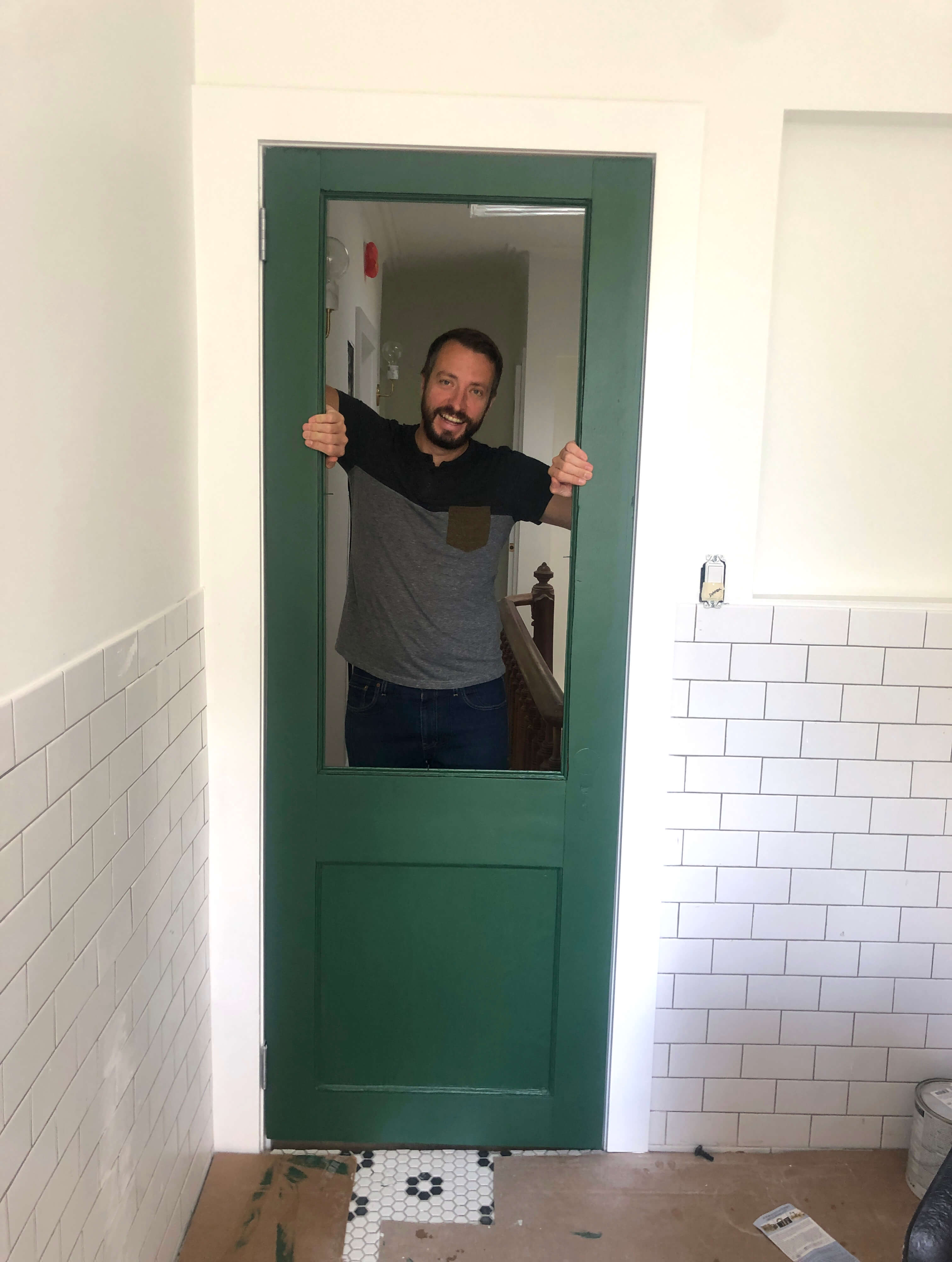
In the guest bath we got a vintage door with frosted chicken wire glass. It’s a quirky feature so we wanted to highlight it. We painted it a shade of green from Sherwin-Williams called Isle of Pines. We’re not “green” people but this green color looks great with the matte subway tiles and vintage black and white theme of the bathroom. Its a nice warm green and really gives the pop of color that is needed.
We’re not done yet. We have a few other features that need some color. The library and artwork niche at the top of the stairs and the coat nook at the bottom will get some color. For now, it will be painted white and we’ll have some future projects to look forward to.
It’s hard to believe we are putting paint on the walls! We’re close but still so much work to do.
[Photos via Brownstone Boys]
Related Stories
- Brownstone Boys: Walking On New Ground
- Brownstone Boys: Finishing and Protecting 130-Year-Old Wood
- Brownstone Boys: Choosing the Right General Contractor for Your Renovation
Email tips@brownstoner.com with further comments, questions or tips. Follow Brownstoner on Twitter and Instagram, and like us on Facebook.
What's Your Take? Leave a Comment