
Architect Transforms Brooklyn Heights Co-op Lobby From Grim to Glam
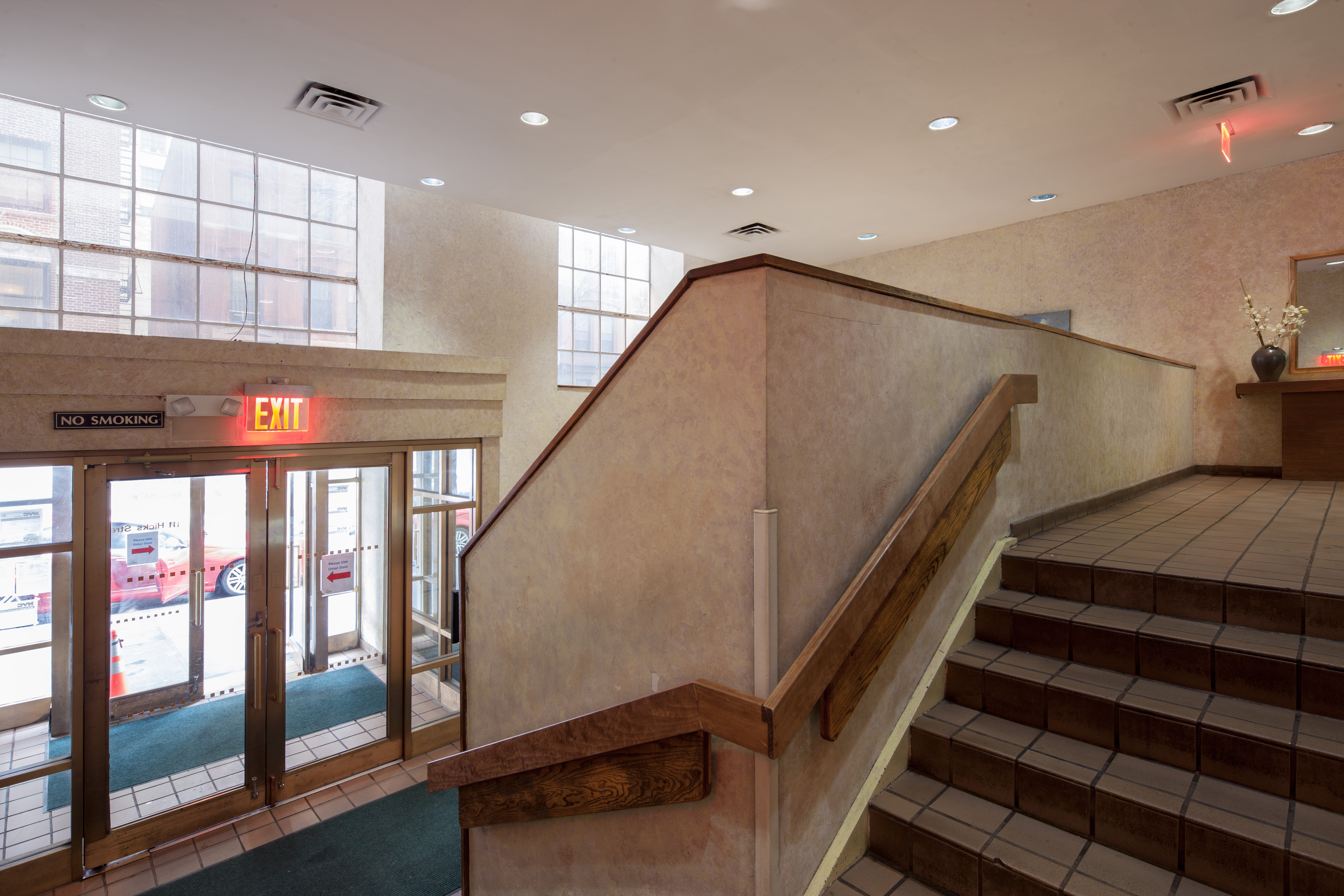
This isn’t a transformation you see every day. When the St. George Tower — once a wing of one of the largest and most luxurious hotels in the entire city — was converted into co-ops in 1984, the old hotel’s service entrance became the new co-op’s lobby. For decades, the space remained sponge-painted beige and…
This isn’t a transformation you see every day. When the St. George Tower — once a wing of one of the largest and most luxurious hotels in the entire city — was converted into co-ops in 1984, the old hotel’s service entrance became the new co-op’s lobby. For decades, the space remained sponge-painted beige and depressingly drab.
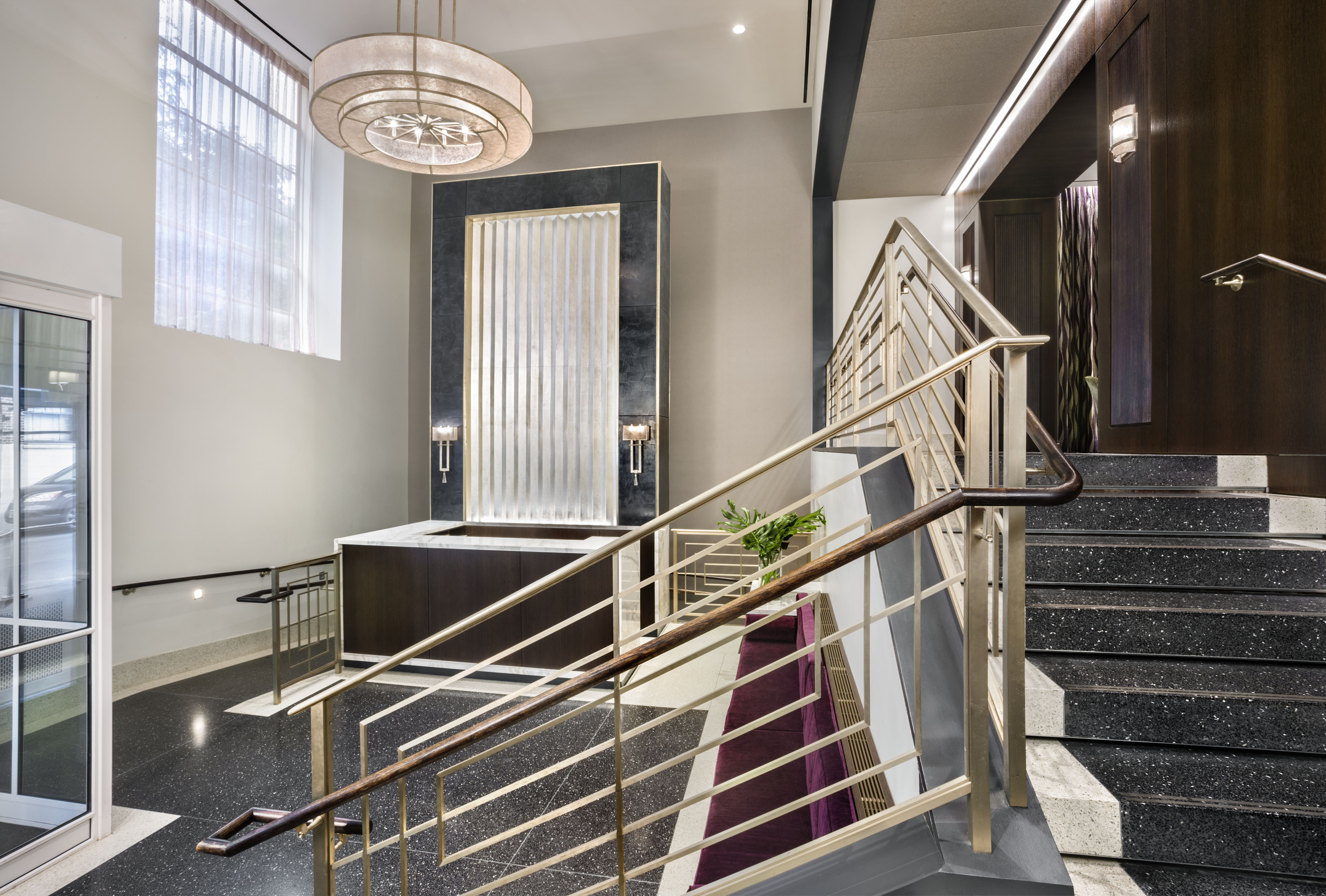
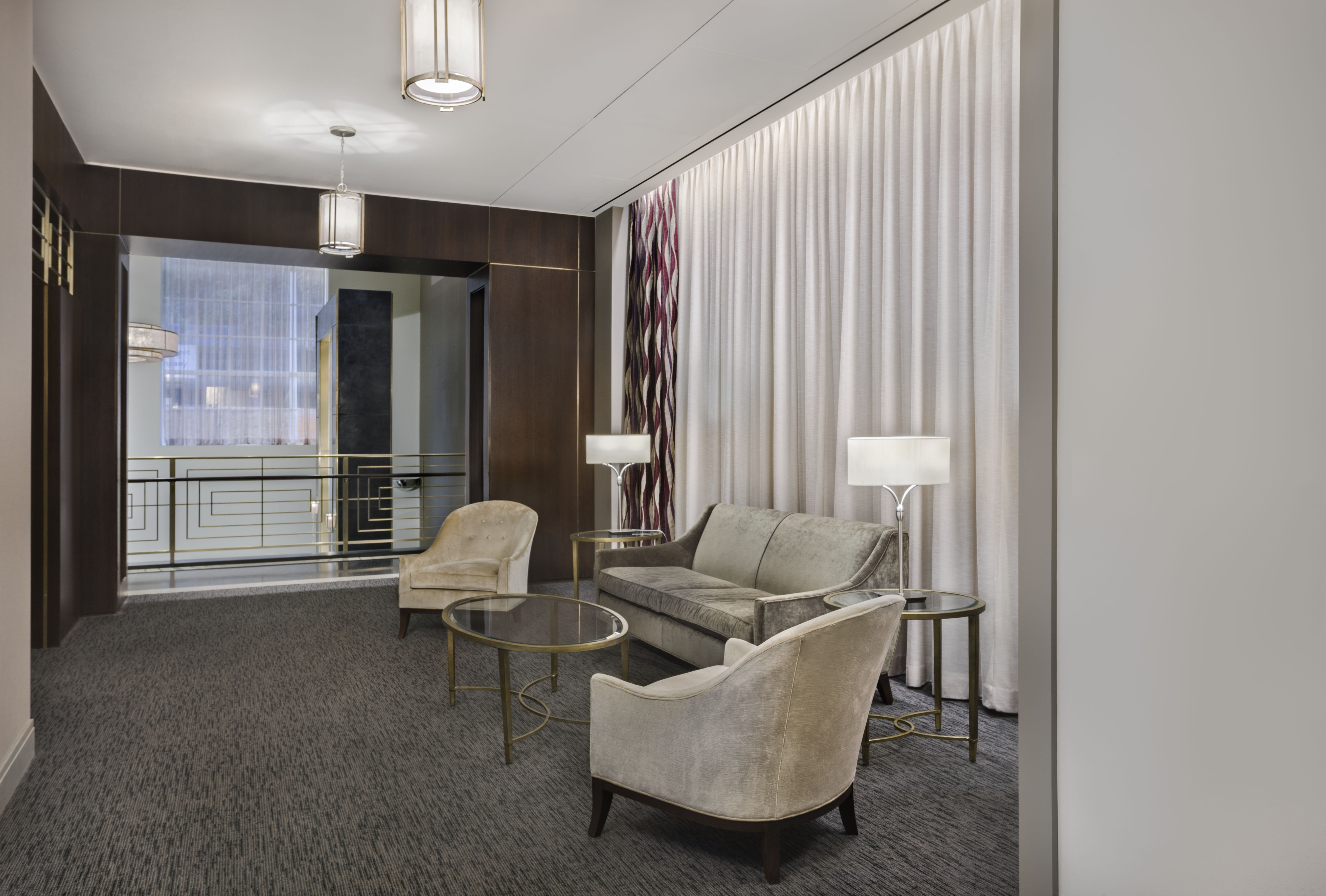
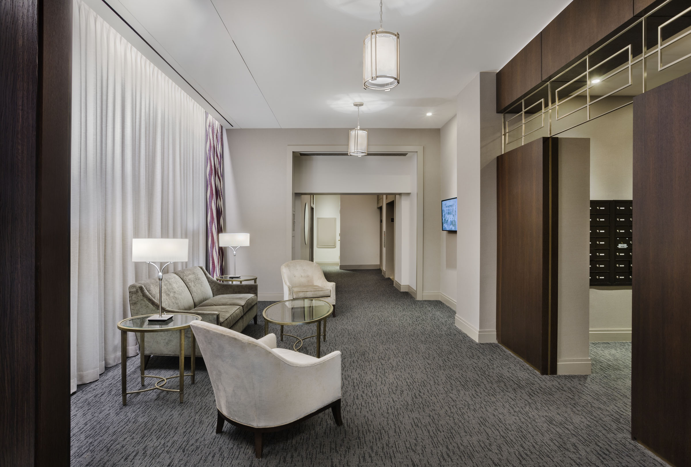
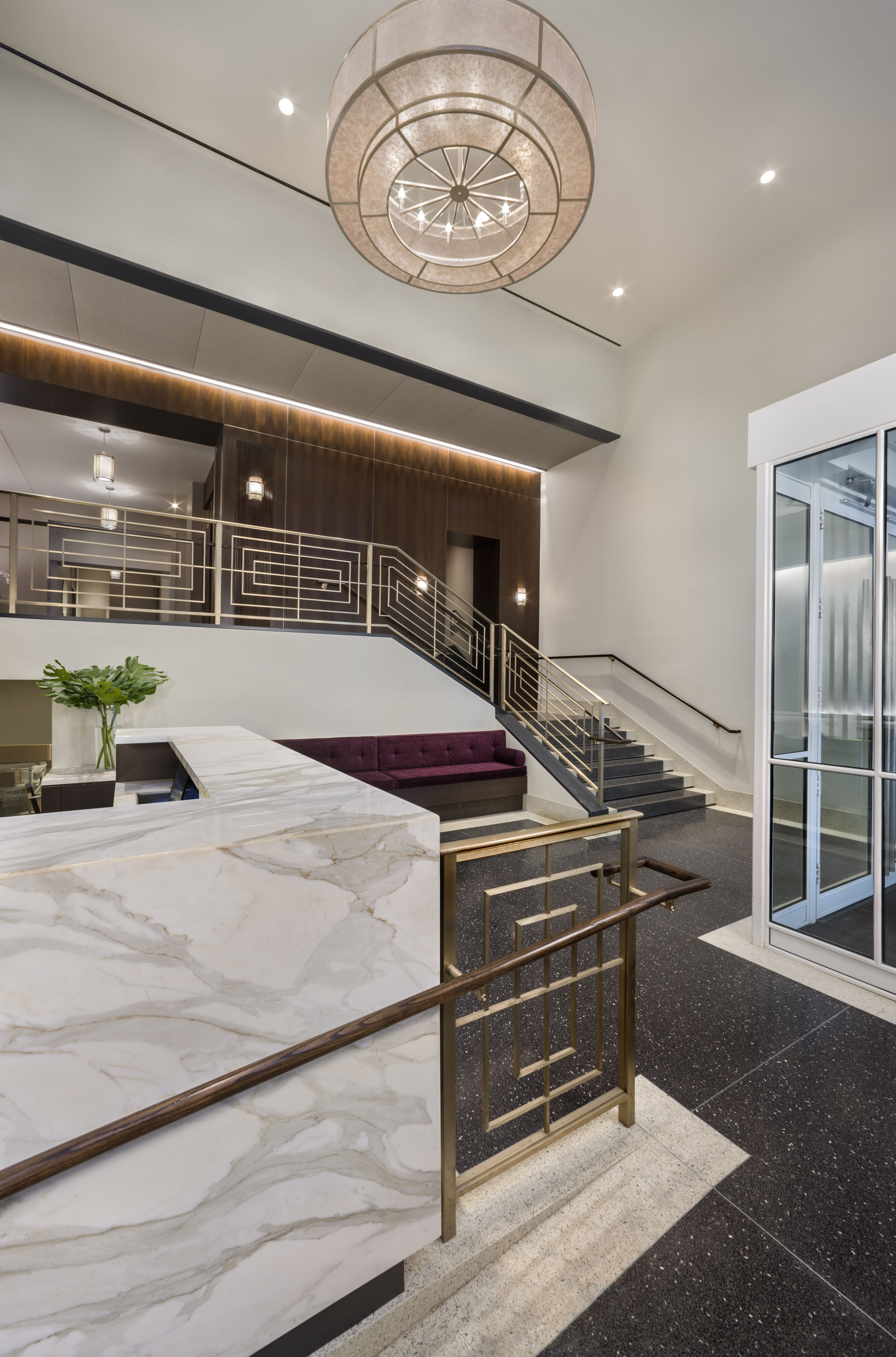
But just last year, a renovation designed by Katz Architecture transformed the worn and ill-lit entrance into a clean, lavish space with details harkening back to the building’s Art Deco past.

The 30-story tower was designed by notable architect Emory Roth in the late 1920s as the final expansion of the grand St. George Hotel in Brooklyn Heights. But as the hotel diminished in popularity, it was broken up into separate spaces and sold off.
The co-op that took over the St. George Tower wasn’t attached the hotel’s main grand entrances on Clark or Henry streets — so they made do with the former service entrance at 111 Hicks Street. The anonymous lobby space was divided into three levels: an entrance and concierge desk, a lower service area, and an upper mailroom and elevator bank accessed up a flight of stairs.
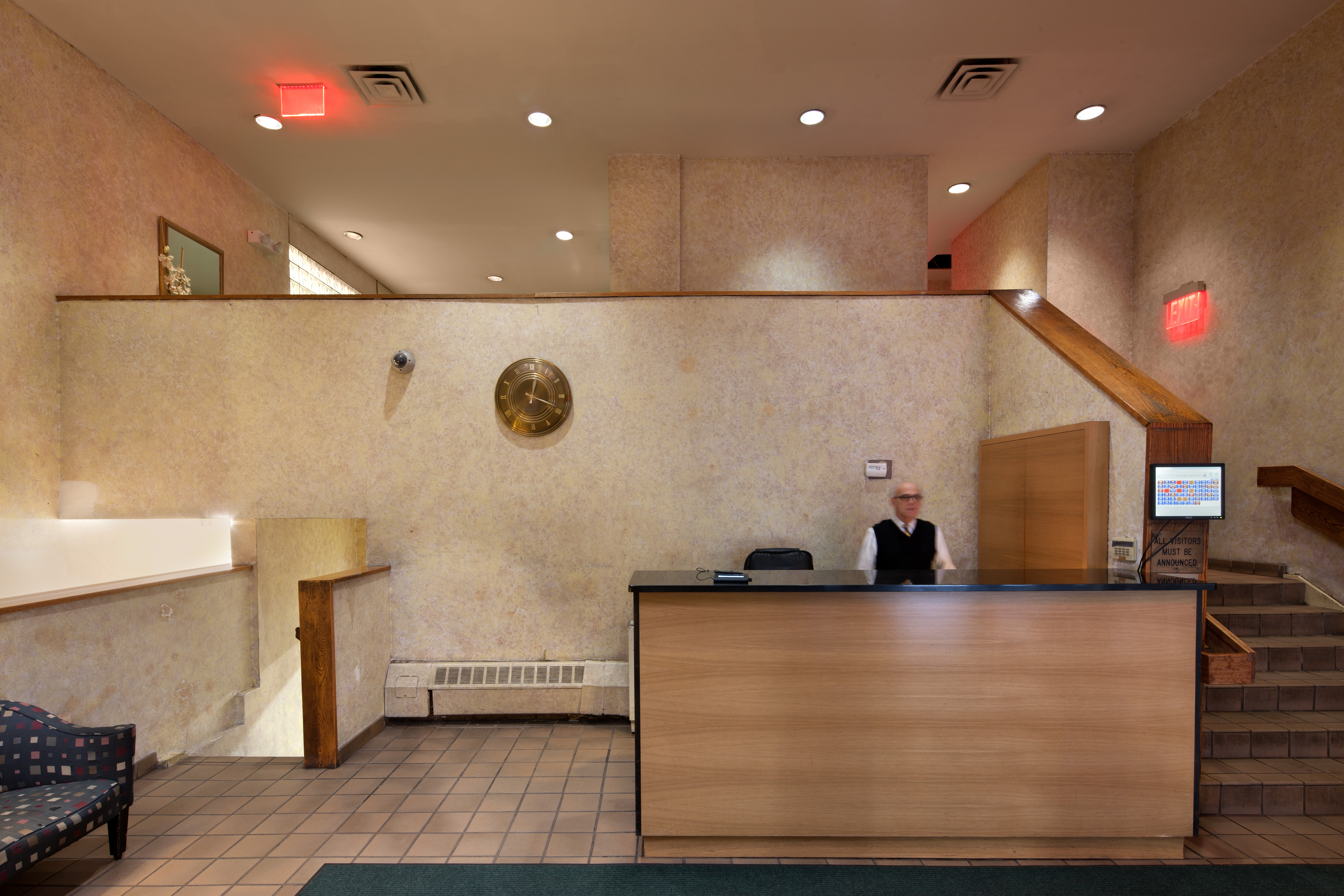
From the look of the “before” pictures, any change would have been better than the existing lobby design. But Katz set out to evoke the glamor of the Tower’s design roots, choosing “shimmery” materials and dark wood to create contrast and visual drama.
“The original Egyptian Art Deco interiors of the Hotel St. George were opulent and playful at the same time. Playing off of this, we wanted the space to feel both dramatic and inviting,” David Katz, Principal of Katz Architecture told Brownstoner.
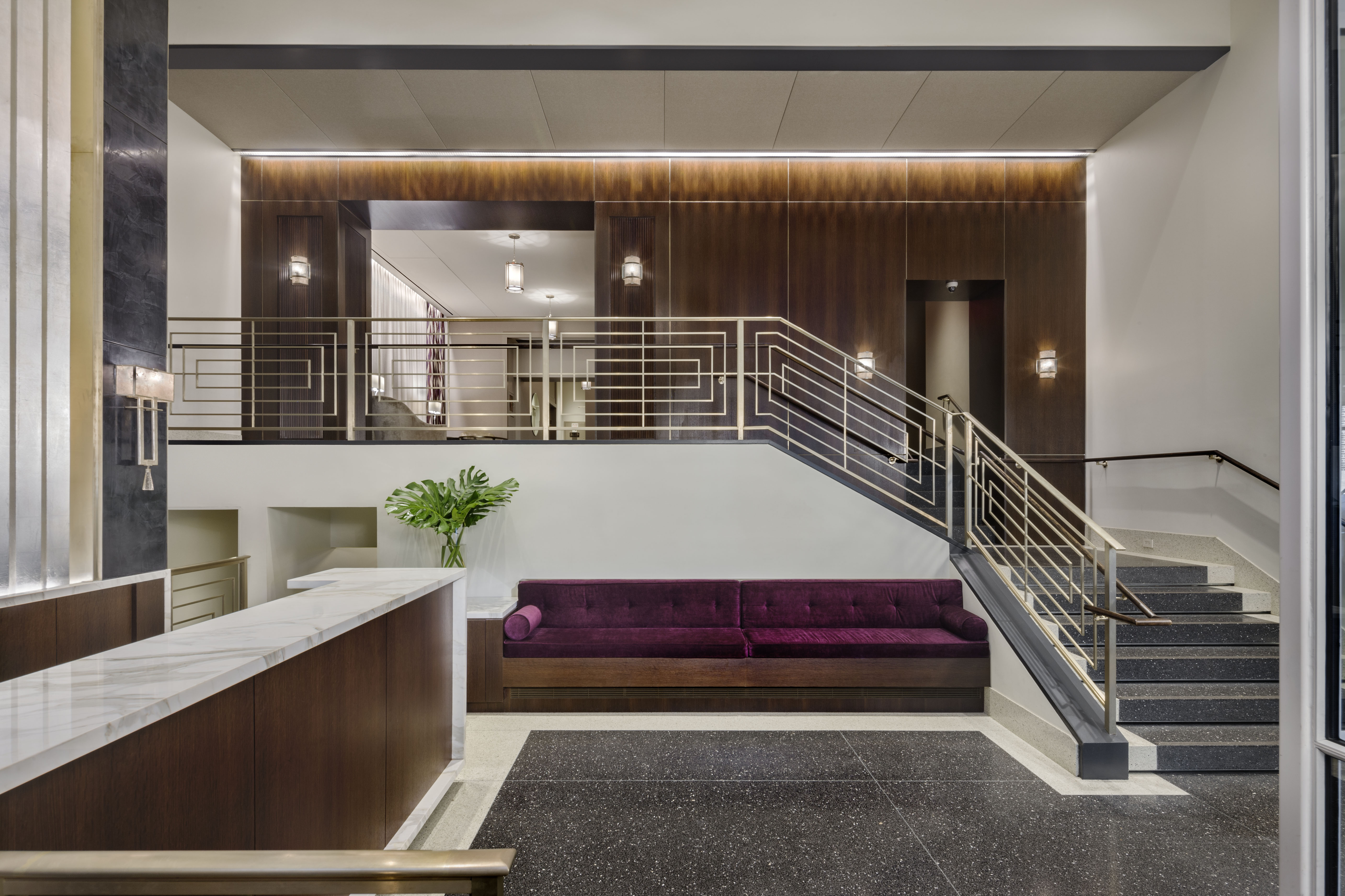
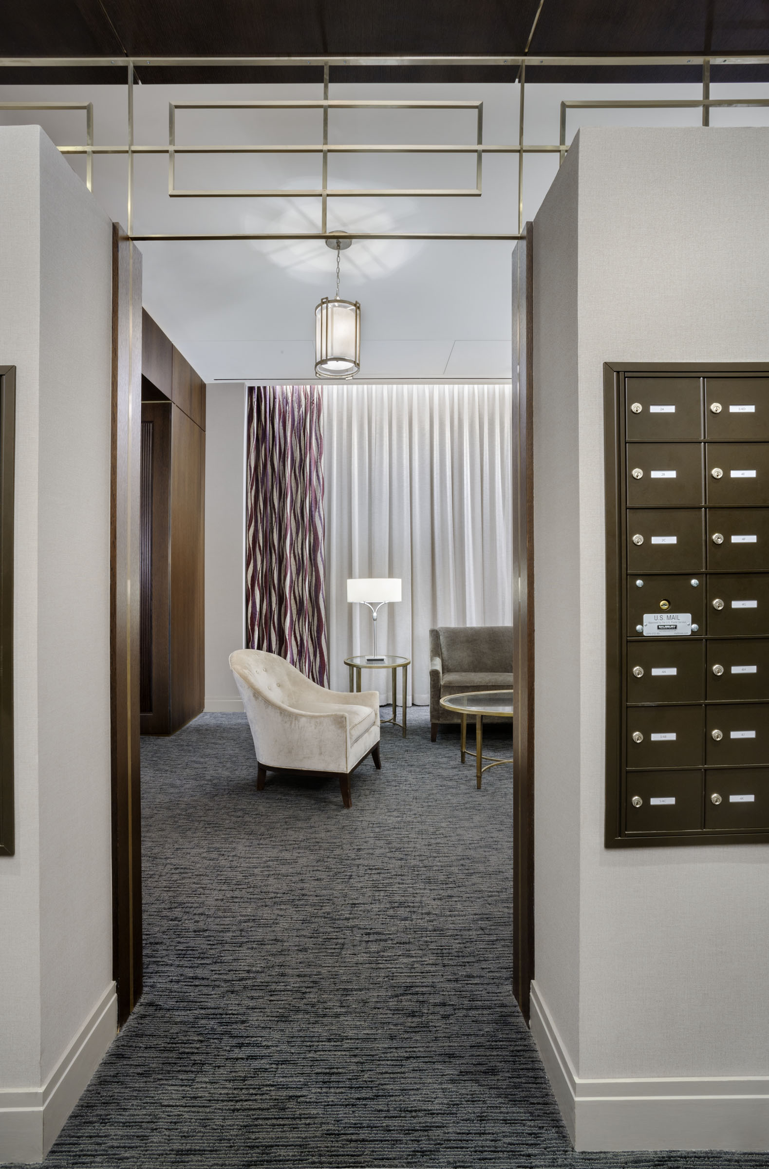
Katz also raised the ceiling of the space and moved the concierge desk, creating a more expansive feel and reorienting the flow of the room. The worn quarry tile floor was replaced with terrazzo. An aluminum-leaf and black plaster wall conceal the ramp down to the service area.
“We wanted to incorporate craftsmanship into the details as much as possible,” Katz told Brownstoner. “Like with the hand-applied aluminum leaf panels and the custom designed railing.”
In total, the renovation took roughly nine months and cost $1 million.
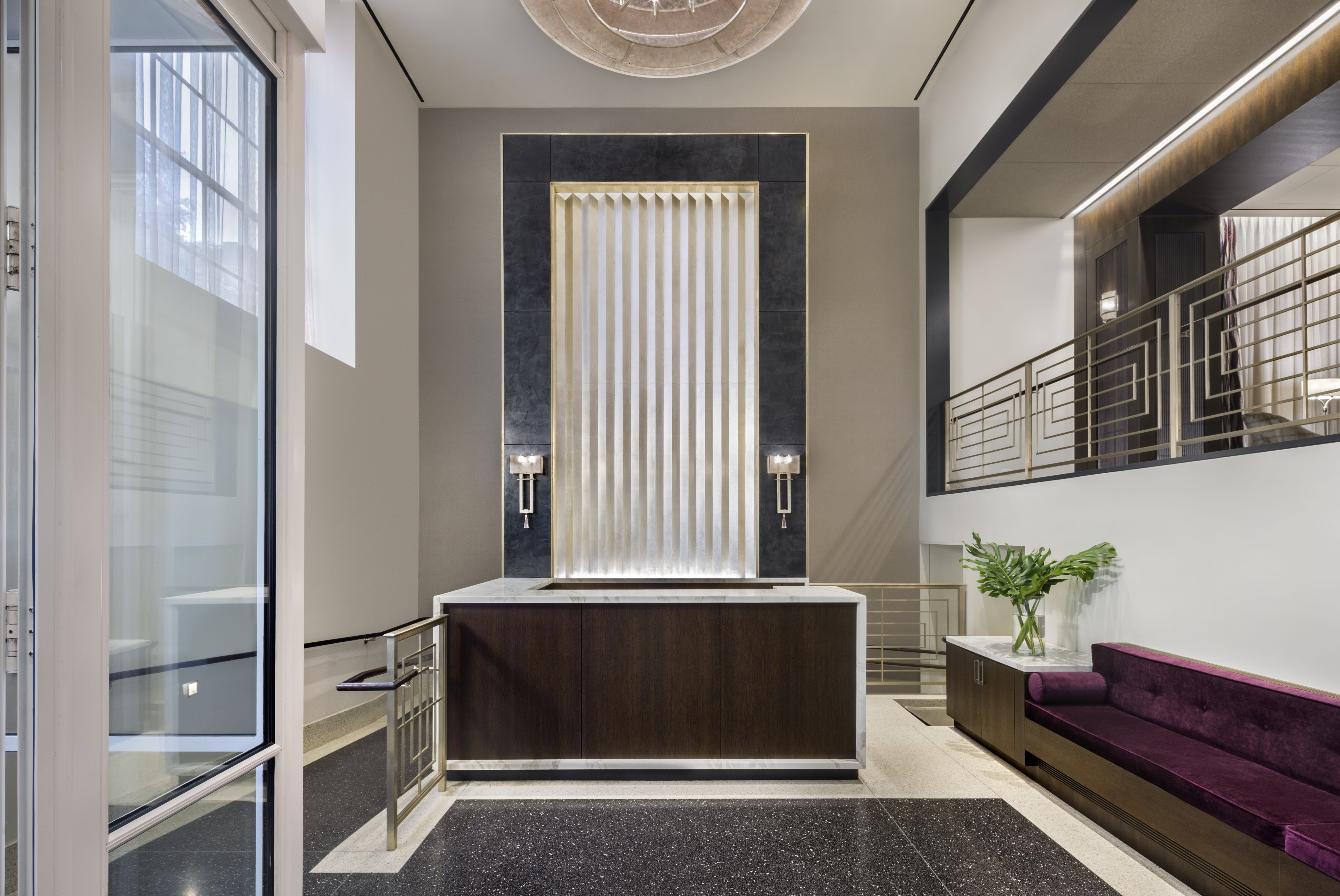
The new concierge desk is made of dark rich wood and white marble. The faceted wall behind it conceals the ramp that leads to the service area downstairs. Notice how the geometric shapes of the light fixtures and metal railings create an Art Deco feel that’s contemporary, not kitsch.
“Our favorite detail is the incorporation of nickel silver into the reveals and corners of the fumed oak and black venetian plaster panels,” Katz told us. “It doesn’t scream out at you but provides just enough of a glint to give the place some subtle 1930s pizazz.”
Katz Architecture is a residential design and consulting firm that’s made a specialty of shepherding co-op and condo boards through the renovation process.
Upstairs, the mail room and elevator area have softer tones and textures, with a gray carpet and light curtains.
Related Stories
The Grand History of Brooklyn’s Hotel St. George
Once-Bland Brooklyn Heights Home Now Wows With Wallpaper and Period Details
Designer Uses Vivid Color to Infuse Fort Greene Brownstone With Youthful Spirit
Email tips@brownstoner.com with further comments, questions or tips. Follow Brownstoner on Twitter and Instagram, and like us on Facebook.
[sc:daily-email-signup ]


Holy cow that looks amazing. The value of every apartment in that building just went up. Just shows what good design can do.
Are you an employee or family member of architect David Katz or one of his contractors? No one makes a comment like that unless they have a vested interest in one of the named contributors. Shill!
What an improvement. I think the period specific “glam” is spot on and well done.
Look at ads for the Marine Park Funeral Home in Brooklyn!
I actually took your comment seriously and googled the Cincinnati Holiday Inn. After looking at the pictures I realize you are just trolling bullshit.