(Ugly) Development Watch: 190 Franklin Avenue
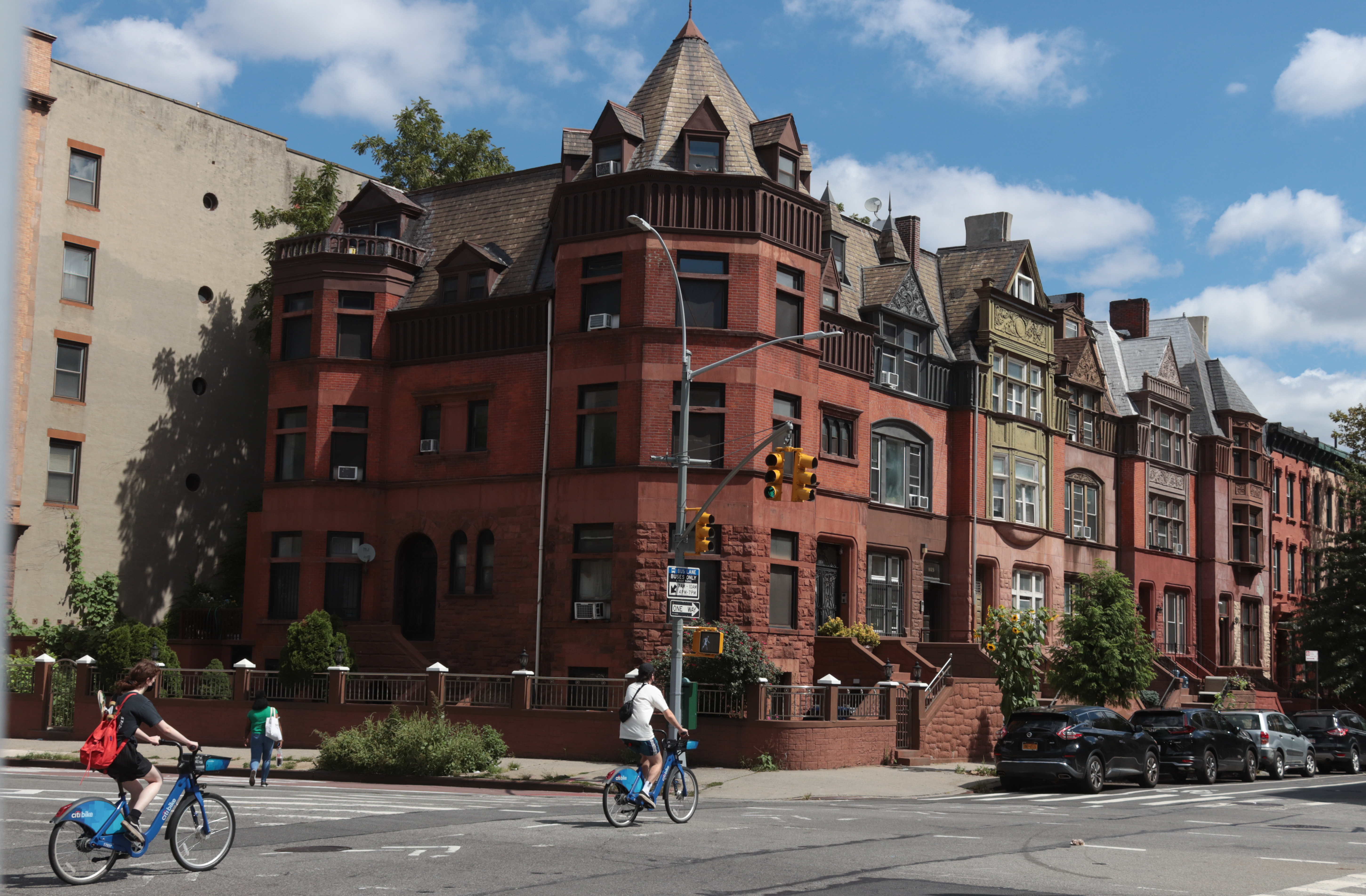
Here’s what we think when we see this: These developers sorta tried to make something nicer than your average piece of crap but in the end their own lack of taste got the better of them. The building’s proportions and the way it relates to the sidewalk and neighboring structures just don’t work. We appreciate…
Here’s what we think when we see this: These developers sorta tried to make something nicer than your average piece of crap but in the end their own lack of taste got the better of them. The building’s proportions and the way it relates to the sidewalk and neighboring structures just don’t work. We appreciate that the materials and the windows are a step up from your average Fedders shlock but the whole thing still looks haphazard. And what the heck is up with that balcony over the side door? It should be amputated while there’s still time. GMAP


Is this house done? can anyone provide some more updated pictures? i”m a extirior designer and wish to see how they finished it, Thanks yell
10 bucks says its a hasid house. Yes, they are that far south now… further on several streets.
Huge duplex for what reason? Could this be for large Hasidim family or is too far south? Or maybe some sort of organization, group home, headquarters?
hey like someone above said, you have to give them credit for at least making an effort. the rustication around the front door and the keystone things above some of the windows.
they could have gone 100% fedders or Scrarano…
thank goodness they didn’t.
but they should have put on a real mansart roof, instead of sticking a standard asphalt shingle, pitched roof.
Come on, JeremyBertn, take off the sock puppet and fess up that you’re the developer. This is ugly–mass does not equal beauty.
I give them an A for effort and a C for execution. The top floor looks a bit like some of the pre-fab work on the low-cost hotel chains (Clairon, Holiday Inn, etc) you see diving along I-95. They have tried to do a little with the windows including the bay on the side and the arched front windows, but something is just off. I can’t say anything more about the balcony/overhang thing that hasn’t already been said.
I agree with dreadnaught, the problem is the design. It looks like they knew what the problems are with the Fedders, but couldn’t really figure out a good solution. But this is better than the average Fedders and we should give them credit for at least trying.
I don’t think its half bad. Especially when compared with the mess at the corner of fulton and classon.
Beauty is in the eye of the beholder, or in this case in the eye of a blind-folded beholder (Or maybe in the eye of a drunk)
It looks like a diving platform. Triple Lindy onto Franklin?