
Inside Third & Bond: Week 11
This is when it starts to get really fun…This week we get a first look at the renderings that the Rogers Marvel Architects has come up with for the Hudson Companies’ townhouse project at Third & Bond in Gowanus. One of the best things about being real estate developers is the opportunity to see in…

This is when it starts to get really fun…This week we get a first look at the renderings that the Rogers Marvel Architects has come up with for the Hudson Companies’ townhouse project at Third & Bond in Gowanus.
One of the best things about being real estate developers is the opportunity to see in a tangible way the fruit of our labors. There’s nothing better than passing a beautiful and active building, knowing that you made it happen. There’s also little worse than passing a building and feeling aggravated by a detail you don’t like. And as hard as we are on ourselves, we also bear the criticism of Everyone Else. The entire public gives the building a critical eye because it becomes part of the urban landscape.
And the public that we are often most concerned with is the buying public. If buyers hate the way the building looks, then there’s a chance they won’t even come inside.
So, we spend a lot of time with our building exteriors.
Above is a recent model created by our architects at Rogers Marvel…
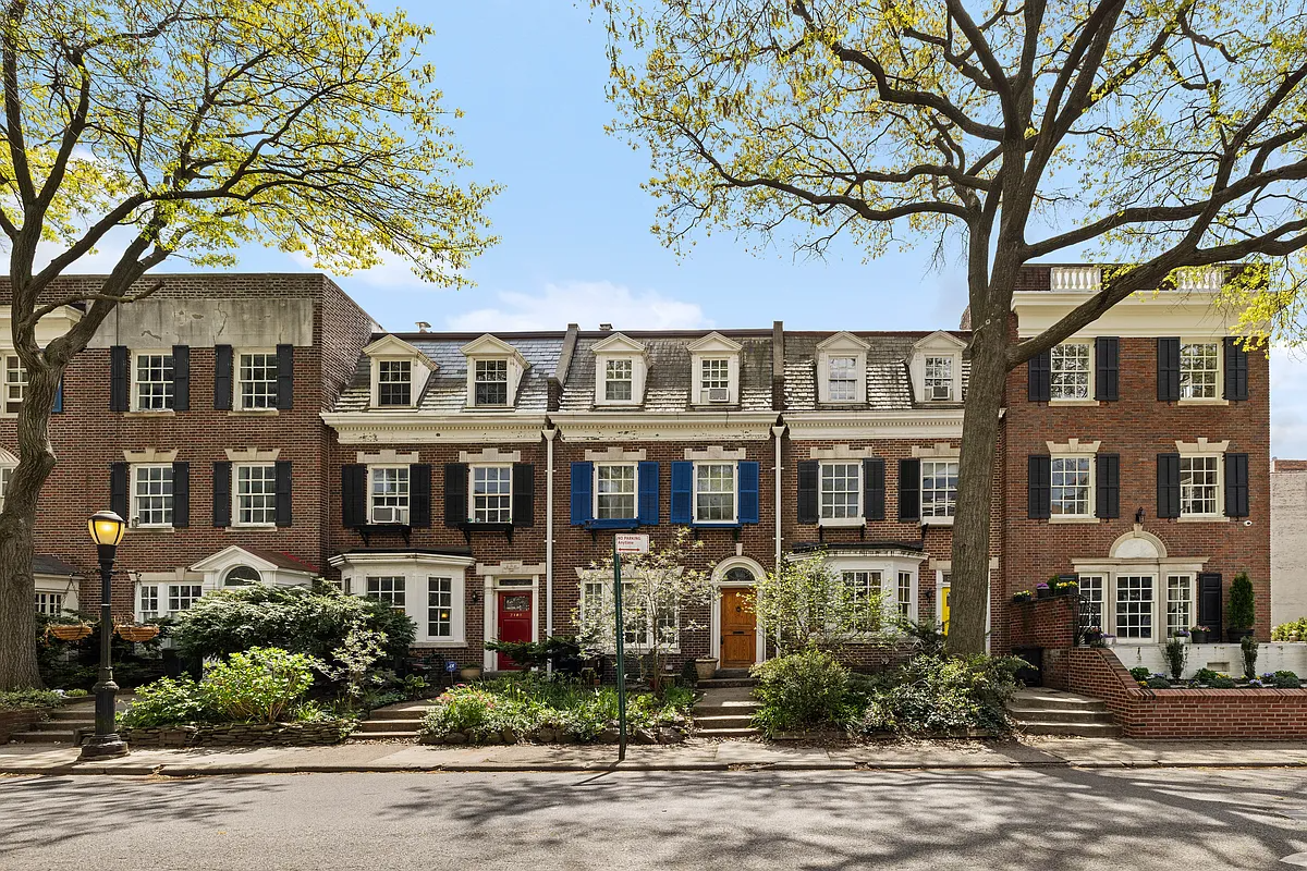
…(When we first interviewed them, they took pride in the extensive modeling they undertake for each of their projects. We’ve found that great models, more than renderings, help us understand what the buildings will eventually look like.) One of our goals was to create a façade for the 8 buildings that is both continuous and distinct in other words to reflect the context of a neighborhood made up largely of townhouses and brownstones. At the same time, we wanted to avoid simulacrum (e.g., mimicking townhouses built 100 years ago) and to create a fresh, modern look. We thought Rogers Marvel aced this challenge when designing the 14 Townhouses on State Street.
 Prior commentators on this blog were very upset with us for not incorporating stoops in the design (remember: first floor has to be ADA compliant). However, we think that these townhomes are going to look great even without stoops. We have a plan to incorporate front yards though, which is in keeping with all of the other residences up Third Street and will give additional privacy to the living spaces on the first floor. Just like townhouses, each of the buildings along Third has its own front yard, own entrance, and own facade. (Around the corner, it’s a little different with a courtyard to enter the buildings off of Bond St. See the picture of the black and white model.)
Another item of note is the upside down L that extends above some of the buildings’ facades. This is a bris soleil that reaches back from Third Street toward Second. Up there, beneath the bris soleil are private roof patios. It looks two dimensional in this photo, and when we first saw it, we asked, what’s the doo-hickey? But when it becomes three dimensional and serves as a trellis for the roof level, it will look like it belongs.
 The façade is a combination of brick and either a metal panel or a cement board. We are looking at bricks that are red with some variegation. For the panels/cement board, we are thinking about a similar red though we’ve also looked at grays and burgundies. The decision to use brick on the front was easy there’s a lot of brick in the neighborhood and we’ve done many projects with brick. We wanted also to use a material to break up the brick and create what our architects like to call events in the streetscape, so we started looking at a couple of metal panel and cement board products…and couldn’t stop. We haven’t decided on the panel or cement board yet; there’s a lot to learn about each system how it fastens to the building, the lead time in producing it, etc.
 Some of the things we agonized over in the design process (beside the on-going metal panel versus cement board debate) were the height of the windows at grade that are behind the front yards, the design of the corner (a major event), and the types of windows. This last one was more than just an aesthetic issue it significantly impacts costs. The first set of façade drawings we saw had over 30 types of windows. Say you have a 3 x 6 window by itself and you have two 3 x 6 windows adjacent these are considered to be 2 types by window manufacturers. So one of the major tasks that our architects undertook was to reduce the number of window types while keeping an interesting façade and matching the right kind of windows to the rooms behind them. Now we have around 14 types.
The façade will change some as we proceed with design but not a tremendous amount. Still, it’ll certainly look different in person from the paper model you see here. Because no matter how many renderings or models you have, you can’t create a scenario that captures all of the elements that interrelate in reality the quality of light, the details of the building materials, and the cityscape around it. At some point you have to trust your instincts and those of your architects and commit to putting a façade out there that will be part of not only your realm but also Everyone Else’s.
Inside Third & Bond: Week 10 [Brownstoner]
Inside Third & Bond: Week 9 [Brownstoner]
Inside Third & Bond: Week 8 [Brownstoner]
Inside Third & Bond: Week 7 [Brownstoner]
Inside Third & Bond: Week 6 [Brownstoner]
Inside Third & Bond: Week 5 [Brownstoner]
Inside Third & Bond: Week 4 [Brownstoner]
Inside Third & Bond: Week 3 [Brownstoner]
Inside Third & Bond: Week 2 [Brownstoner]
Inside Third & Bond: Week 1 [Brownstoner]
From our lawyers: This is not an offering. No offering can be made until an offering plan is filed with the Department of Law of the State of New York.”
The small, vertical, windows between the buildings bother me. It is not clear which building they are a part of and it confuses the concept of rowhouse, making them blur into one big mess.
I don’t think blending in should mean mimicking the existing older buildings–just relating harmoniously to them somehow in an interesting way. Which they appear to be trying to do with the red brick, alignment of the windows, and scale.
I suppose a contemporary design could feature some kind of cornice and could use wrought iron, but I agree with the developer that it’s a bad idea to try to replicate the house styles of 100 years ago. Those attempts almost always fail. That said, I’m not completely sold on the doohickeys yet, and I think this design doesn’t look to have the grace and restraint of the 14 Townhouses. But I’ll withhold judgement until we see the renderings in 3D.
Tetris.
11:39 — Good idea.
The front yards and tree plantings look good. There are a number of buildings along Bond and on the side streets towards the Gowanus canal that don’t have stoops, so their absence in your design is not as noticeable as some might think.
IMO metal plates to break up the red brick facades would be too harsh a look – I’d prefer the cement, or perhaps a different colored brick. Incorporating that material above the windows would give a little detail to what looks like an otherwise plain brick surface – and refer back to the design most common in the neighborhood.
What happened with the stop work order?
11:38 — No elevators. The 4th floor has a studio and a 1-bedroom. We thought about putting the 3-bedroom duplex up there but then figured that families are less likely to be willing to traipse up the 4 flights than singles.
Elevators are expensive and not required for a building of our height.
I appreciate the attempt to blend in ie use of brick and front yards but it appears to stop there. Cornices and wrought iron railing on the roof patios would fit it much more. Overall, nice design for South Beach
I like how you’re lining up your windows with the existing brownstone, and I like the “doohickey” on the corner unit with the apparent cathedral ceiling. And the red brick. But the other three doohickeys–how will it look if people have roof-deck furniture right at the front of the building’s facade? It wouldn’t be more private and attractive to have the arbor thing set back a little? I’ll look forward to seeing the 3D. Thanks again for this really interesting story.
I have to say, I am not that picky, but I don’t like them. I’ve seen a lot worse in the neighborhood, but these are very bland