
Still Out of Scale on State Street
In case you’ve been wondering why Robert Scarano rubs people the wrong way, this eyesore at 326 State Street in Boerum Hill should speak for itself. When we posted about this place back in January, we wondered how he was able to get 8,833 square feet of space approved. The answer seems to be that…

In case you’ve been wondering why Robert Scarano rubs people the wrong way, this eyesore at 326 State Street in Boerum Hill should speak for itself. When we posted about this place back in January, we wondered how he was able to get 8,833 square feet of space approved. The answer seems to be that this is gross square footage and not actual square footage that DOB cares about. Size aside, however, the fact remains that this building is just a giant “F— You” to the community. In making zero attempt to respect its surroundings, it is a poster child for the need to strengthen and expand landmark boundaries. The poor neighbors.
326 State Street: When Too Much FAR Is a Bad Thing [Brownstoner] GMAP P*Shark DOB
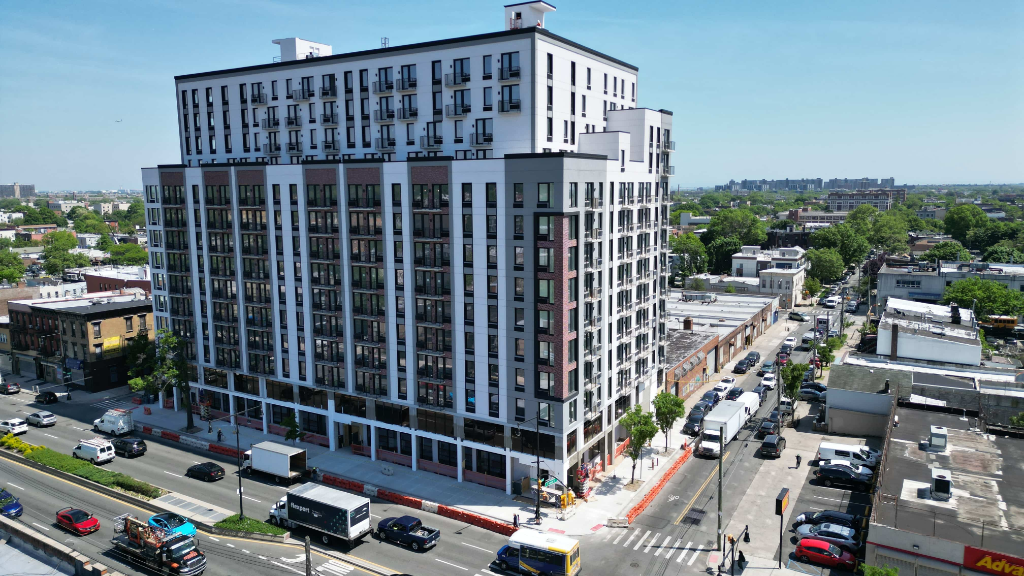
OMG, this is awful. It juts out from the block like its saying “me first!”
UGH No architectural manners.
If you want a modern building to blend in, even if it is a little taller than the neighbors, set it back behind an areaway like the older buildings. A little semi-public space first, then the facade. It is such a basic little thing to mainatain the street wall. Not doing so is very very bad IMMO.
i walk by this place frequently and can confirm that it looks worse in person than in the photo, although it’s not all that bad. i am baffled, though, by the bizarre mini-patios that run down the center of the building. they look barely 2 feet wide and barely even a foot deep. plantholders with doors!
Truth is that the city needs to upzone a lot of the brownstone neighborhoods. Scarano’s innovative use of space and maximization of the development potential of each parcel of land allows more families to live in decent, clean housing, and not be overcrowded into small apartments. Because he uses high ceilings, families can put lofts in their bedrooms and get a lot of extra living space, which is important due to the very low FAR’s in brownstone brooklyn.
Rowhouses are nice, but they aren’t the optimal way to use the space.
$#%ing ugly and utterly out of context. Like everything this guy does. Why he still has a license is beyond me.
I don’t mind a mix of modern and 19th Century on a street but this building shouldn’t have been allowed to extend past the frontage of the one next door.
In fact, for a better fit, this building should have had it’s front a bit recessed from the street. Otherwise, it’s not that unattractive.
It is hideous.
It is hideous.
This picture doesn’t do it justice. I live around the corner and I can tell you it looks seriously out of place on this street.
This web site has a grudge against this architect. The building looks fine. Why so rude?