
Bricolage New-Build in Red Hook Ready (Already)
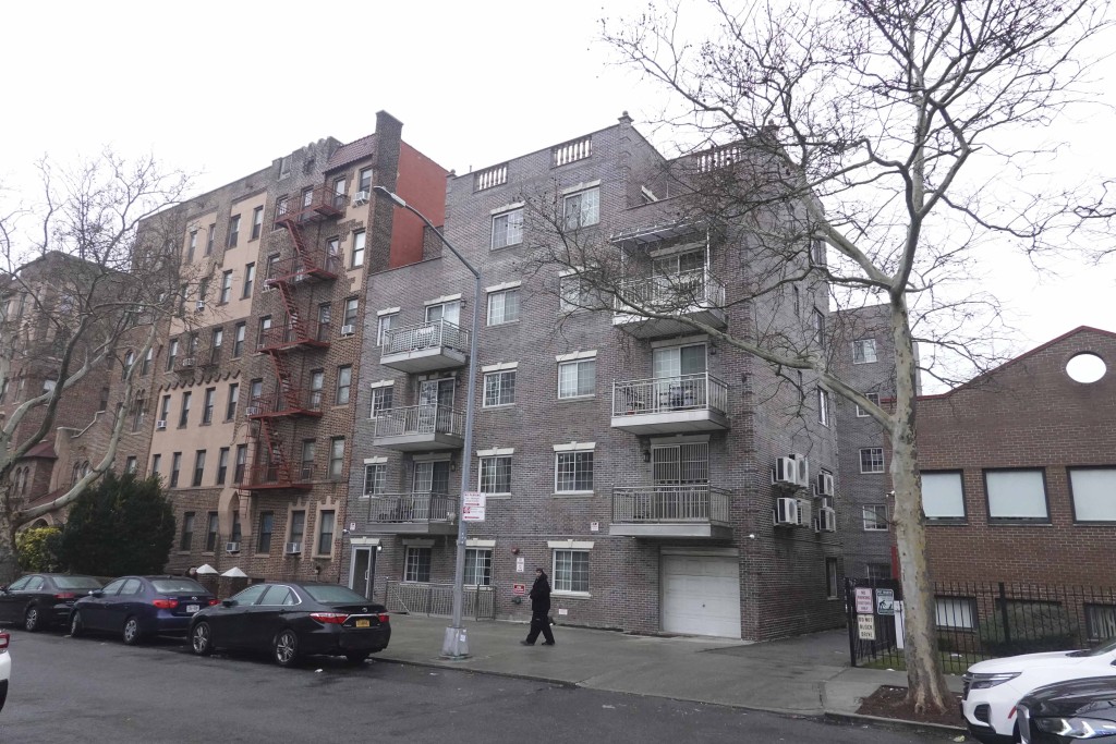
The Bricolage-designed building at the corner of Richards and Coffey in Red Hook appears done. According to The Real Estate, this is a pair of 3,400-square-foot carriage houses and not one multi-unit building. While it looks like the architect tried to make this nicer than his average fare (and we’ll give him credit for the…

The Bricolage-designed building at the corner of Richards and Coffey in Red Hook appears done. According to The Real Estate, this is a pair of 3,400-square-foot carriage houses and not one multi-unit building. While it looks like the architect tried to make this nicer than his average fare (and we’ll give him credit for the windows), it still looks odd to us. Are these on the market yet? Who’s got the listing?
Red Hook: Where Time Really Stands Still [The Real Estate] GMAP P*Shark
I applaud the degree to which they didn’t fuck up this project. but jeeze, would a cornice have really broken the bank?
quoins, too
it needs quoins
What’d they run out of money half way up?
That thing needs a cornice or some visual weight up top, it’s unbalanced.
The windows are a little funny, too. The size and spacing are wrong: too big/close for row house double hungs, but not massive and banked enough for an industrial look.
Oh, well. At least they tried.
7/10
doesn’t look that bad…
at least they tried to make it sort of look like something of a brownstone type building.
(also, compare to the building they are putting up on Hicks St. near Kane)
this must be a sad commentary on the state of architecture in NYC, but this looks pretty decent, there seems to have been some effort made on the design! congrats!
I think a good example of a new building that fits in is the one on the corner of Degraw and Clinton. It is 4-story brick apartment building that wraps around the corner. It blends in and the proportions are pleasing. I think that is what often grates on the nerves of people who are really into architecture–there are just some proportions that look “right” and others that seem clunky or clueless. BTW, I do think the building that started this thread is better than most new construction.
The top really does look weird in the photo — just a stark box. It can’t be that it would have cost that much more to put some kind of cornice on. It looks okay, but it’s annoying that with the slightest bit more effort it could have looked much better.
combustible – I wasn’t responding to context, just the design of the building itself. I know the area pretty well (lived on Dikeman for awhile), and you’re right, this is probably an improvement over the lion’s share of buildings in the neighborhood. And as I noted earlier, its also an improvement over the lion’s share of Bricolage’s work. But that’s all damning with faint praise – I don’t think either of those statements is really saying all that much – for me (personally), this is not a great design.
I live in Red Hook (own an 1880s brick rowhouse there) and think the developers did a very nice job, especially compared to a lot of the other new builds and renos that have been done recently. And for all of you crying about “context”, I’d invite you to walk down that block and then revisit your point. What does “context” mean for a neighorhood where the lion’s share of original buildings got the wrecking ball over 30 years ago? Most of what else is on that block is on par or worse. This is an improvement. I agree, a cornice would have been nice but that can be added after the fact. And yes this is in an area zoned industrial, so they were originally being touted as Live/Work spaces.