
19 Lefferts Revealed
[nggallery id=”47138″ template=galleryview] As the developer pointed out to us when we bumped into him on the street while taking a photo of 19 Lefferts Place, there aren’t a lot of people building new brownstone buildings these days, mostly because it’s a lot more expensive than brick. We agree that he gets big points for…
[nggallery id=”47138″ template=galleryview]
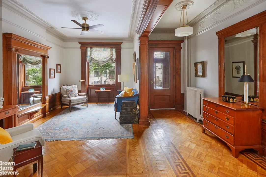
As the developer pointed out to us when we bumped into him on the street while taking a photo of 19 Lefferts Place, there aren’t a lot of people building new brownstone buildings these days, mostly because it’s a lot more expensive than brick. We agree that he gets big points for the decision, as well as for the large windows, high ceilings and subway tiles in the bathroom. If we had our druthers, the new four-family would have a cornice to match the brownstone next door, but overall this place is a huge relief, even with the rooftop addition. We’ve included a few photos from the impromptu walk-through. The condo offering plan won’t be ready until later in the Fall, but if we had to guess we’d say the floor-through units, which weigh in at over 1,100 square feet, will go in the mid-$600,000’s.
Development Watch: 19 Lefferts Place (1/10) [Brownstoner] GMAP
Development Watch: 19 Lefferts Place (7/08) [Brownstoner] DOB

Camel – the ground floor is entered at grade, unlike a traditional row house, which is entered at the basement (ground floor) level (three or four steps down) or the parlor floor level (4 to 12 steps up). So right there, everything is out of line with the historical model. To make it worse, 19th century row houses had varying floor heights – the parlor (first) floor had very tall ceilings and each floor going up had progressively lower ceiling heights. Modern construction builds everything at the same floor height – so the floors don’t line up, and there isn’t a graduation of floor heights as you go up (you can cheat this by varying the window heights, but it’s not convincing).
Personally, I think infill buildings are better when they are true to their time and don’t try to fit in with ham-fisted gimmicks. By way of example, look at the picture of Third & Bond on today’s front page or Montrose Morris’ Building of the Day at 510 Hancock (an 1891 infill building). Neither of these mimics their surroundings, but both are quality designs and quality executions, and both add something to the block in a way that this doesn’t. IMHO.
Wait explain how the windows don’t line up? And I know this is the internet and all, but what new buildings DO you guys like?
I do agree lining up the windows really would have helped.
But modern or vintage style, I don’t think it really matters, as long as the quality and scale match the existing buildings.
The brownstone work looks pretty good but the aluminum windows with “between the glass” muntins are a miss. They don’t do the trick. The lack of cornice also detracts from the overall look of the building. Better to go with a cornice and have the setback story look like an addition.
In order for this historical approach to be successful you really have to go with it all the way.
A brick sidewall would have also enhanced the finished product and made it classier.
Between this one and the brick one that went up on the corner (2 Lefferts), one of my favorite blocks in Brooklyn got two new construction buildings that look contextual and nice. That’s a minor miracle.
I think these will go pretty quickly if not priced too aggressively. That little area where Lefferts T’s with St James Place is full of families with babies and little kids.
given these are flr thru units, NOT align windows make sense in that all units have same ceiling heights which should help with sales. as a buyer, I rather have a higher ceiling height than a lower one that might be aligned with neighbor
I find these ersatz brownstones very blah — and the failure to align the windows makes me ask, why bother to be contextual if you can’t get that simple aspect right?
Frankly I’m happy to see something very modern — it adds more energy to the streetscape — so long as it is well done, ie. NOT a fedders fugly bldg.
How about something like this:
http://tiny.cc/v26cg
When I was living in Carroll Gardens about six years ago, a bunch of new Fedders buildings went up across three lots. I really did not understand why the developer didn’t do something more like this new brownstone above.
Or, at the very least, why the developer didn’t make the ceilings higher and the windows bigger. He could have gotten WAY more money and profits for the buildings. I could only surmise that he only knows one way of doing things. It’s too bad. They are really ugly.
Beautiful. I like the inside and the outside. Lovely work.
There’s a little bit of vintage-style infill scattered around the U.S. here and there, mostly the work of enlightened developers. In my hometown, for example, a local rebuilt a beloved Victorian gingerbread house on spec. Arts & Crafts cottages seem to be the most popular style. I’ve seen some where you can’t even tell from the outside it’s new.
The insides always have modern layouts with “great rooms,” those things that combine kitchen-dining-living room, with islands and granite. I’ve interviewed some of the developers and the inhabitants, and the great room seems to be a requirement of most families.
The developers say the tradeoff is less square footage but more expensive built-ins. Also, naturally, they are located within walking distance of historic downtowns.