
Furman Center Tracks Brooklyn Market
The Furman Center at NYU has just given birth to another one of its detailed studies about New York City, and it’s got lots of info in it about how the Borough of Brooklyn fared during the last decade. More specifically, the report looks at population and housing data between 2000 and 2008. During that…

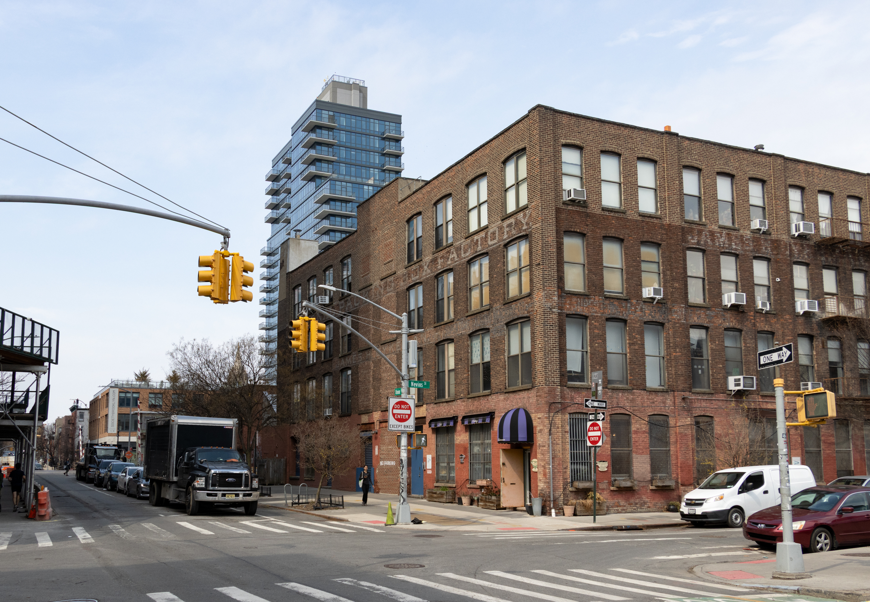
The Furman Center at NYU has just given birth to another one of its detailed studies about New York City, and it’s got lots of info in it about how the Borough of Brooklyn fared during the last decade. More specifically, the report looks at population and housing data between 2000 and 2008. During that period, unemployment decreased from 10.7 percent to 7.2 percent. There was a decline in the poverty rate and a rise in median household income over the same period. “Housing sale prices peaked later in Brooklyn than in three of the other boroughs, but by 2009, price declines from their peak were comparable to the City as a whole,” says the report. “Home purchase and refinance mortgage borrowing rates decreased from 2007 to 2008. Foreclosure filings have increased dramatically since 2007, with nearly 7,000 notices of foreclosure filed in 2009.” As for demographics, Brooklyn continues to have the largest black population of any borough, with 33 percent of residents identifying as black, but Brooklyn was also one of only two boroughs to experience a rise in white population since 2000.
Brooklyn Market Report 2000-2008 [Furman Center]
Dissecting the Real Estate Boom [Curbed]


Legion, you’re such a repub-homer, nothing you say has validity. The data in this report do not correlate with your statement. Simple fact. No matter how many times you parrot the party line (and quote the insipid Sarah Palin) changes that. How am I being reactionary by looking at the data? Drink some more Kool-Aid, brother. You need it.
Posted by: JIPS at March 26, 2010 1:49 PM
“repub-homer”
Yeah, that’s a new one, I’ll have to look that one up,
is that a new one from the manual of reactionary reductionism?
How did I know that if I only posted the name Bush in relation to prosperity, someone would inevitable come out of the woodwork to once again perpetuate the leftist party line that nothing good could possibly have come from the years 2000-2008.
But don’t worry, my friend, you don’t have to take my word for it, just look at the graph there for the years 2000-2008,
sure it’s an oversimplification, just as much as the oversiplification of BUSH EVIL that I was poking at in the first place, with my initial statement.
“you betcha”
Legion I never said Club for Growth were terrorists, just bad people.
you wanna go back in terrorism, please don’t forget the KKK.
Legion, you’re such a repub-homer, nothing you say has validity. The data in this report do not correlate with your statement. Simple fact. No matter how many times you parrot the party line (and quote the insipid Sarah Palin) changes that. How am I being reactionary by looking at the data? Drink some more Kool-Aid, brother. You need it.
Why do they include only foreclosures and not lis pendens, knowing the games that banks are playing?
From propertyshark as of 4Q09
http://tinyurl.com/yzal2of
Foreclosures up +24% YOY but down -7% QOQ.
Lis pendens (shadow inventory) up +180% YOY (!!!!!!) AND up +11.4% QOQ (!!!!!!).
And now Obama wants to shrink principals. I thought we needed to look forward for price drops. Now, in effect, we’re going retroactive!
***Bid half off peak comps***
“now I see that figure for 2 to 4 family is price per Unit in the bldg”
Can’t be. They said that these are the predominant housing types. That would be 2-4 family buildings lived in and partially rented out by owners. Sales of units within 2-4 families are not predominant throughout the borough.
***Bid half off peak comps***
“Housing sale prices peaked later in Brooklyn than in three of the other boroughs” – Furman
The collapse lags between cities, boroughs and even sections of boroughs (i.e. Park Slope vs Fort Greene).
“price declines from their peak were comparable to the City as a whole” – Furman
…and the metropolitan area as a whole and, hence, the NY Case-Shiller Home Price index. -20% (only, thanks to the temporary reGOVery campaign) and falling.
Why the inconsistency of features between CD’s? For example, price graphs and REO dots. REO dots are probably everywhere but, as you’d expect otherwise, not shown in Brownsville.
Borough-wide data…
Brooklyn Median Income: $43,224/yr
Brooklyn Median Rent @ Peak: $856/mo
Brooklyn Median Price @ Peak (2-4 fam): $275,920
Sustainable price fundamentals (income and rent)…
(3 x 43,224)/275,920 = 47% of peak
(10 x 12 x 856)/275,920 = 37% of peak
Conclusion…
Half off, easy.
“Things improved in those years because of the wealth effect from the stock market. Then the shit hit the fan and things fell off.” – DIBS @ 10:49
The paper wealth effect of the bubble econzimy. A series of Ponzi schemes that would be the tech and housing bubbles, all mathematically destined to fail.
“Now, with the market up 71% from last March, things are improving again…predictable, expected cycles.” – DIBS @ 10:49
You got the predictable part right as history always repeats. The market was up 25% in April 1930 from the November 1929 “low”. They THOUGHT things were improving again. Our “bed” today is “made” the same as it was back then or worse (parabolic worldwide credit expansion, balance sheet fraud and now an inevitable, painful contraction). Now we have to sleep in it.
***Bid half off peak comps***
pete and wasder,
sorry but the radical fanatics have been going at us for a while now and they are responsible for the following:
-Killing Bobby Kennedy
-Killing Isreali athletes in 72
-Holding American hostages for nearly 2 years
-Bombing the marine baracks in Beirut
-the 93 WTC bombings
-Kenya and Tanzania bombings US embassies
-USS cole bombings
-Somalia
-Jakarta bombings
-London bombings
-Madrid bombings
-9/11 attack
etc, etc
the Federalist society? not so much.
My vote for villain of the decade is “Club for Growth”