
CH For Sale: 863 St. Marks Avenue
This newly built house on St. Marks Avenue between Brooklyn and Kingston Avenues ain’t our cup of tea but we’ve seen worse. To be fair, it looks like the developer did make some effort on the aesthetic front. At least you’d be surrounded by beautiful old buildings. GMAP P*Shark

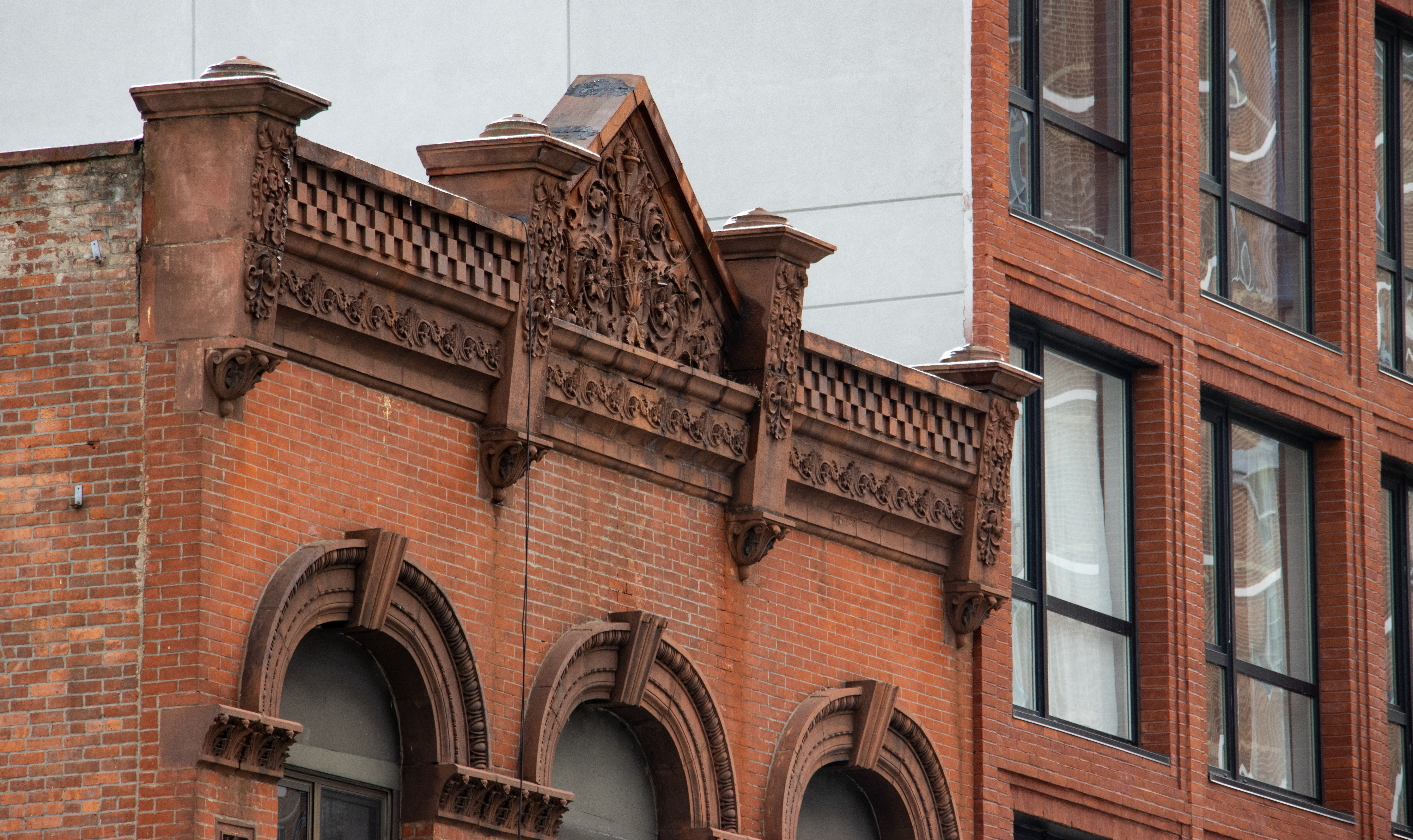
Okay, I agree with acck! ptui! and blech. I’d also like to add Gack! And that said, I think what we’re looking at is probably the architects attempt to make the building look like it fits in as opposed to the owner/developers admonition “cheap! cheap!” So the proportions, like the bay and the windows are smaller, knocking off the visual balance. Then the doorway looks dwarfed and the little attempts at decoration look even more unimportant visually.What I did notice is that he did attempt to create a strong vertical with the bay, so it relates to the building next door in that respect. I give him credit that he did give it a bay but why the red brick? Even if he went with a lighter color brick it would have been better.
Halden’s right about what a little money can do. As it is the building looks unfinsihed- like a cake waiting to be decorated. At least they don’t have the infamous fedders signs plastered all over the facade.
Other than the projecting bay, little effort was made – its basically an undecorated brick box between two highly decorated Renaissance-revival limestones.
Decoration aside, this also shows why its so hard to build a proper “contextual” building in many nabes. First off, this building has an at-grade entry (requried by ADA, I assume) – this means that the stoop needs to be extra high, and have extra turns in order to provide access below. Worse, in order to keep the projecting bay within the property line, the architect has to set the recessed portion back from the adjoining buildings, which sort of makes the building look like someone pushed a tooth in.
With an owner/developer willing to spend a little money on design and materials, something can be made of all this, and the building would be truly contextual – either as a purely modern building or as a “retro” piece. In this case, its another case of neither fish nor fowl.
Blech! I’ll never understand how things like that get built. Unless the architect is legally blind, there’s no excuse for it. I mean, the proportions are so frakking wrong, yet there are perfect guides on either side. It’s like not being able to color within the lines or something.
Ackkk, ptui!!! Yeah, it could have been worse, but if you saw the whole block you would see how out of context and awful this house is. Almost all of the houses on this block are limestone faced. This sticks out like a sore thumb. This is “Doctor’s Row” mentioned yesterday, and it’s a shame they couldn’t have done better. This is why landmark status is so important to our neighborhood. A building like this would have had to be better.
To be kind, I guess this may appeal to someone who wanted to live in an old house neighborhood, but not in an old house, although I think its all floor through apartments, so if you wanted more room, you’d have to tear out a kitchen, etc. That would definately not be me.