
Behold the New Old Header
The people have spoken. The old header captured 57 percent of the vote, defeating the new one 47 to 35, you get the old one back. Thanks for all the feedback on the design this week — It was very helpful indeed. One idea we’ve been tossing around is to hold periodic competitions for people…
The people have spoken. The old header captured 57 percent of the vote, defeating the new one 47 to 35, you get the old one back. Thanks for all the feedback on the design this week — It was very helpful indeed. One idea we’ve been tossing around is to hold periodic competitions for people to submit their own header designs and then have readers vote on which one they like the best. Do you think that’s a good idea?
Brownstoner’s New Look [Brownstoner]

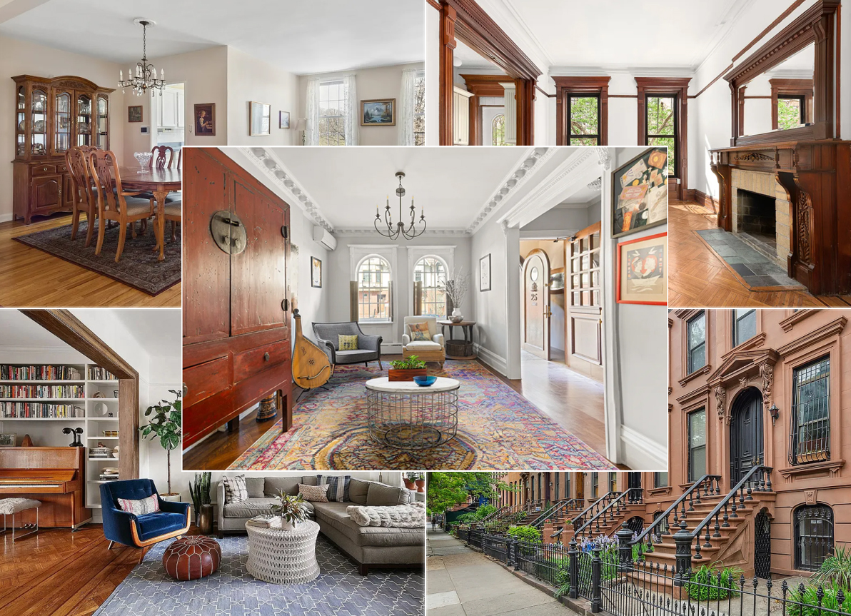
I didn’t get a chance to vote, but … I’ll say now that while I didn’t love the new header, I’m not a real fan of the old (restored) header either. I happen to like the picture, but I don’t think it accurately represents what this site is about. What you really need is a better picture than the one you chose of a beautiful Brooklyn brownstone block. I also liked the “unhealthy obsession” language — “Brooklyn Inside and Out” it too vague.
Yeaahhhhh… feels like home again! Thanks for bringing the picture back. Perhaps I have an unhealthy obsession with that great photo!
The old was much better, glad it’s back. I also miss “unhealthy obsession.”
It’s fixed
It’s a typo. Delete the J–or wait til it’s fixed…
I also see the link to “MY Brownstone”, but when I click on it I get “JHTP is not a registered protocol” However, it’s nowhere near 24 hours yet.
thanks I see it
My Brownstone should be back up within 24 hours…
And what happened to “My Brownstone” section?