
Inside Third & Bond: Week 57
[nggallery id=”25048″ template=galleryview] This week the Third & Bond bloggers turn to marketing. It would be difficult to come up with a topic for this week that is as weighty as the conversations happening right now about the bail-out and the presidential race. So instead of a Wall Street-Main Street-Third Street post where we try…
[nggallery id=”25048″ template=galleryview]
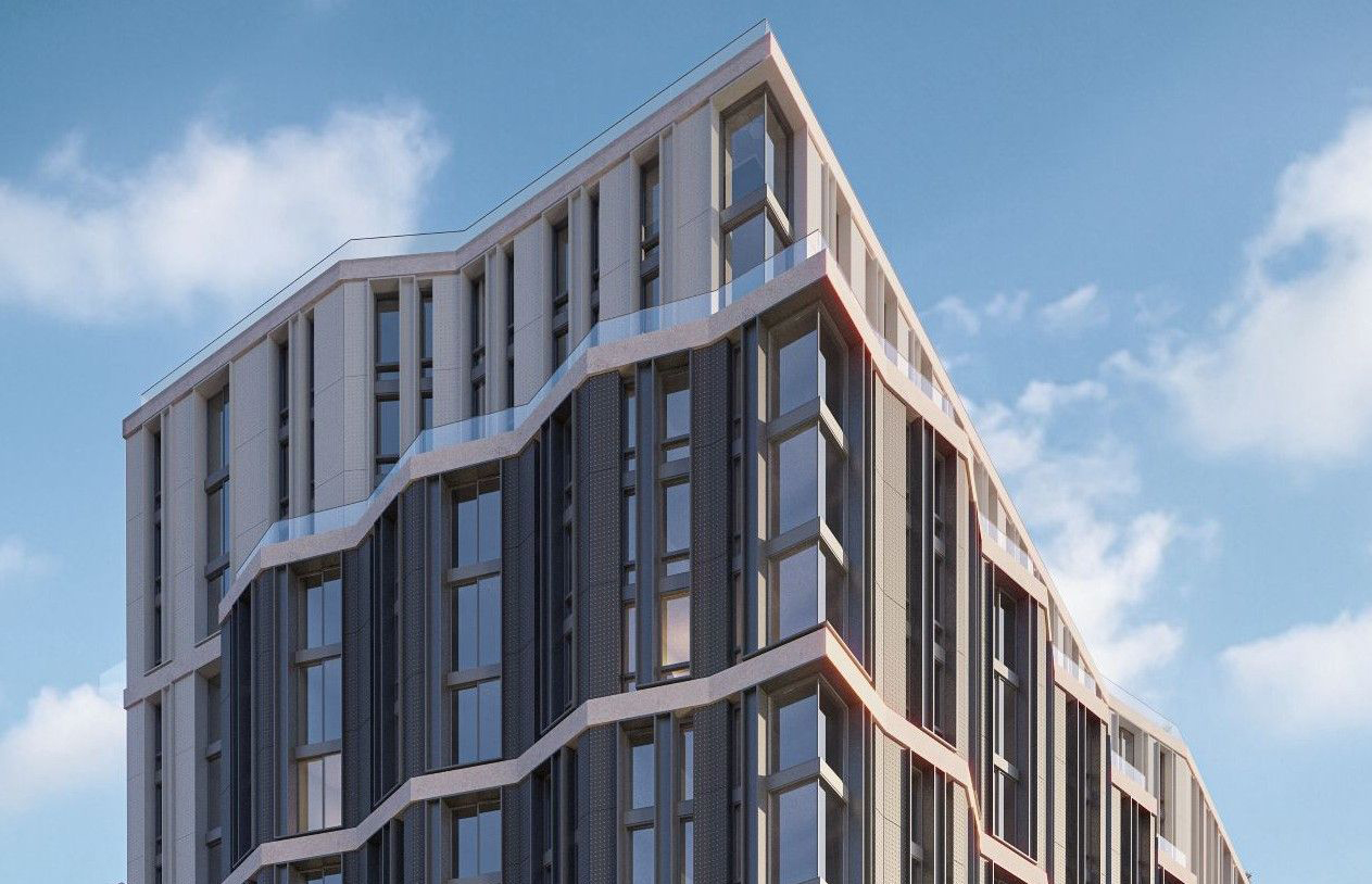
This week the Third & Bond bloggers turn to marketing.
It would be difficult to come up with a topic for this week that is as weighty as the conversations happening right now about the bail-out and the presidential race. So instead of a Wall Street-Main Street-Third Street post where we try to guess, by way of snarky jokes, how the outcomes of these major issues will impact Third & Bond, we’re coming to you with a softball about marketing. While it will still be months before we open up our sales office, we have gotten started on the marketing materials. Earlier this week, Clarke/Thompson showed us a couple of different brochure lay-outs, recycled papers for printing, and final logo ideas. One component of the brochure is what-will-be a gorgeous rendering of the project. Right now it’s little more than a wire frame that presents the angle on which the rendering will be based and gussied up. Actually, it is more like they because we have three options for the angle. One of them is straight on and is more like the photo of the model our architects made many months ago (see Week 11). We like this one because it feels simple and the repetition of façades emphasizes the townhouse feel. But it might also be too plain-Jane. Options two and three have more drama and dynamism by approaching the building from an angle with the more unusual corner building highlighted. More drama might be bad when it comes to the economy but as the presidential candidates know, it can be a good thing when you want to catch a buyer’s eye.
Which do you think is better? (Squint your eyes and imagine the usual puffy white clouds in a blue sky, a lady-figure with shopping bags in the foreground, a child trailing her with a fistful of balloons…)
Inside Third & Bond: Week 56 [Brownstoner]
Inside Third & Bond: Week 55 [Brownstoner]
Inside Third & Bond: Week 54 [Brownstoner]
Inside Third & Bond: Week 53 [Brownstoner]
Inside Third & Bond: Week 42 [Brownstoner]
Inside Third & Bond: Week 51 [Brownstoner]
From our lawyers: This is not an offering. No offering can be made until an offering plan is filed with the Department of Law of the State of New York.”


why does every job they do look like a clone of another Scarano job. Why not just go to them?
just realized the options are not shown above in order, so the poll results are likely meaningless (assuming others were confused like i was).
I understand the argument for the straight on view. However, It may look distorted on the ends and the streetscape may turn out to be a little tricky once it goes in because it is not a “natural” view. You will also miss out the corner condition.
The view can be adjusted at anytime, I would suggest putting in some context, ie sky, sidewalk, street and a couple of trees before you make up your mind. Also, the way these pictures are cropped will not be what you use in the end. You don’t have to choose now, but if the renderer has an idea of the proportions (hight x width) it might make it easier for the graphic person to integrate it into the final brochure design.
I voted option 1 because I agree with the Third & Bond guy it looks more like townhouses/brownstones. It’s a traditional image in photography and graphic design people will recognize and understand, the row of townhouses from straight-on. It’s very classic NYC. And I don’t think it’s at all boring, visually. One sees lots of repetition and straight rows in graphic design and art. Both the images shown from angles (#2 and #3) look like they could be suburban developments. Those don’t read visually as NYC townhouses to me.
definitely either 1 or 3 (they look pretty similar to me). 2 is not as attention-grabbing.