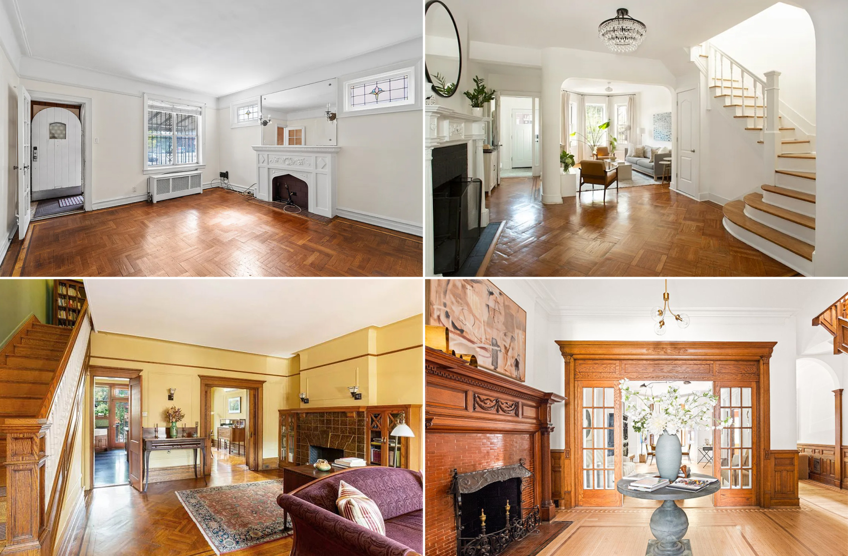
Repainting the Front Parlor
When we originally moved into our house more than two years ago, our intention was to use the front parlor in the near-to-medium term as our own home office while renting out the rear to a non-profit. (It’s a five-story house and we didn’t want to make it a three-family.) The hope was that within…


When we originally moved into our house more than two years ago, our intention was to use the front parlor in the near-to-medium term as our own home office while renting out the rear to a non-profit. (It’s a five-story house and we didn’t want to make it a three-family.) The hope was that within five years or so we’d be able to afford to take over the entire parlor floor and move the kitchen to the rear of it with a deck and stairs down to the yard. Of course, instead of a useful home office, its proxomity to the front door made it a dumping ground for bicycles, strollers, boots, etc. Fed up, we purged the space over the holidays in anticipation of turning it into a clean, sparingly decorated dining room: One table with chairs, maybe a sideboard and that’s it. The first step is to repaint, so we put up some swatches last week. From left to right, you’re looking at Farrow & Ball’s Pigeon, French Gray and Black Blue. We were tempted by the Pigeon but the prevailing opinion among family and friends was that it would be too dark, as the Black Blue would be. So we’re going to be going with the French Gray (center). Anyone else used this color?


I can highly recommend BM Stonington Gray — we did our front parlor in it, and it came out a great neutral medium gray.
I used a close BM match, Sea Haze, in my dining room (could not wait the several weeks to order the F&B French Gray since my painter was available then). It definitely reads fairly green (almost sage green) in electric light (not what I was going for), a very nice blueish gray in natural light (what I was going for). Of course, the BM color may react differently to light than the FB color, which I believe has more pigment or a different base.
don’t get it color-matched. it misses the whole point of those paints. you will be disappointed because the matching will only pick out a few of the stronger tones.
If you can’t tell the difference then you should by all-means do it.
the pigeon is one of my favorites.
it is much BLUER than the french grey which will read pretty green in the whole room.
I also fell in love with the Parma Grey color I used it on my parlor floor. I think the medium tone French Grey would work well,I also used Skylight in the parlor and I felt it was a little to pale. Also, French Grey is reading very green to me on my color swatch.Good luck
By the way I hope you are getting your paint color matched it’s way cheaper.Beacon Paint has all the formulas for Farrow and Ball and you can choose your base paint.They are experts at properly matching the colors.
^yes. We used FB’s “parma gray” extensively in our renovation. It’s not really gray, but a blue gray, and less blue than French Gray.
Do you want a gray color or a blue color? Im pretty sure that FB’s French Gray is actually very blue once on the wall. Its a lovely color but its almost baby blue.
(Grays tend to lean toward blue, purple, green or brown depending upon the light and the paint. Finding a true gray is nearly impossible)
Pigeon looks pretty green so same issue but with a green shade.
Black blue is a pretty gorgeous color for a grown up dining room but I think you need a room with a lot of light colored molding and furniture, tons of light and high celings to pull it off.
Can’t wait to see what you choose.
I think I used their French White — but this was 6 years ago and it’s a white.
Are you still renting out rear? How does that work to have DR and kitchen on 2 diff. levels?
gray dining room is pretty bleh
http://emilygiovanni.com/wp-content/uploads/2007/09/dining-room-framed.jpg
If you are looking at Farrow & Ball, I love their Elephant’s Breath, which is a lighter softer warmish grey and a classic.
I personally really like dark colors on walls, but only in smaller rooms because dark colors or intense colors are overwhelming in large rooms with high ceilings IMO.