
The Insider: Architects Modernize Layout, Function of Park Slope Prewar
The apartment gained an open kitchen, foyer, laundry, office, and herringbone floors without compromising original finishes like coved ceilings and doors.

Photo by Nicholas Venezia
Got a project to propose for The Insider? Contact Cara at caramia447 [at] gmail [dot] com
You know you’re looking at the floor plan of a prewar apartment when it shows a narrow, enclosed galley kitchen, behind which is small bedroom labeled “maid’s room.” These days, homeowners do their own cooking, and don’t want to be isolated while they do it. And that small room tucked behind the kitchen is perfect for another modern must: the home office.
“This was an interesting space for us to work on,” said architect Rachel Robinson of the Manhattan based studio Dunham Robinson, which reimagined a dated apartment in a 1920s multi-unit building to suit the needs of a young professional couple. “Our clients purchased it in estate condition from the daughter of the previous owner, who had lived there for decades, until she was nearly 100.”
Immediately inside the existing apartment’s entry, two doors right smack next to each other led to side-by-side corridors. The door on the left revealed a narrow hallway with oak parquet flooring, leading to the main public spaces. The one on the right, nearer the kitchen, was the staff entrance, opening to a hall with pine board flooring.
Dunham Robinson made this complicated entry sequence far more welcoming, as well as brighter and airier, by unifying the two halls into one large open foyer connected to an expanded kitchen and dining room. “We tried to open things up as much as possible without touching the building structure,” said Michael Dunham, the firm’s other partner.
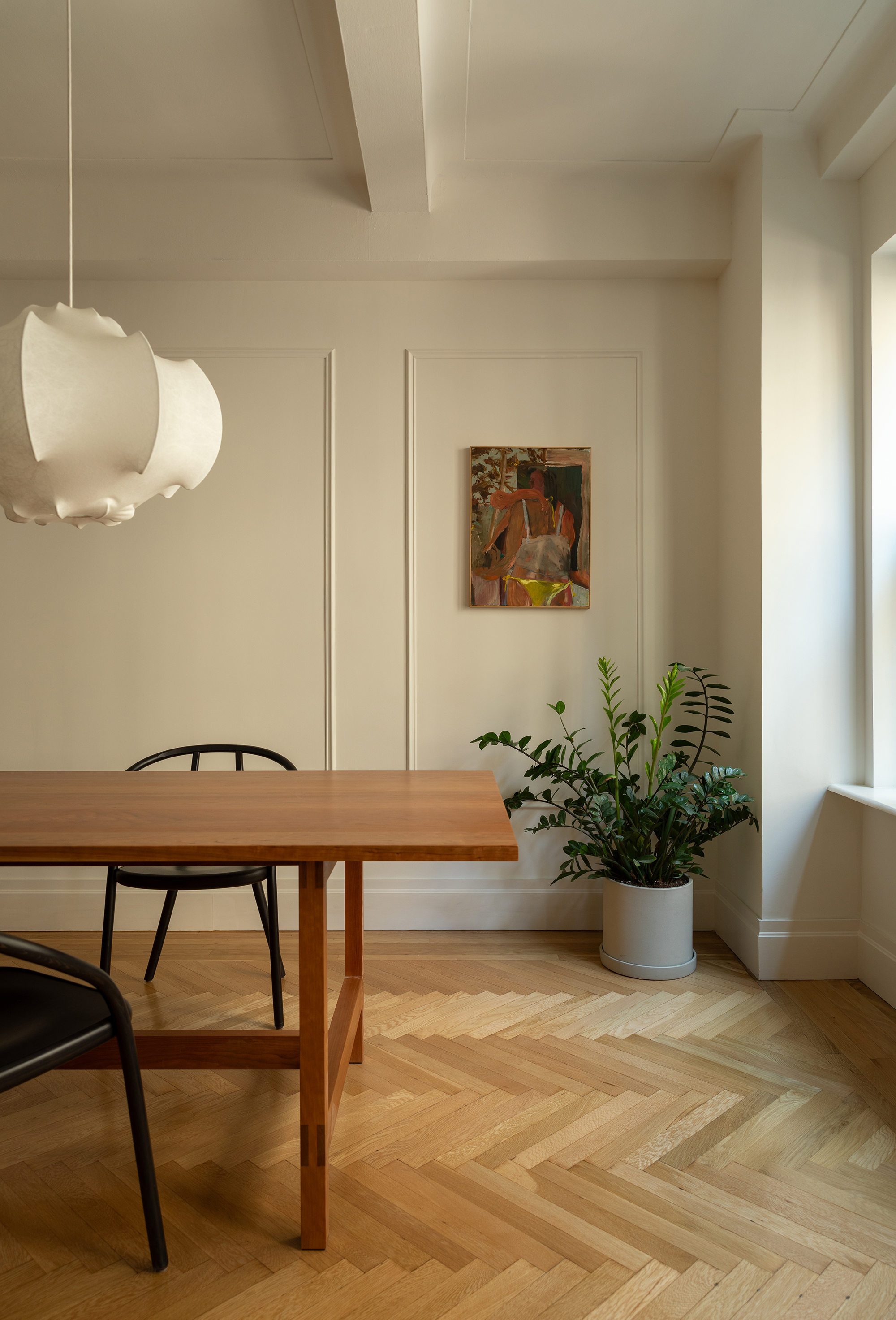
The project also entailed the insertion of a laundry room where the maid’s bath had been, and the renovation of two other bathrooms in their entirety. Areas of pine flooring were replaced with new oak herringbone, and moldings and baseboards were judiciously added where they were absent.
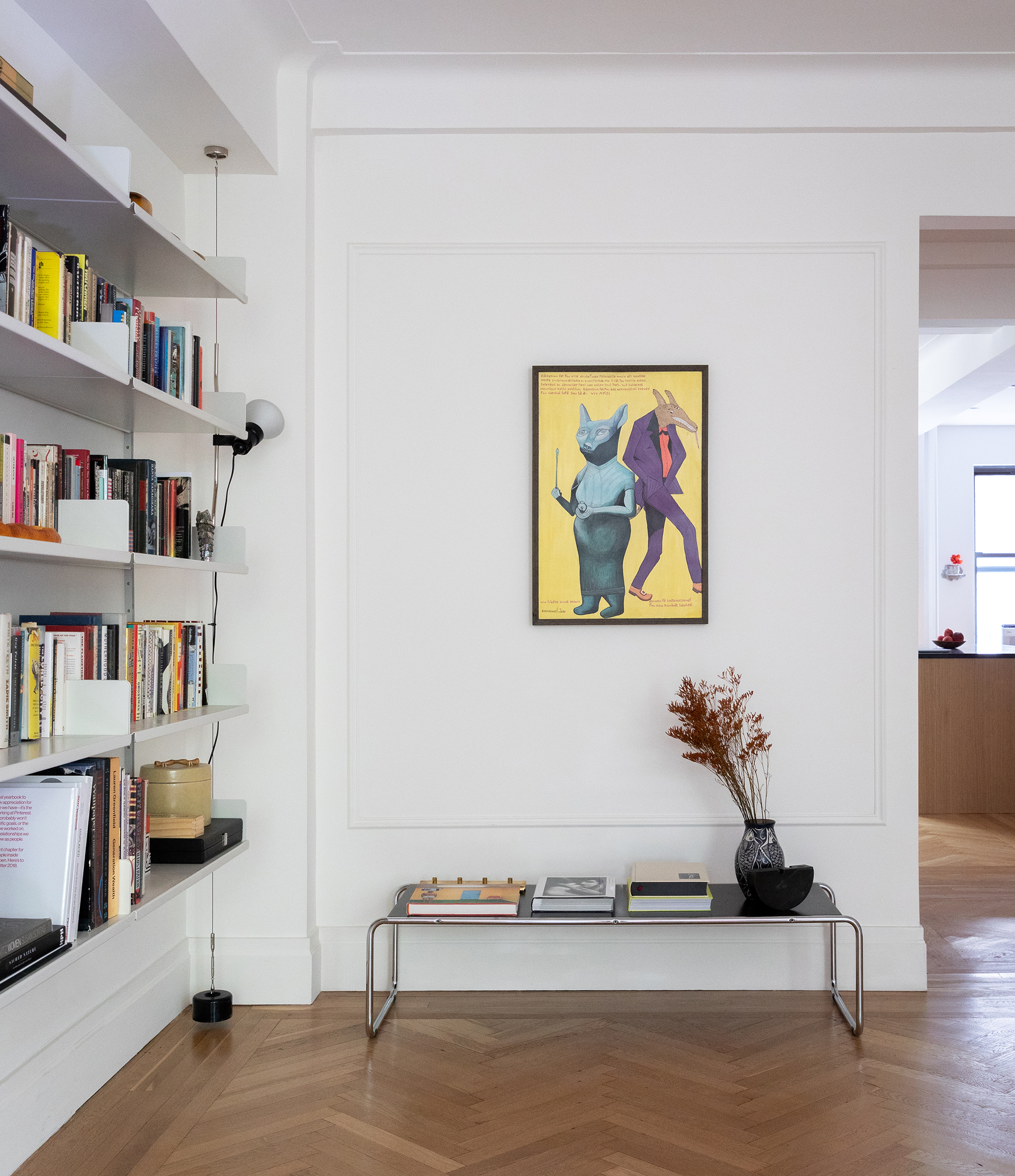
The colorful artwork and refined furnishings, mostly classic vintage modern, came from the clients’ existing collection.
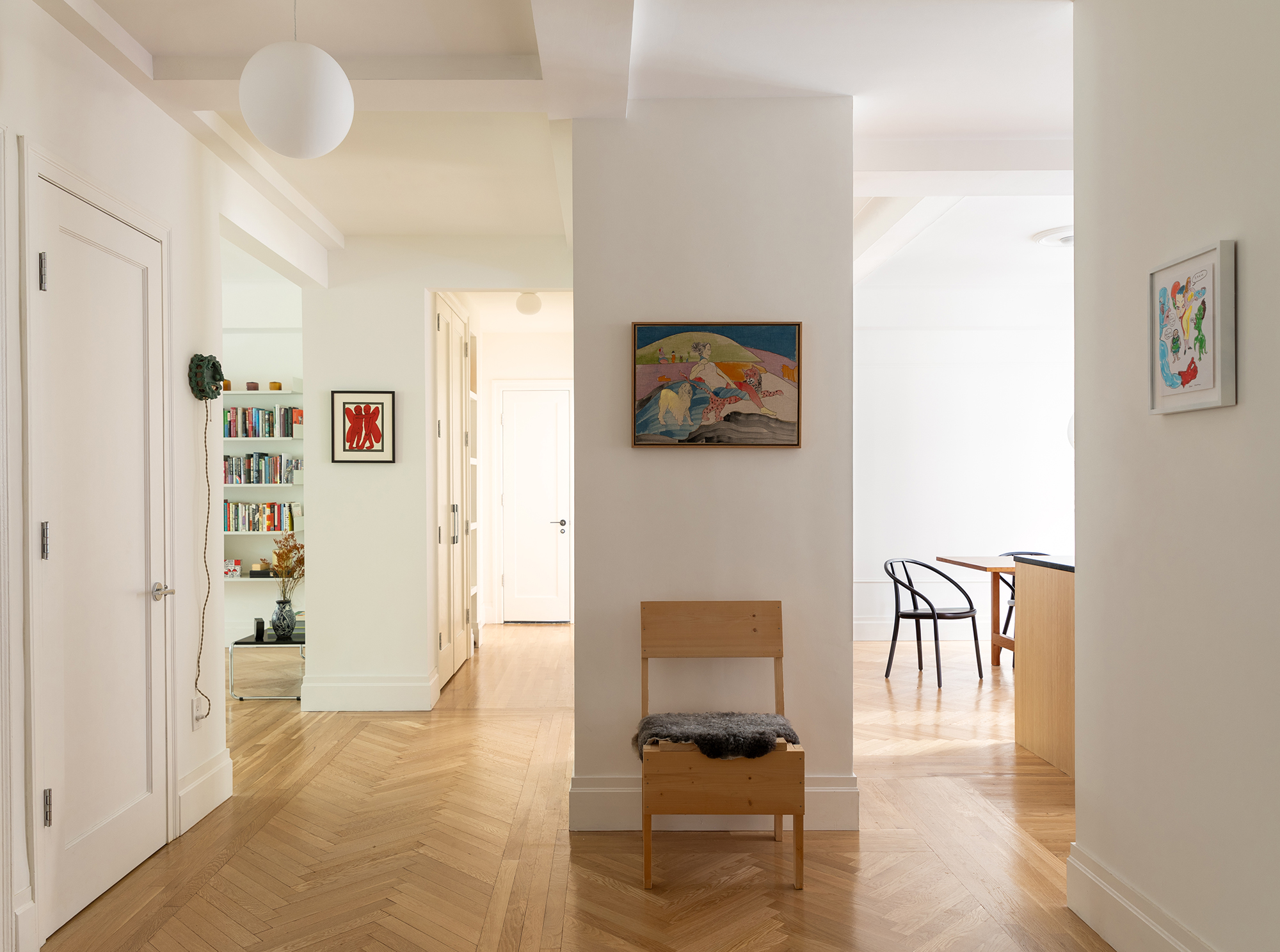
Two narrow hallways were combined to result in a spacious foyer.
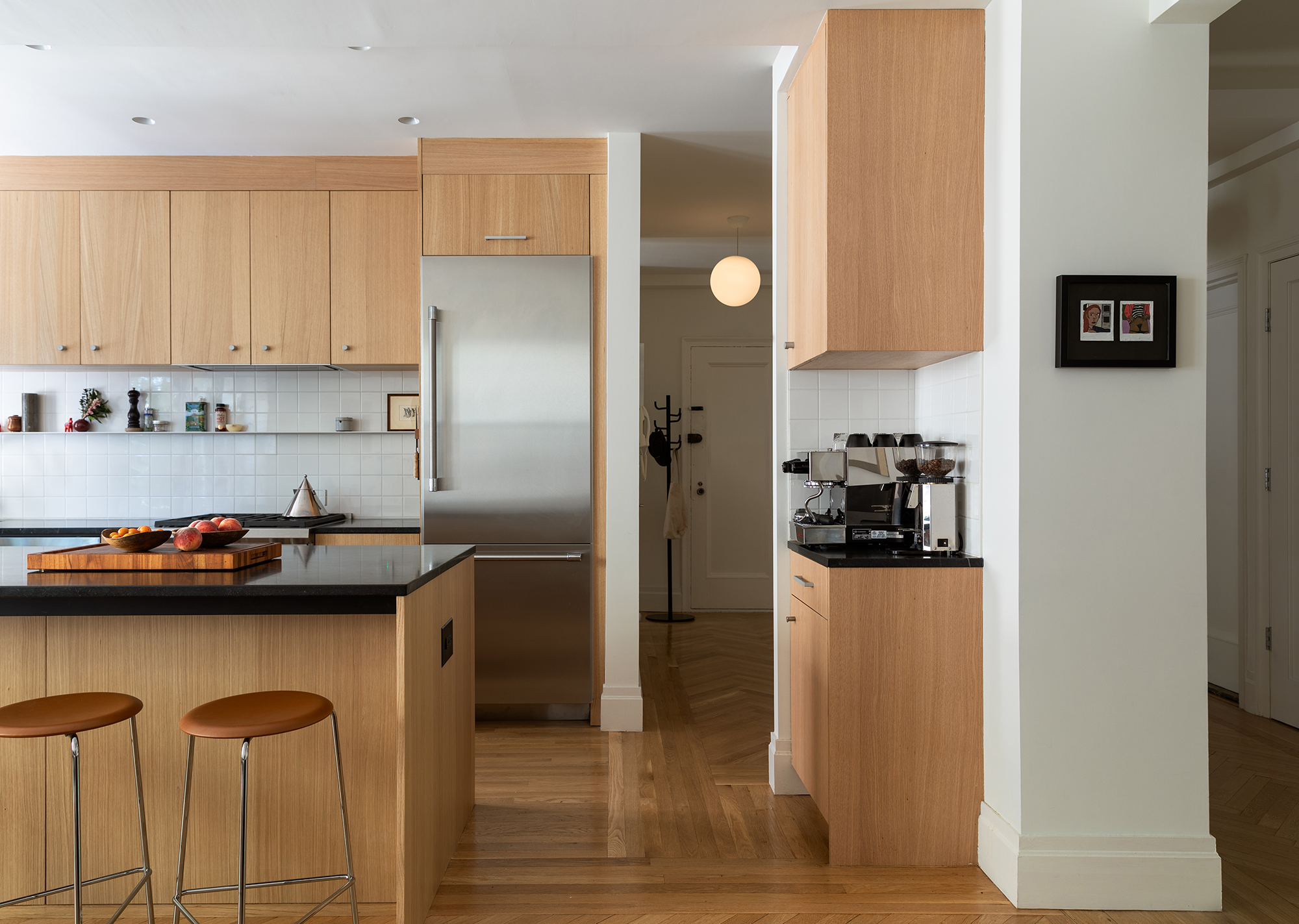
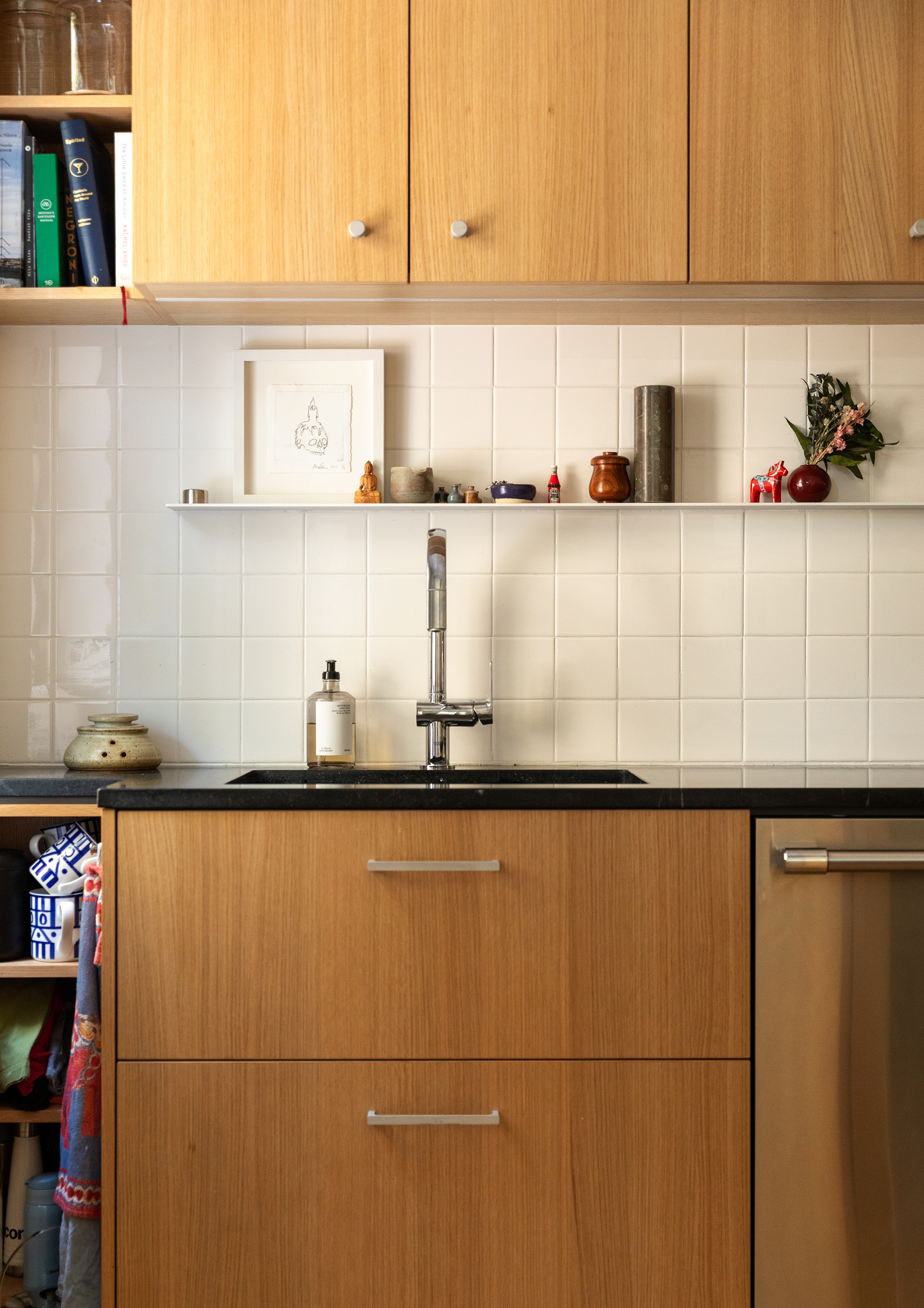
The architects were able to demolish a non-load-bearing wall to create a large, open kitchen/dining area (top photo). A structural column that couldn’t be removed was put to good use as a coffee bar and finished to coordinate with the rest of the kitchen. The room’s white oak cabinetry, sourced from Space Theory, was topped with soapstone.
Simple white 4-inch-by-4-inch tile as a kitchen backsplash was “kind of a nod to the previous mid-century kitchen in this space,” Robinson said. A minimal metal ledge is handy for items in daily use.
The pendant lamp is a 1960 design by Achille Castiglione for Flos, the Gustav dining chairs the work of Milan-based contemporary designer Gordon Guillaumier.
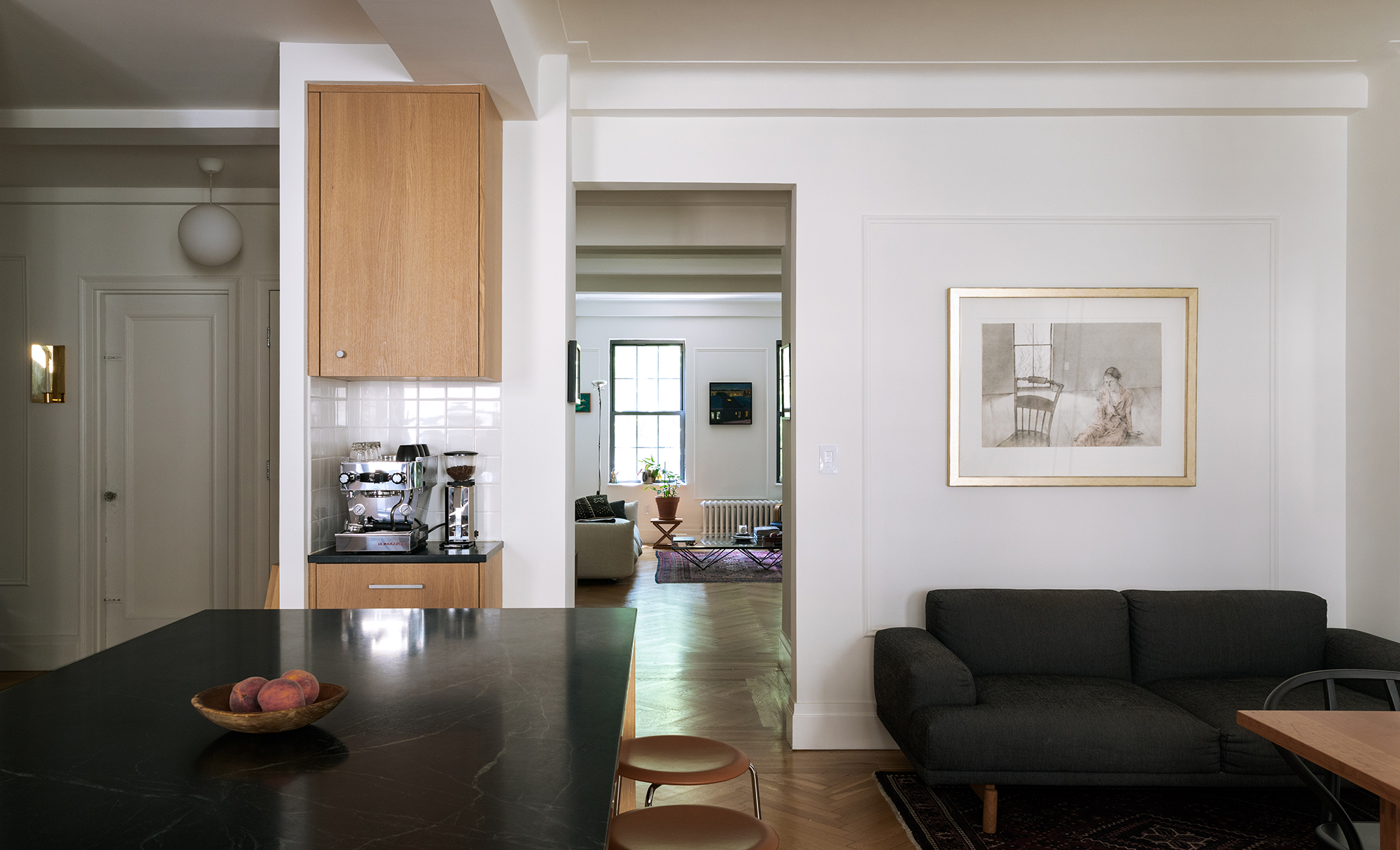
The kitchen was opened up on two sides, and a new door opening cut between the kitchen/dining room and the living room beyond.
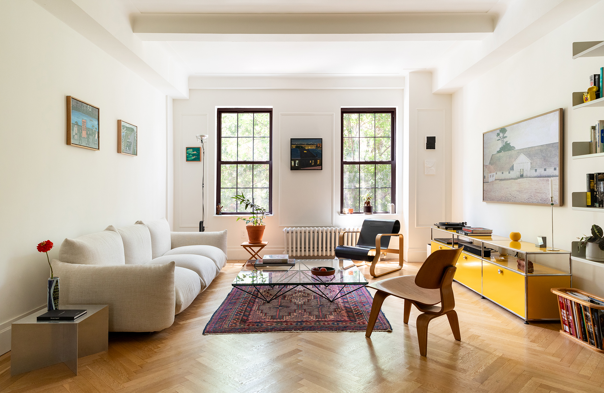
Pedigreed vintage modern furniture in the living room includes a Marenco sofa, designed in 1970 for Arflex. There is a coffee table from B&B Italia, an Alvar Aalto Paimio chair, a plywood Eames chair, and Vitsoe shelving. The media console from USM is a contemporary design.
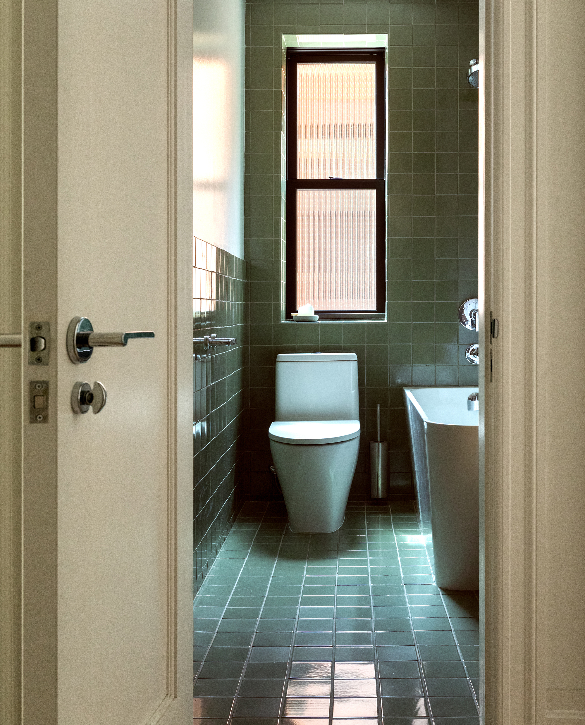
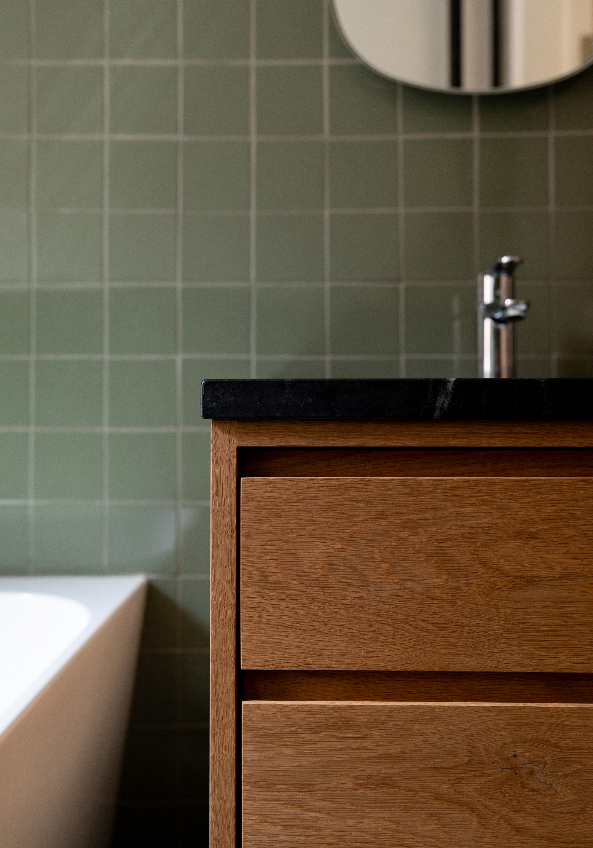
“We searched high and low for that color green tile, and found it at Fireclay,” Robinson said. They used it on both floor and walls in the guest bath. An oak vanity with a soapstone top was custom made to match the kitchen cabinetry. The tub’s rounded corner recalls the prewar tub that was there, Robinson said. “It also felt like a good space saver, with a nice soft edge detail.”
[Photos by Nicholas Venezia]
The Insider is Brownstoner’s weekly in-depth look at a notable interior design/renovation project, by design journalist Cara Greenberg. Find it here every Thursday morning.
Related Stories
- The Insider: Full-Scale Reno, New Decor Refresh Windsor Terrace Beauty
- The Insider: Designer Conjures Sophisticated Salon in Park Slope Prewar
- The Insider: Park Slope Reno Yields Airy, Clutter-Free Apartment
Email tips@brownstoner.com with further comments, questions or tips. Follow Brownstoner on Twitter and Instagram, and like us on Facebook.

What's Your Take? Leave a Comment