
Inside Third & Bond: Week 96
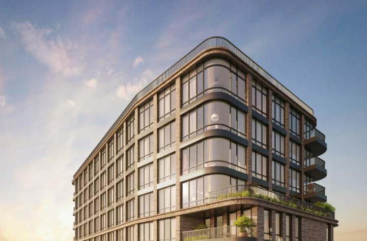
It’s a big day for the Hudson bloggers today… Welcome to the Third + Bond teaser website. You’ve seen the logo, now see the renderings.The teaser website may well be our buyers’ first introduction to the project. We want to capture their attention by highlighting key attributes that we think rise to the top for…

It’s a big day for the Hudson bloggers today…
Welcome to the Third + Bond teaser website. You’ve seen the logo, now see the renderings.The teaser website may well be our buyers’ first introduction to the project. We want to capture their attention by highlighting key attributes that we think rise to the top for design-and-comfort-conscious, value buyers: space + light, convenience + neighborhood, eco-living + inspired design.
Often, developers do teaser websites when they want to start collecting names but don’t yet have the condo plan approved and so are limited in the marketing they can do. We have our approved condo plan but still thought the teaser was a great way to launch. Already we are getting calls from potential buyers and this will help direct those calls to our sales team. We have a full website ready to go but prefer to launch that in September when the models are available for touring and NYC has returned from August vacations.
For those of you around town, like us, the teaser website: http://www.thirdandbond.com immediately awaits your curious eyes.
Inside Third & Bond: Weeks 1-95 [Brownstoner]
The complete offering terms are in an Offering Plan available from Sponsor. File No. CD080490. Sponsor: Hudson Third LLC, 826 Broadway, New York, NY 10003.

the layouts are crappy.
why must the kitchen be put in the living room, actually it looks like it is one big kitchen and there is no Living Room.
i do not like the windows, can you clean them from the outside??? and a bathroom window would have been nice too, since that is the one room where ventilation is really needed, forget about the exaust fans, duh !!!
Like the suggestion, Mr. Joist. The full website shows static images of the renderings, each one getting its own page. But we’ll think about your idea for the interim.
Chill out re: the music people … they included a mute/pause bar at the bottom.
My advice: have the renderings on the left side of the page after the contact form comes up. People want to see those pictures without having to re-load the page.
Cut the music for God’s sake. It’s horrible! What do think this is, the Age of Aquarius?
web sites that auto play some crappy music are annoying. you should get rid of that feature.