
Gothamist Spots Gentrification in PropertyShark Map
Gothamist points out that PropertyShark’s latest map of sales price increases and decreases in Brooklyn since 2004 is a perfect guide to gentrification. For our part, we’re surprised to see how large is the gray-shaded area where prices have stayed flat or decreased. In fact, those areas seem to take up slightly more than half…
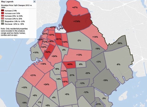
Gothamist points out that PropertyShark’s latest map of sales price increases and decreases in Brooklyn since 2004 is a perfect guide to gentrification. For our part, we’re surprised to see how large is the gray-shaded area where prices have stayed flat or decreased. In fact, those areas seem to take up slightly more than half of Brooklyn. Maybe it’s not completely fair that areas where prices increased “only” 10 percent in eight years are colored gray — by most normal measures, a 10 percent increase in that amount of time would be considered healthy growth. One real puzzler, though, is Prospect Heights, where prices have decreased 4 percent since 2004, according to the map.
Image from PropertyShark via Gothamist

What's Your Take? Leave a Comment