
Developer Tones Down Mad, Mod Building Design in Bed Stuy
Proof that public opinion can influence building design? SSJ Development has hired Durukan Design to rein in the crazy space-age look of the 70-unit apartment building now rising at 785 Dekalb Avenue in Bed Stuy. Durukan Design sent this new rendering and details to Curbed, which published them yesterday. (Click through to Curbed to see more…

Proof that public opinion can influence building design? SSJ Development has hired Durukan Design to rein in the crazy space-age look of the 70-unit apartment building now rising at 785 Dekalb Avenue in Bed Stuy.
Durukan Design sent this new rendering and details to Curbed, which published them yesterday. (Click through to Curbed to see more details, including an interesting atrium.)
The new plans are nothing short of amazing, because the structure of the building, including the balconies, is already in place. The new design jettisons the gold dome and the slanted oval portholes, swaps in more sober cladding materials, and flattens what appeared in the first rendering to be an undulating facade.
That’s quite a feat, but a quick stop by the work site this morning revealed the building facade is, in fact, already flat. (Except for the rounded center, which is staying.) The balconies, however, are wedge-shaped. Perhaps they will be able to shave them down into rectangles?
Of all the many controversial new building designs planned for Bed Stuy recently, we have to admit, this was one we actually had a soft spot for because it was just so out there and wacky. But we were probably alone in that view. We find the new design much more tasteful and in keeping with the look of the neighborhood.
Click through to see the previous rendering and lots more photos. What do you think of the building’s new look?
Formerly Hideous Bed-Stuy Rental Is a Monstrosity No More [Curbed]
785 Dekalb Coverage [Brownstoner]


Cate, can you follow up with the developer of 410 Tompkins to see if he is willing to amend that incredibly unattractive design that will mar the block, especially given over 80 comments, mostly negative on his proposed design (the crack house)?
I propose Brownstoner creates a daily section to follow up on developer projects. Maybe that would make a difference if they knew how the public felt earlier in the game. Their end goal is money but they are not going to max out if they building is ugly so it is in their interest anyway to pay attention to what is being said. Maybe they would even let us vote on the design? Would be a cool Brownstoner feature and great way for these developers to get free market feedback.
The rendering looks like a 1970’s New Jersey hospital. I get why a real estate agent who sells brownstones in the surrounding area would like this building to be a giant brownstone knockoff, but the rest of you surprise me. Why try to copy the real thing with a cheaper, blander version with no personality? I agree the first rendering was absurd, but this will just stand out as tacky and cold.
This is much better.
I had a soft spot for it too (although I’d rather have this in the neighborhood). As far as remaining in keeping with the look of the neighborhood goes, I’m all for that. But this particular stretch of the neighborhood has no coherent look beyond gradually recovering desolation, so I think you can get away with something like this more easily than, say, Hancock and Tompkins. Even with the sea monkey palace, I was just glad something was filling that giant gap.
Is blandness really a victory? At least the original would have been fun to walk by. What’s the value of this?
Agreed. But this is in the northern half of Bed-Stuy. And the block is currently anything but fabulous.
As a journalist, can you reach out for their reaction? That is what journalists do.
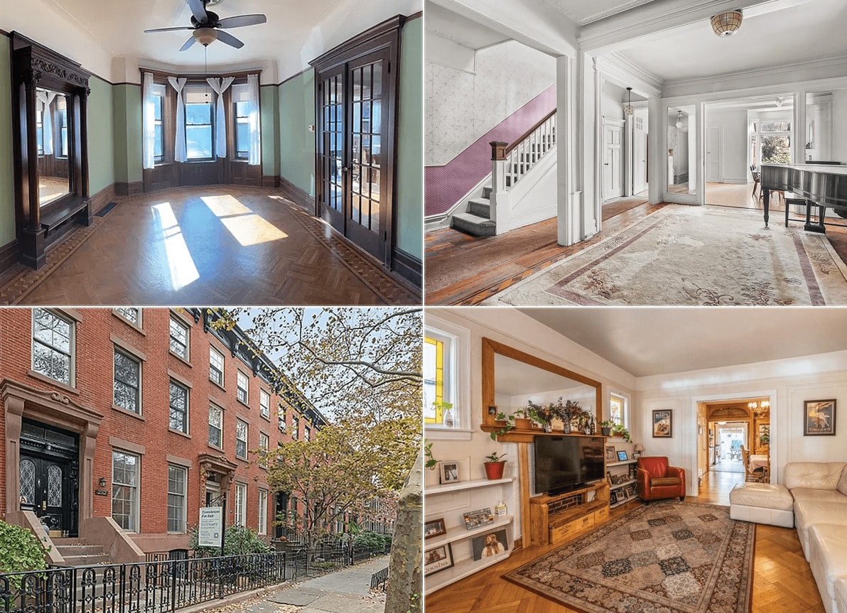
The southern half Bed-Stuy is not just any neighborhood. It’s one of the largest areas of intact Victorian buildings in the country. It’s a fabulous museum of 1880-1900’s life and domestic design. To hodge-podge it up with modern “innovative” design is careless, needless, and common. Just plain common. People who think it’s not worth it to preserve the feeling here with new infill architecture that works with the local context are not innovative. They’re just visionless.
So you’re agreeing with me?